 headout
Eevee-lution: building Headout's in-house design system
One design system, five Pokémon-inspired packages, and a lot of lessons. Here’s how we built it to scale, drive adoption, and stay fun to work with.
Back in 2021, during my interview for a frontend engineering internship at Headout, I casually mentioned to our then-CTO, Vikram, that I was reading "Atomic Design" by Brad Frost. Little did I know that I would later apply these learnings in shaping Headout’s very own design system: Eevee.
Why we needed a design system
Headout’s frontend is made up of several projects, each catering to different parts of the customer journey. While their functions vary, their design language shouldn’t. We needed a single source of truth for consistent, modular, accessible UI components—a system that could scale with us.
Without one, we started to see the same problems surface across teams.
Take the humble Button, for example. In the absence of a shared system, each project created its version. They looked similar at a glance but behaved differently—some missed loading states, others lacked accessibility considerations, and edge cases were handled inconsistently.
Multiply that across multiple components and teams, and the result was a fragmented user experience and increased maintenance overhead. Fixing a bug in one place didn’t guarantee it was resolved everywhere.
That’s when it became clear: we didn’t just need reusable code—we needed shared standards, unified documentation, and a common language for design. We needed Eevee.
But Eevee wasn’t our first attempt!
Lessons from an earlier attempt
We had tried building a shared component library before, but it never quite took off. Here's why:
- No Storybook setup:
There was no easy way to preview components without integrating them into a project. This meant building the package (or fiddling with symlinks) just to see what a button looked like. - Inaccessible components:
Most of the components in the package did not adhere to W3C accessibility requirements. - No Testing pipeline:
Without tests, bugs frequently slipped through, adding friction during the development and QA process.
Unsurprisingly, the library saw low adoption. It became a stagnant collection of components—used by few, updated by even fewer.
Enter Eevee: Right place, right time
In early 2024, the frontend team decided to move away from styled-components in favour of PandaCSS—a build-time CSS solution that also works well with React Server Components (RSC).
That decision was our opening. If teams were already shifting CSS libraries, why not pair that transition with the rollout of a new design system?
A fresh start, shared momentum. Win-win.
July 2024: The journey begins
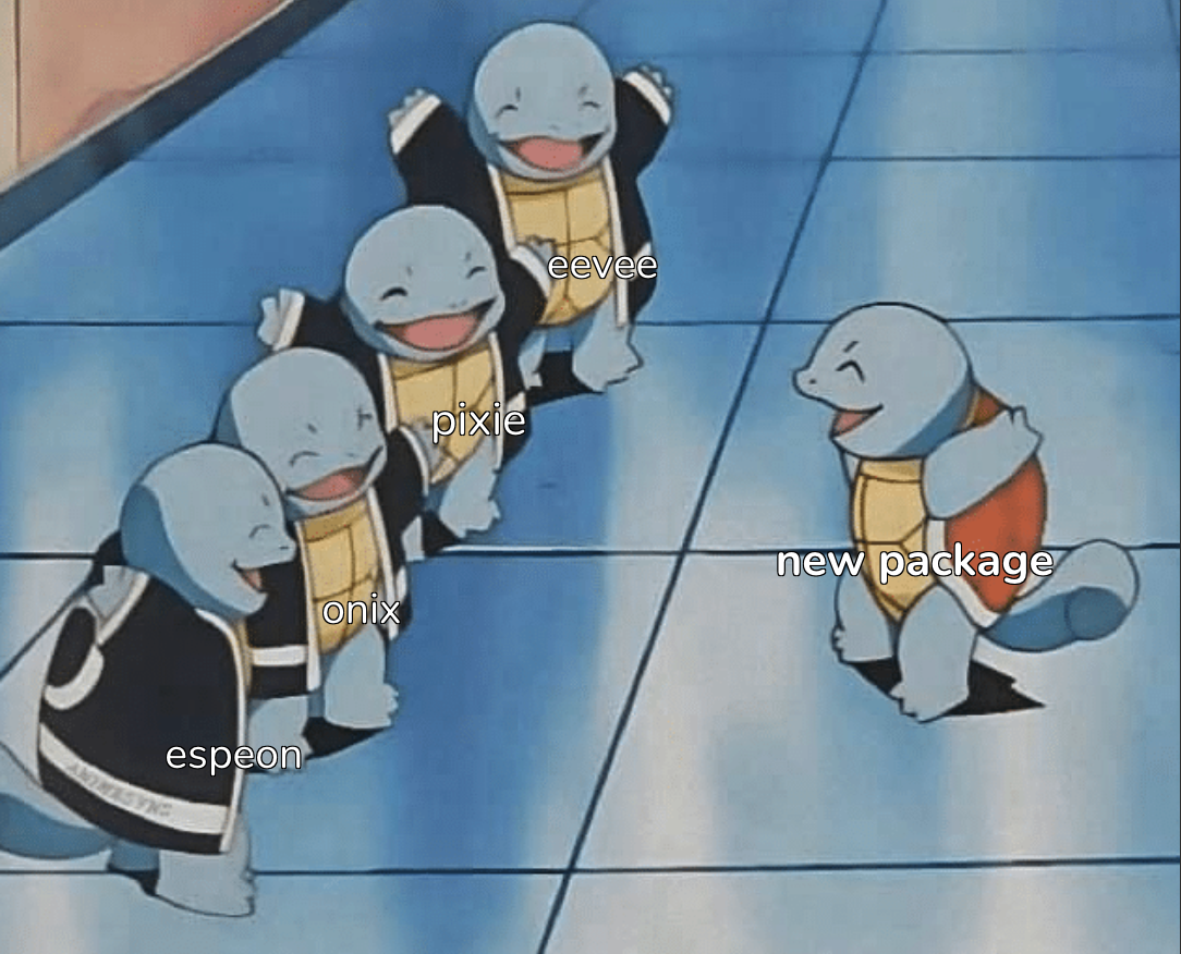
Because we’re Pokémon fans, we named the design system Eevee—a nod to adaptability and evolution.
We kicked things off with a monorepo, designed to host multiple packages related to the design system. To manage it, we chose pnpm—its workspace support and performance made it incredibly straightforward to manage dependencies and versioning across multiple packages.
Here's how the ecosystem started—and how it's grown:
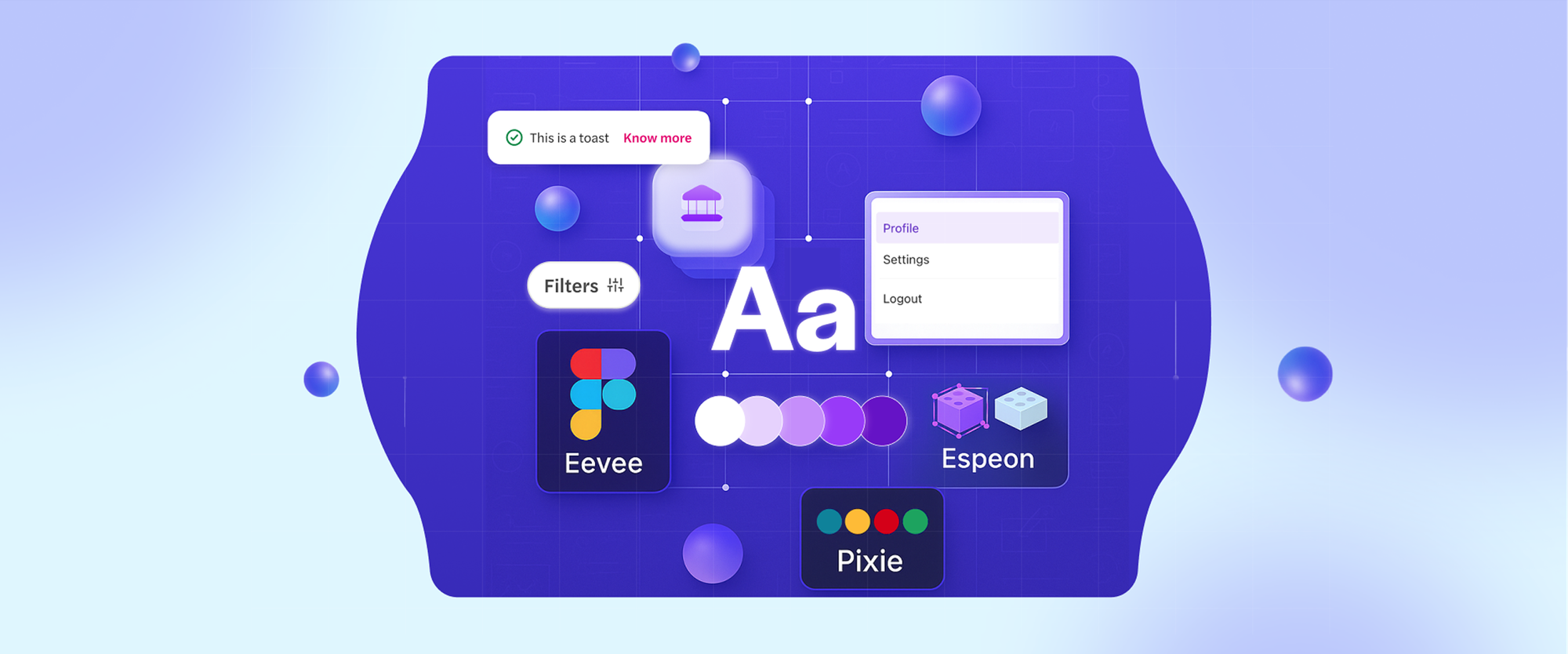
The core packages:
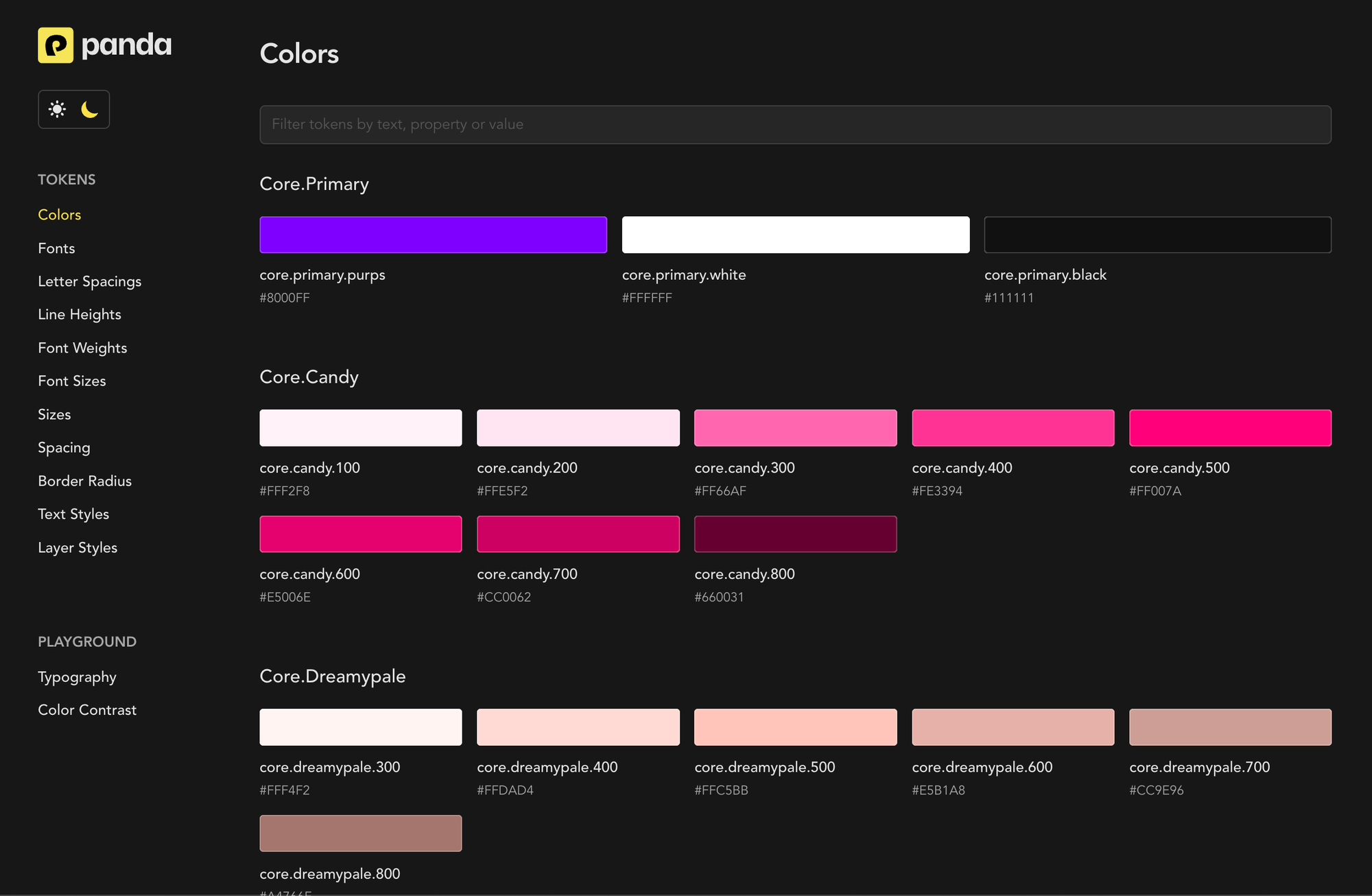
- Eevee:
The heart of the design system. It houses accessible, modular components—our atoms and molecules—built using React and PandaCSS. - Pixie:
Our design token system. From font sizes and colors to box shadows, Pixie holds it all. Under the hood, it’s a thin wrapper around Panda CSS, which means it works seamlessly across both React and non-React projects.
The additions
- Onix:
Our cross-platform icon library, compatible with both web and native (mobile). Onix currently houses 500+ icons—all optimized for performance and consistency. (More on this in an upcoming blog) - Eevee-scripts:
A utility package designed to cut down manual work through automation. Right now, it powers:- Codemods for smoother migrations
- Icon sync scripts that pull assets directly from Figma
- Adoption tracking scripts to help us measure usage across various projects.
- Espeon:
A step up in evolution, Espeon houses complex components that go beyond visual presentation. Built on top of our atoms and molecules, these components come bundled with business logic, making them plug-and-play for real product use cases. Think of it as the bridge between design system primitives and production-ready UI.
How we built it
We didn’t start from scratch. Instead, we combined lessons from our past with inspiration from leading open-source design systems such as Primer, Blade, and others that have set the bar for scale and clarity.
A few foundational principles guided our approach:
Documentation first
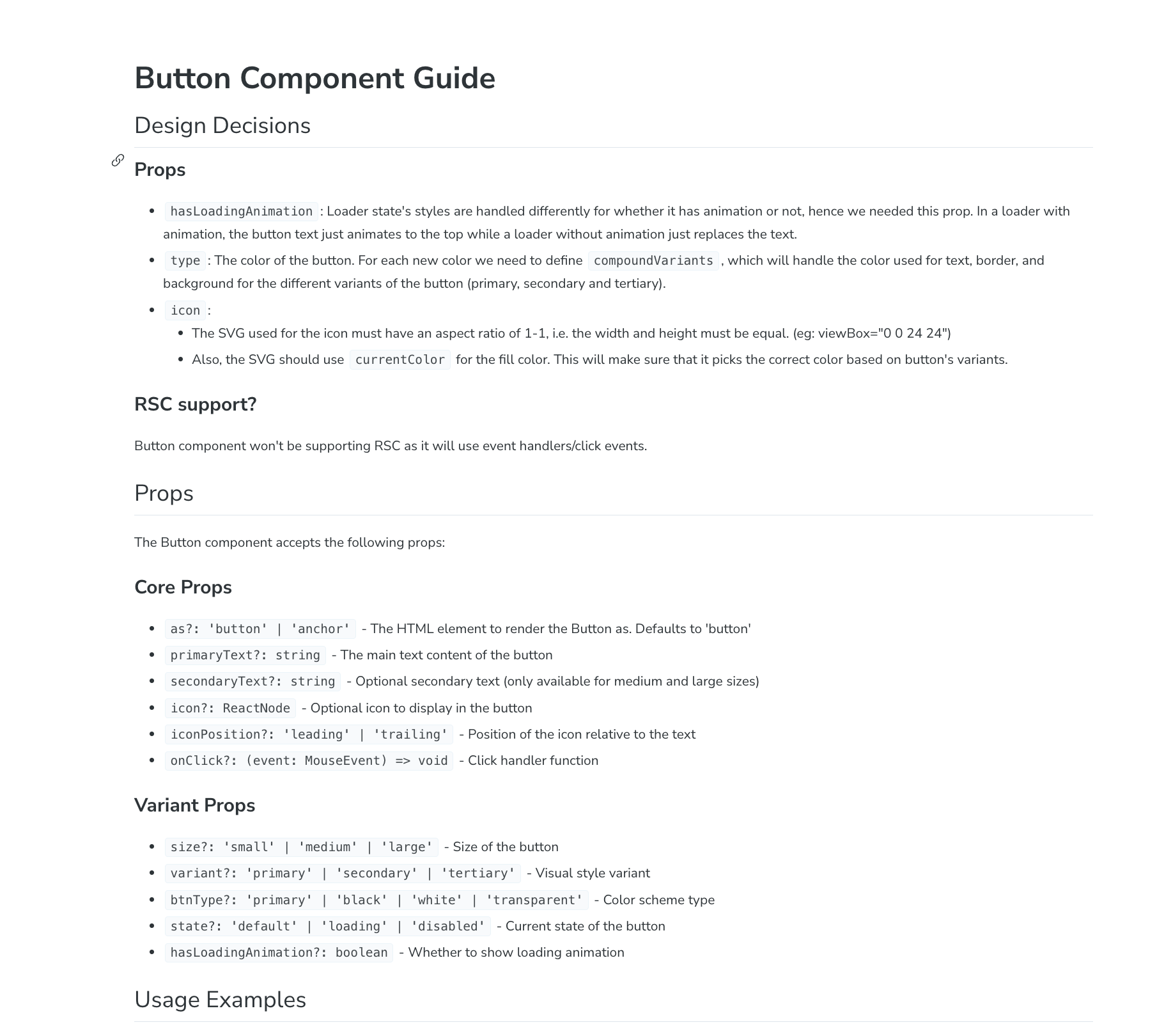
Before writing a single line of code, we document the API of each component, covering props, expected behaviors, edge cases, and usage patterns. This initial spec is reviewed by multiple engineers, helping us align early, catch gaps, and reduce friction during development.
At this stage, we also define the right balance between flexibility and constraint. How much should a component expose? What should it enforce?
We discuss questions like:
- Should a
Buttonbe allowed to render as an anchor tag? - Should a
Linkbehave like a button in certain contexts? - How should a
Toastcomponent be triggered from outside the React tree?
By addressing these decisions upfront, we are flexible where it needs to be, and opinionated where it matters, reducing surprises down the line.
Storybook setup
- Every component has well-defined stories that showcase all its variants, covering different states, sizes, and edge cases.
- Each component also includes a documentation guide within Storybook, outlining its props, usage examples, and the key design decisions behind it.
- The stories are fully interactive—changing props using controls updates the component in real time. This makes it easier for designers, engineers, and QA to explore behavior without touching code.
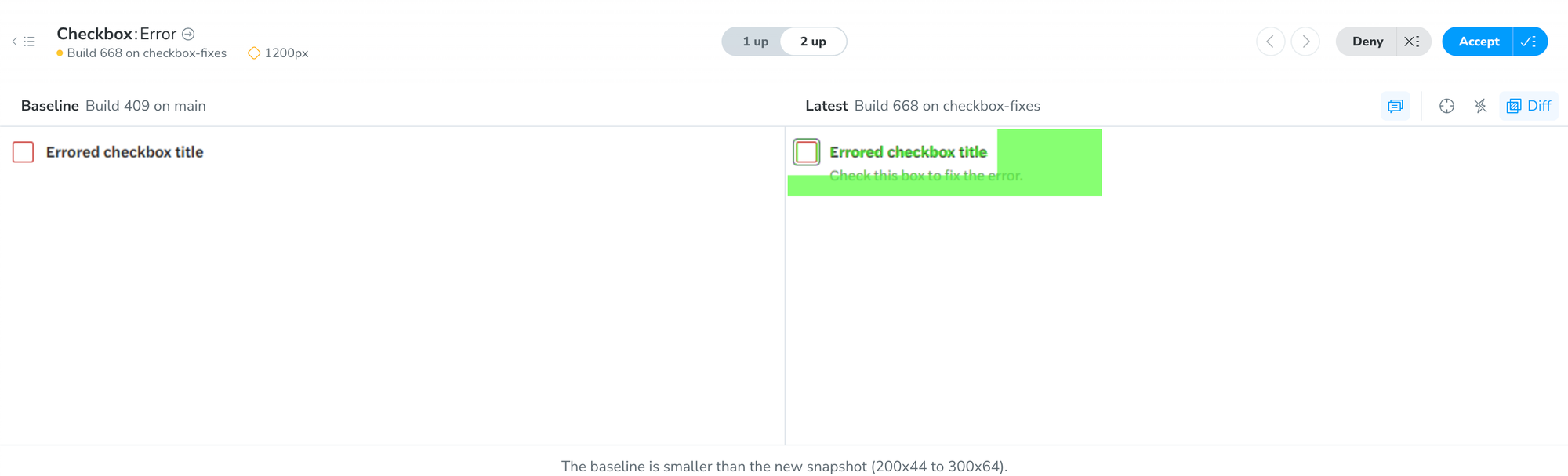
Testing: Three pillars
We run three types of tests on each component to ensure quality and reliability:
- Accessibility tests
Verifying compliance with W3C standards. This makes sure we catch accessibility issues within the stories. - Interaction tests
Ensuring that components behave correctly in response to user input. - Visual tests
Using Chromatic, we compare the component’s visuals against a base design to catch unexpected UI changes.
Accessibility and interaction tests are powered by Storybook’s test runner, which uses Playwright under the hood.
Workflows that keep us moving
We’ve baked reliability into our process:
- Automated storybook deploys
GitHub Actions push updated Storybook builds on every change, making it easy for devs to share live previews with designers and other stakeholders. - Two reviewers minimum
At least two engineers must review every pull request. It’s a lightweight safeguard that helps catch oversights early. - Tests must pass to merge
Failing tests block merges—no exceptions. Quality is non-negotiable.
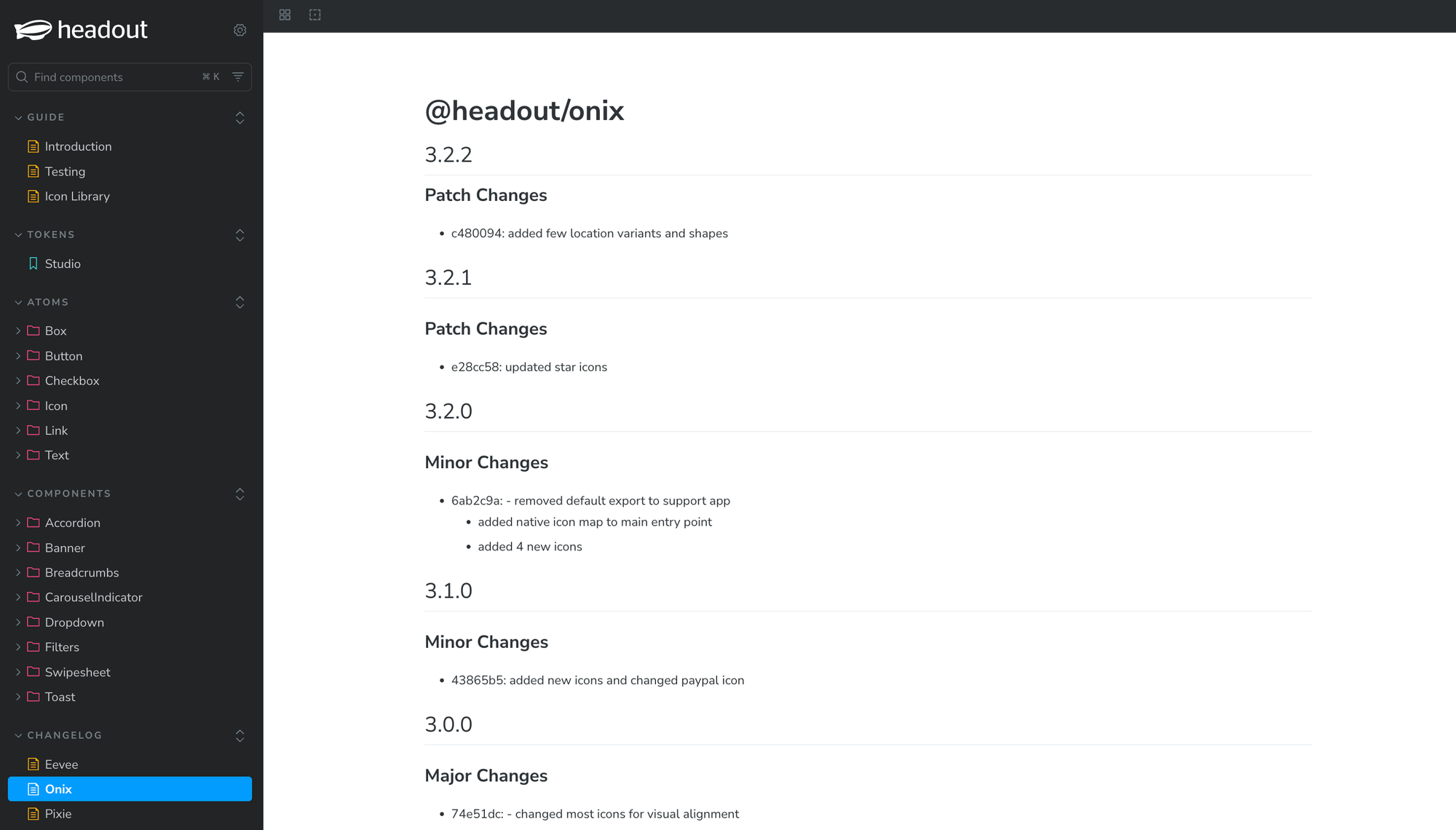
Versioning with changesets
We use changesets for streamlined versioning and publishing. It's a helpful tool for versioning in a multi-package monorepo setup.
Bonus: it auto-generates changelogs like this one 👇
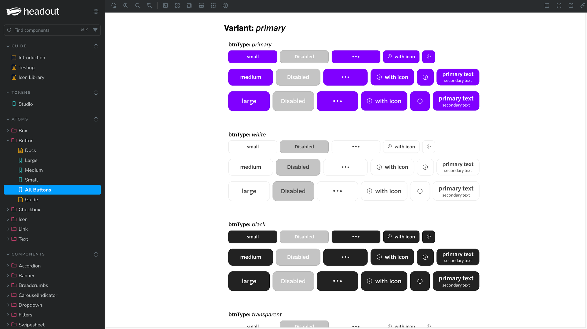
A year in: Where we stand
In just one year, Eevee has grown steadily:
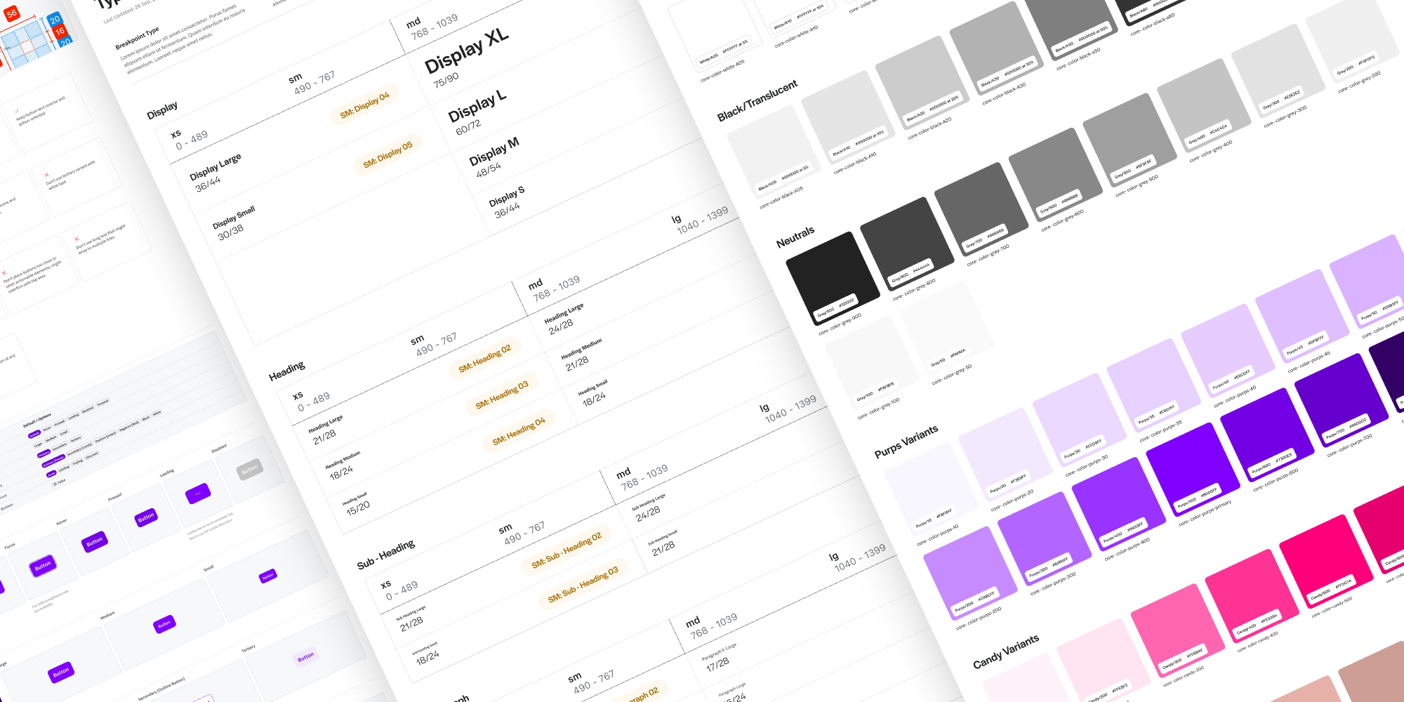
- 6 atoms
- 8 molecules
From foundational components like Button and Text to more advanced ones like Accordion, Swipesheet, and Dropdown.
Here's how the storybook looks:
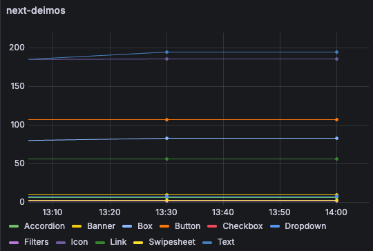
Tracking adoption
We recently introduced scripts to track design system usage across our applications. Using a custom setup of react-scanner, we run weekly scans and push the data to Grafana for visualization.
But we’re not just looking at raw adoption numbers.
This data helps us identify gaps—if a component isn’t being used, it might be missing key functionality or flexibility. On the flip side, high adoption confirms we're hitting the mark.
Beyond that, we also track how each component is being used—specifically, the frequency of individual prop usage. This gives us insight into which props are essential and which might be underutilized, helping us make more informed, data-driven decisions when designing future components.
Here’s a snapshot from the dashboard:
What’s next?
We're just getting started. Eevee is evolving—not just in its component count, but in how it integrates into our design and development culture.
Up next, we’ll be diving into Onix, our cross-platform icon library that powers all visual elements across Headout. From web to native, we’ve got some exciting things to share—stay tuned.
P.S. If this work excites you and you'd like to help shape the next phase of Eevee, check out our careers page. We’re hiring!