Aisle be honest: Your Broadway seat might suck (We fixed that)
Transforming Broadway booking process by replacing confusion with clarity. From no seatmaps to beautifully redesigned, interactive visuals — we’ve made choosing your perfect seat a seamless, confident experience.
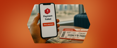
Imagine walking into a car dealership. You’re ready to buy.
You say, “I’ll take one in red.” They say, “Perfect — we’ll pick the specs, interior, and features for you. You’ll find out after you pay.” No peek at the car. No test drive. Not even a look at the dashboard.
Feels ridiculous, right?

That moment of not knowing kills confidence. It’s the reason we pause, hesitate, and often walk away.
This is the same psychology that shows up in digital experiences.
Nobody likes buying blind. Not when booking a hotel. Not when ordering food. And definitely not when picking a seat for a show.
It’s not just about being picky — it’s about feeling sure. We trust what we can see. And when that context is missing? Trust goes down. Nowhere is that more obvious — or more important — than Broadway.
Broadway isn’t just a place; it’s a stage for once-in-a-lifetime experiences. From the booming rhythms of The Lion King to the revolutionary verses of Hamilton, the shimmer of Wicked, and the razzle-dazzle of Chicago and Moulin Rouge — these shows bring people from all over the world to a handful of theatres in midtown Manhattan.
But the magic doesn’t just happen on stage. It happens in the theatre — and more specifically, in the seat you’re sitting in.
Because a great Broadway experience comes down to three things:
- The show — of course
- The theatre — for acoustics, scale, and charm
- and the seat you sink into for the next two hours

That seat? It defines your view, your comfort, and how close you feel to the moment.And when you’re spending Broadway money, you don’t want to guess. You want to know.
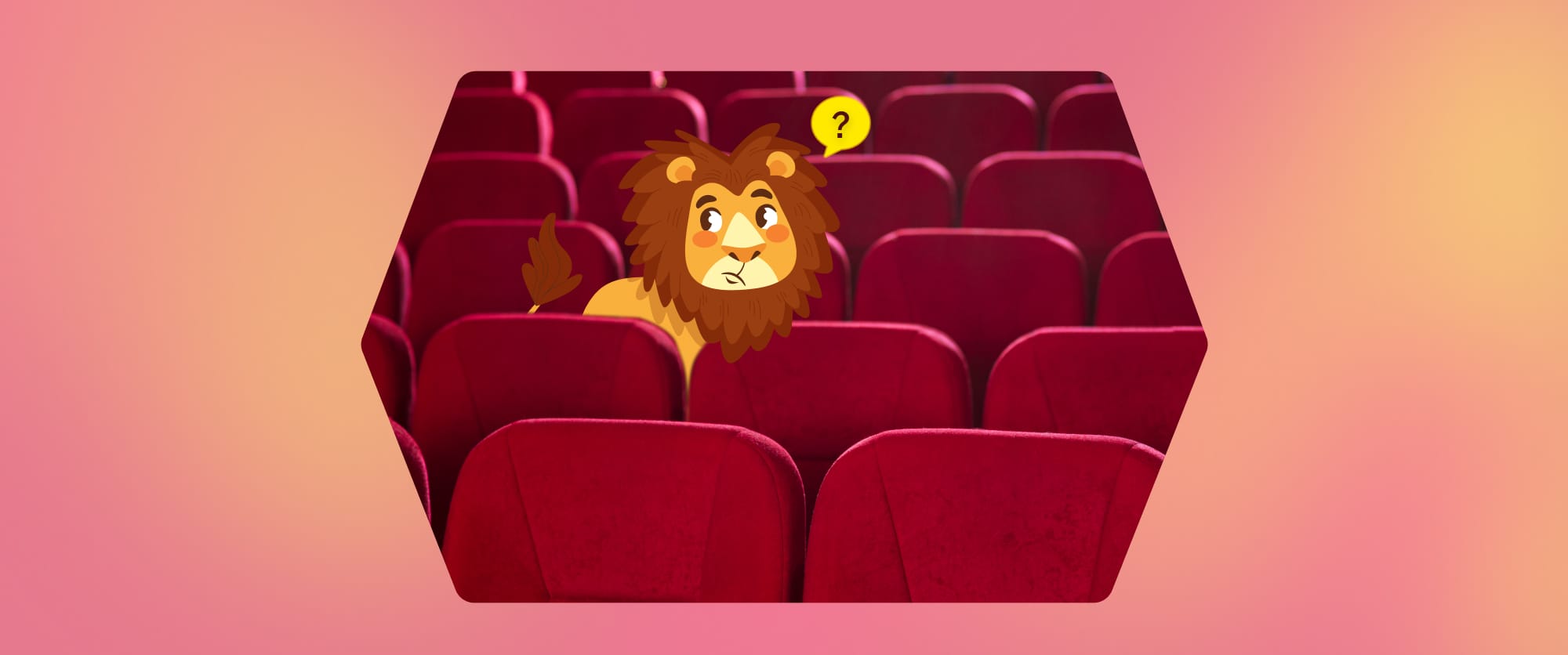
Why do seats carry the most weight?
Because in live theatre, your seat doesn’t just frame the show — it defines it. Let’s start with what it’s not like.
In a UFC match or a sports arena, the action’s centered. The design assumes 360° visibility. Sightlines are mostly fair. In a cinema, it’s even simpler — one screen, same story for everyone. You’re watching the director’s camera, not choosing your own angle.
But Broadway? It plays by different rules. The stage is fixed. The cast moves in three dimensions. Lighting, choreography, and set design are built with space in mind. Your seat decides what you see, how you feel, and how connected you are to the story.
Some seats deliver eye-level intimacy. Others let you drink in the full scale of the production. And some? They leave you craning around pillars, catching only fragments of a moment.
It’s not just about front vs. back. Theatres curve, stack, and slope. Acoustics shift. Overhangs interrupt. Two seats side by side can offer completely different experiences — especially when you factor in the show itself. What’s a perfect seat for Chicago might be the wrong pick for Hadestown.

Even the physical layout of the theatre plays a role.
Some theatres curve around the stage, some stack vertically. The rake (or slope) of the floor, the overhang of the mezzanine, the distance between rows — these details affect how sound travels, how sightlines hold up, and how immersed you feel. In some venues, a rear mezzanine seat might actually offer a better panoramic view than a front-side seat. It’s subjective. It’s situational. And it matters more than you think.
Here’s a real photo of a not-so-great seat view.
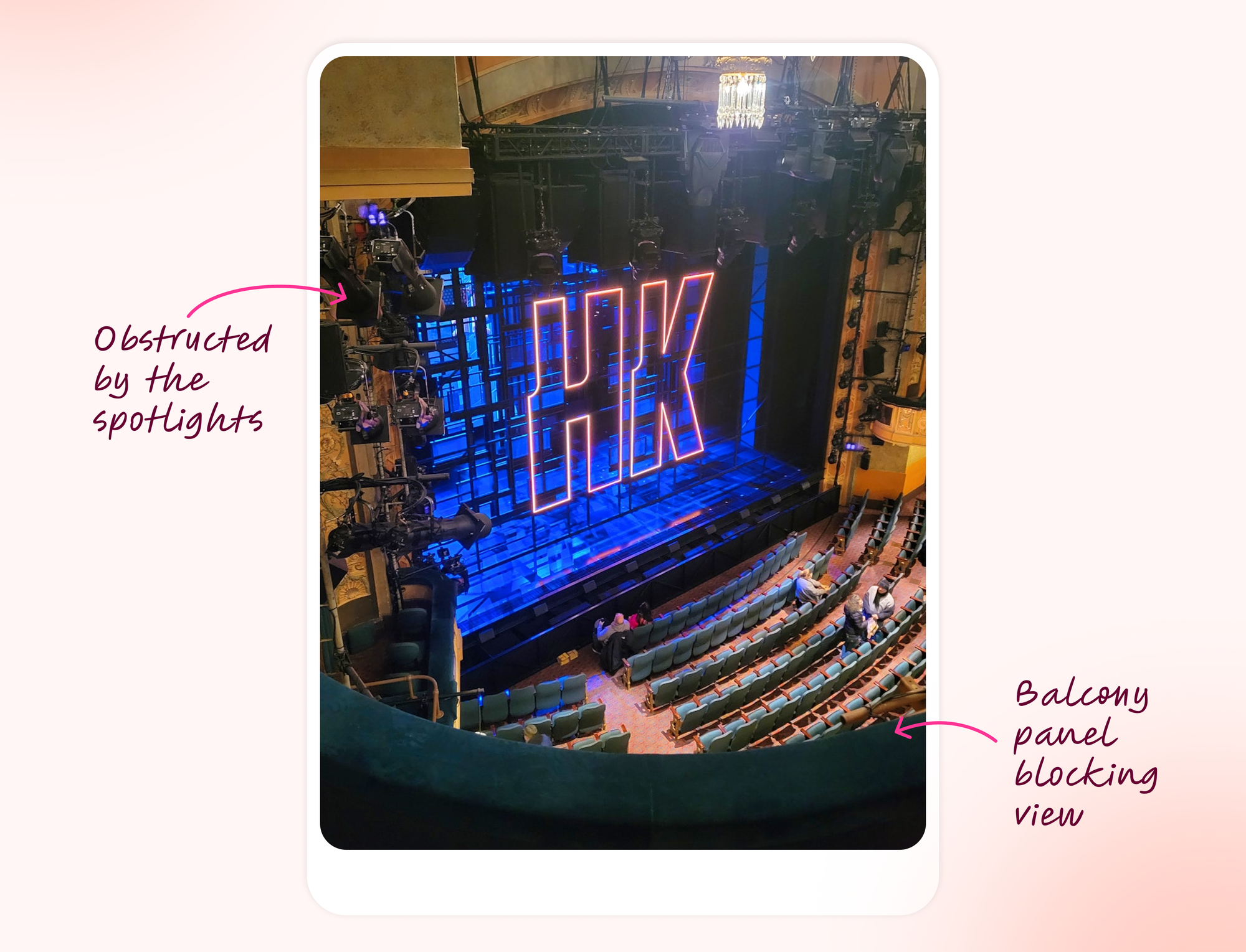
And that’s exactly why we had to fix it. Because when people book Broadway, they’re not buying a ticket — they’re buying a memory. And no one should have to gamble on a seat to make it count.
The Broadway seat maze: why it’s so complicated
We learned quickly that seats on Broadway aren’t like seats at your local cinema.
- Non-sequential seat numbers (A3, A5, A7 — missing even numbers or random jumps)
- Confusing section names (Orchestra Left vs. Left Orchestra vs. Mezzanine Box 3… what?)
- No visual cue (just a section label and seat number, no map or preview)
When we looked at it through the user’s lens, it felt like gambling on your night out.

So why weren’t we showing a seatmap already?
It wasn’t for lack of trying. Here’s what was making it difficult for us:
- Not all supply partners provided seatmaps
- Available seatmaps were inconsistent or hard to parse
- API coverage for section-seat mapping wasn’t reliable
- and even when we had data — the visuals were rough
We weren’t okay with showing users something broken. So we waited until we could fix it properly.

We curated seat-maps for Broadway's biggest shows
We began with a massive data effort: collecting, comparing, and compiling seatmaps across the most iconic theatres and productions on Broadway. This wasn’t just about grabbing whatever was available — we took a highly curated approach, focusing first on breadth.
We prioritized the highest-volume and highest-value shows, ensuring that the most in-demand experiences were covered first. It meant diving into dozens of seating layouts, decoding variations from one theatre to the next, and organizing it all into a structured, scalable system. Once we had a comprehensive library, the foundation was in place — and that’s when the real transformation began.
We redesigned each map to work beautifully in our UI
A raw seat-map is just that — raw. We stripped away clutter, cleaned up the visuals, and removed anything that didn’t serve the user experience. Every seat-map was reimagined not just for clarity, but for beauty and usability within our interface.
We aligned them with our design language, ensuring colors, typography, and layout all matched our broader brand system. But more than aesthetics, we optimized for function: making sure each map fit seamlessly within our interaction model and existing UI elements.
What we built wasn’t a static graphic dropped into a screen. It was a fully responsive, touch-friendly, intuitive experience — light on load time, heavy on clarity. We turned what used to be a confusing part of the booking process into a moment of confident decision-making.
All new Broadway show booking experience on DWeb
All new mWeb booking experience
Broadway got its powers back!
We didn’t make a grand announcement. Instead, we rolled out the new seatmaps quietly, show by show, testing and refining as we went. Before long, they were live across all major productions.
The difference was immediate. Users could now see exactly where they’d be sitting. They could compare sections, assess value, and make more informed choices — all without friction. The moment of seat selection became a point of excitement, not anxiety. Which made the broadway bookings not just functional but it made them delightful again.
What improvements did we see?
We tracked the changes across key behavior moments, and the difference was real:
- ~26-30% relative increase in clicks on Confirm to proceed to Checkout after the reserved seats popup (across all devices).
- ~30% relative jump in clicks on Confirm and Pay after landing on the Checkout Page (across all devices).
- Support queries related to “Where will I be seated?” dropped sharply
This wasn’t a gimmick. It was a clarity upgrade — and clarity always wins.
So what does this whole story tell us?
It reminded us of three things:
- Visual cues matter — because humans are visual creatures. Show, don’t just tell.
- Give users control — when people feel ownership of their choice, they follow through.
- There’s always a way forward — even with messy data and legacy systems, you can find a fix that respects both user and tech.
Final thoughts
People aren’t just buying tickets. They’re buying memories, moments, and connection. We weren’t okay with leaving that up to chance.
So we did what good design always does — we stepped into the user’s shoes, and asked:
“Would I feel good and confident booking this?”
Now, we’re proud to say: yes. Yes, you would.

A huge shoutout to Shivam FE for tackling every hurdle and patiently handling all my design-related nagging—together, we turned this vision into reality. Heartfelt thanks to Rakshita and Ekansh, the true pillars who ensured everything went live smoothly and without a hitch. Thanks to Ramakrishna V for pitching in with an sharp eye for finding any misses from our side and suggesting some great ideas for user interactions to make the experience much more seamless.