 headout
Designing direction: How we standardised maps across experiences
Maps are undeniably cool, but we hit a roadblock when we realized they all looked different from each other, lacking a unified style. In this blog, we dive into how we tackled the challenge of bringing consistency and standards to our map designs.
At Headout, we started with one simple goal: to make it easy for users to explore experiences. To do that, we needed maps that were minimal yet effective—just enough to show key spots like toilets, main attractions, and routes without overwhelming the user. The focus was on clarity, simplicity, and ease of use.
But as soon as we launched these maps, the floodgates opened. Every team within the company wanted their own custom maps—route maps, hop-on-hop-off bus routes, cruise routes with sightseeing points, cable car maps for mountains, and theme park maps guiding visitors through rides and amenities. The variety was vast, and so was the demand. What started as an effort to simplify exploration quickly turned into a design challenge, with each region asking for its own personalized map. And suddenly, the design team found themselves overwhelmed with requests to bring every part of our product to life on a map.
With so many different types of maps, multiple designers jumped in to help, each tackling tasks based on their workload. But here's the catch: each designer brought their own unique style. From colours and markers to typography, every map felt like it was created by a different person. The result? Chaos. We realised that, to truly work as a unified platform, our maps needed to feel like part of the same family.
Learning from the best
We looked to industry giants like Google Maps, Apple Maps, and subway circuit maps — tools millions rely on daily. Their success lies in a clear, consistent visual language — familiar icons, colors, and layouts that make navigation intuitive. From color coding to iconography, every element is designed to reduce cognitive load, helping users find what they need quickly and easily.
Inspired by these, we stripped their rich designs down to essentials suited for our travel experiences, focusing on clarity and purpose. Here are a few key use cases we encountered:
How Google Maps tackled text styles
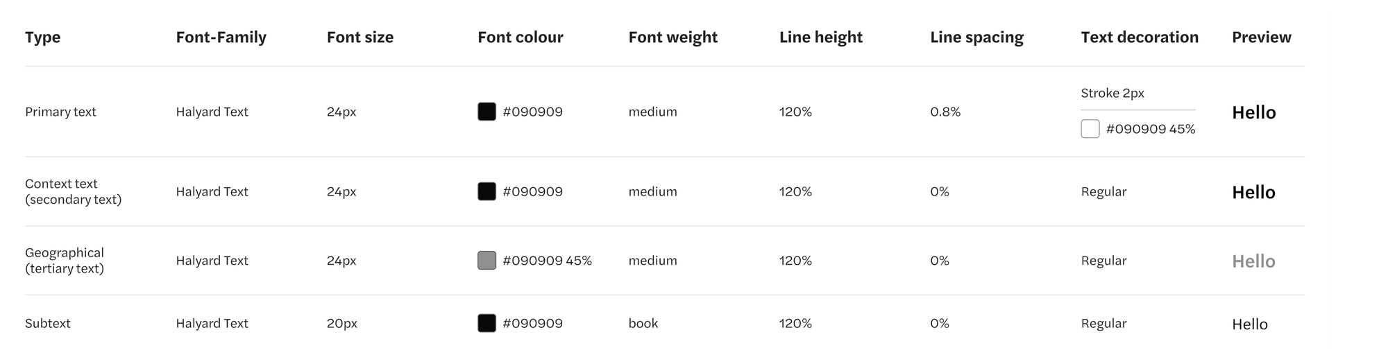
We drew inspiration from Google Maps' typography, where two font sizes are typically used to guide attention to different areas. The text is styled with a stroke to ensure readability against varying backgrounds — white with a dark stroke for dark backgrounds, and vice versa for light backgrounds. For features like national forests, the text blends with the background, using lighter or darker shades of green depending on the terrain.
We applied these principles by developing four text styles with two font sizes to ensure consistency and legibility, especially on mobile, while keeping the text clear across all devices. We tested various stroke sizes, colours, opacities, settling on a 4px stroke with low opacity, with a contrasting colour for optimal readability.
Primary text was made either white or black, depending on the background, while geographical features like forests were styled to blend with the surroundings. Using a hex code of #090909 with low opacity, we ensured the area text worked seamlessly across all backgrounds without needing specific colors for each area.
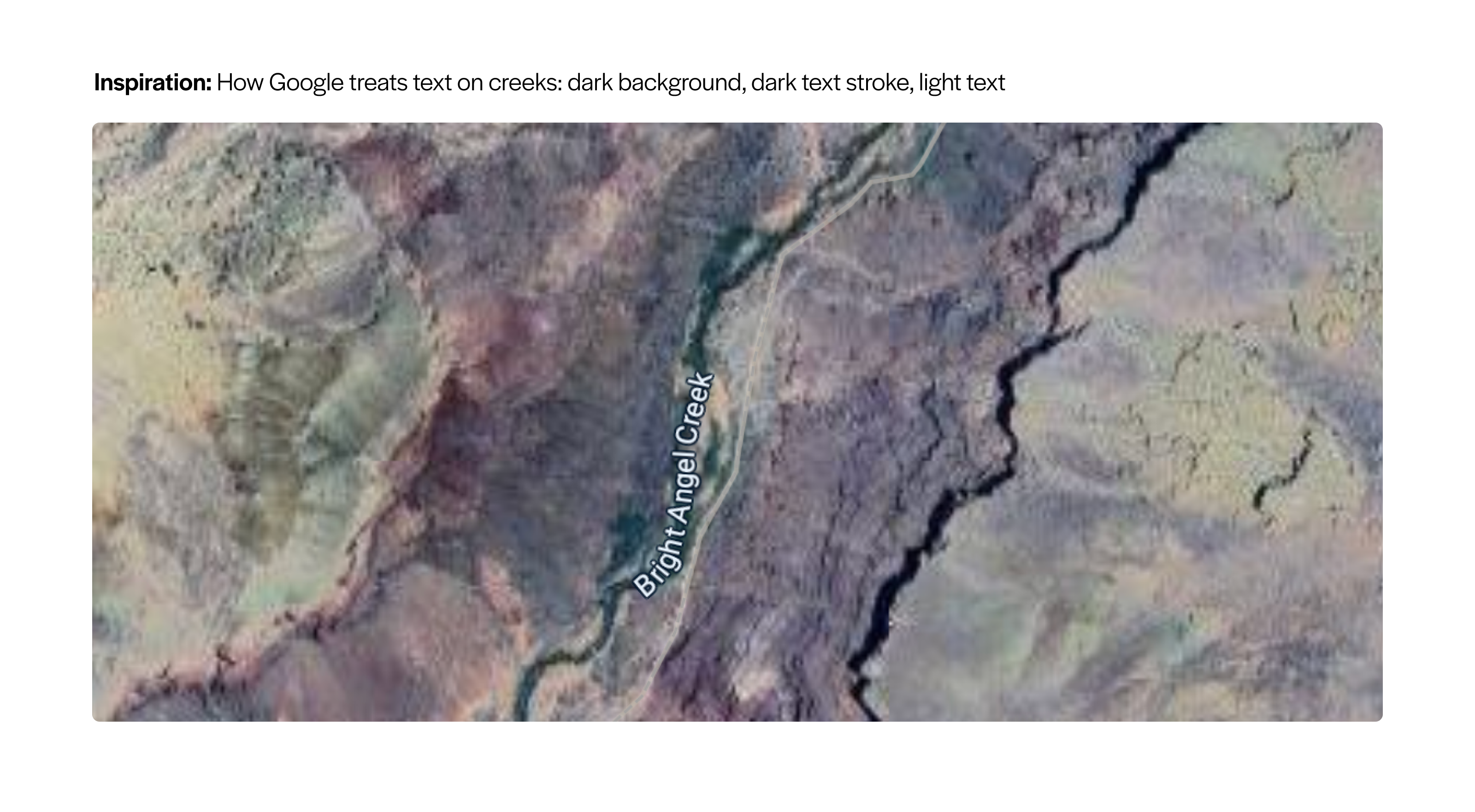
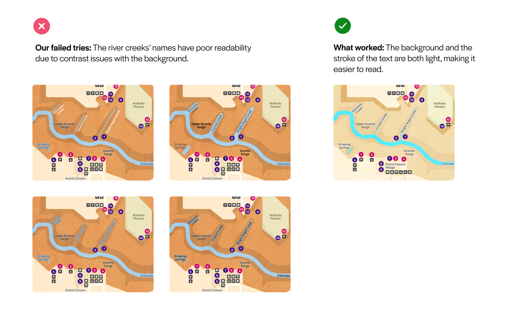
A problem came up when we worked on the Grand Canyon map, one tricky challenge was how to label the rivers and creeks weaving through the vast canyon. The waterways themselves were very thin and busy, causing text labels to clash visually.
We experimented with different text treatments and the colour scheme of the creeks, but kept running into issues. So we turned to Google Maps and carefully observed how they handle waterway labels—their curved text along rivers and subtle color contrasts that maintain legibility without overwhelming the map.
We adopted their treatment style, and it worked beautifully, resolving the clutter and improving readability.
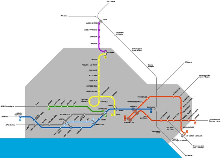
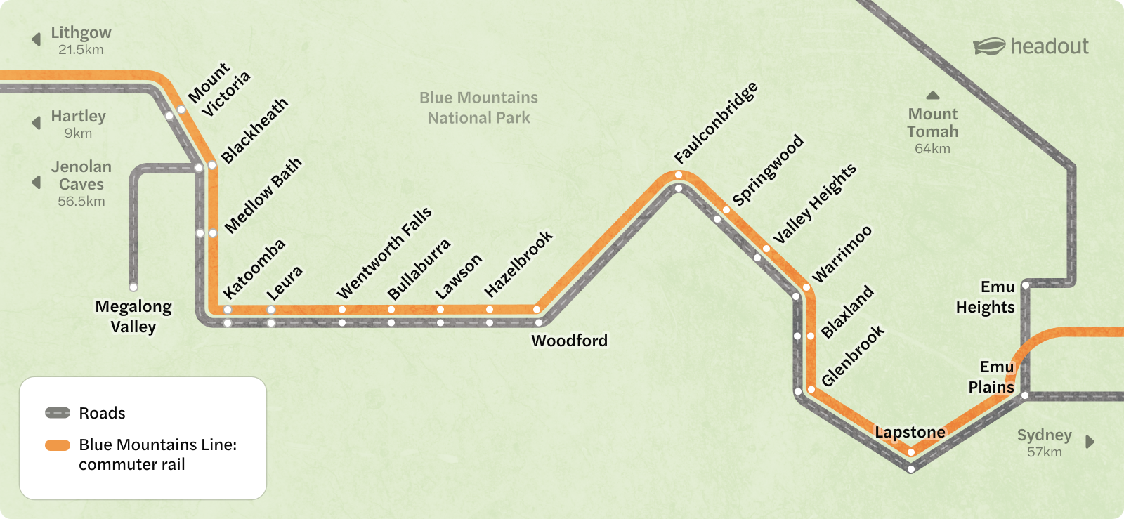
Taking cues from subway maps: clarity through simplicity
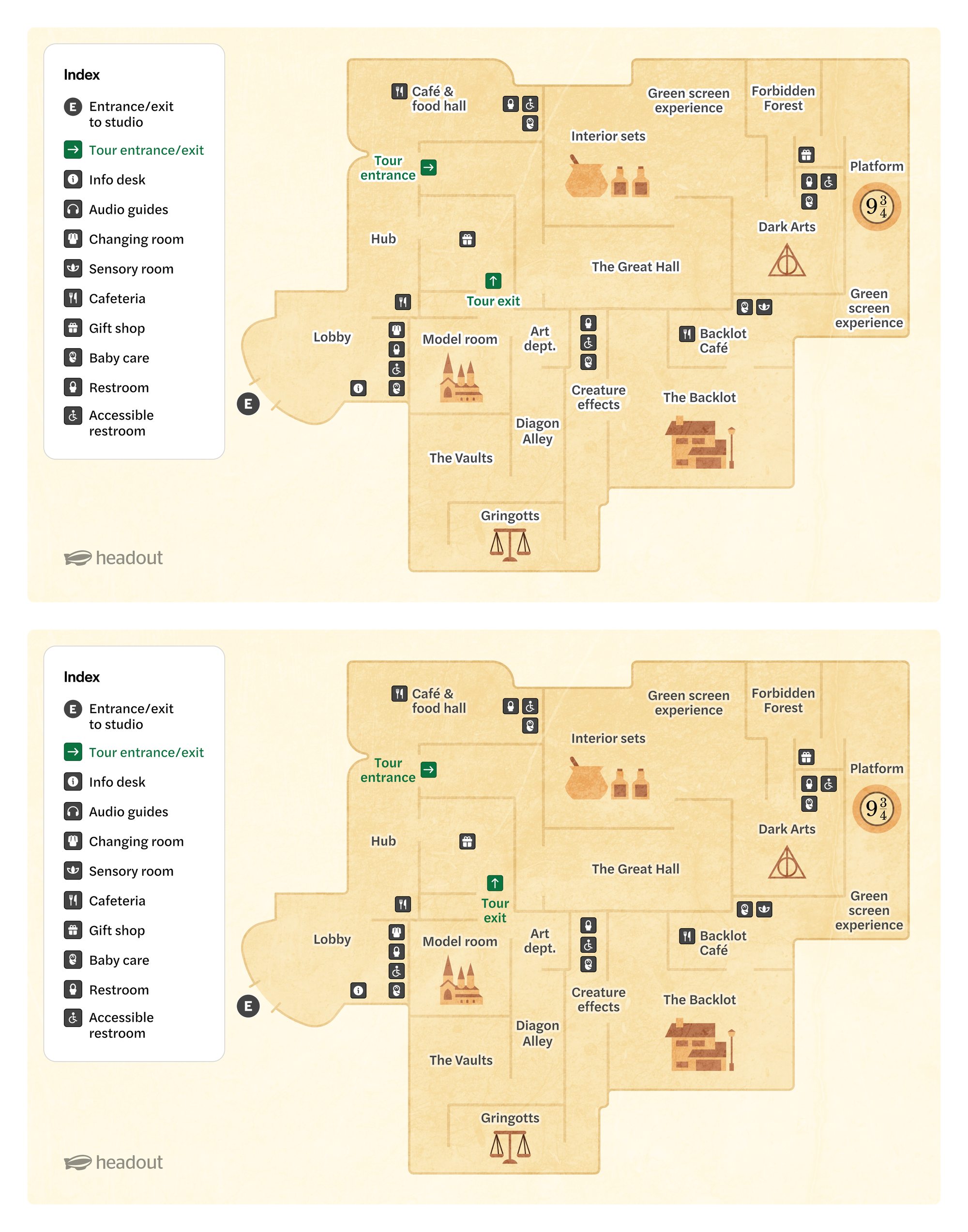
Subway maps excel at simplifying complex routes by focusing only on what matters—stations, lines, entrances, exits, and transfer points—while removing unnecessary details. They use angled station names and straightened routes to create a compact, easy-to-read layout.
We applied these lessons to our route maps, streamlining paths into clean, clear lines that highlight key information, helping users grasp routes quickly without distraction.
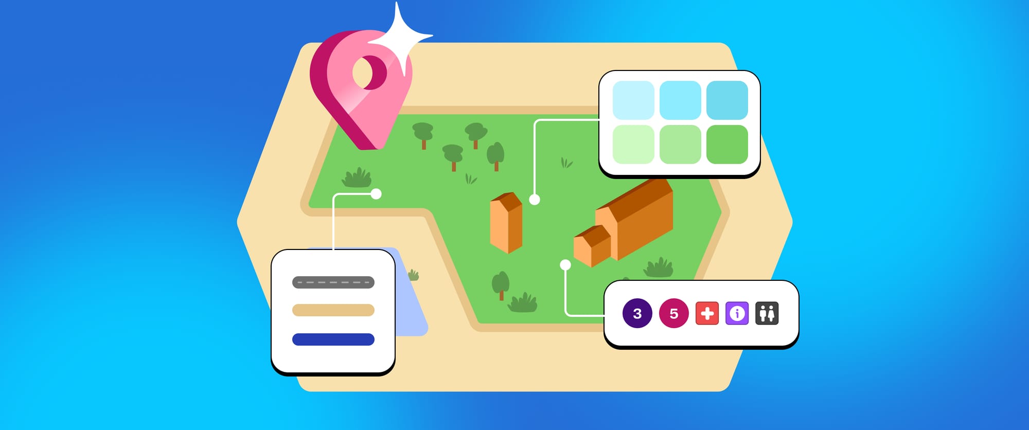
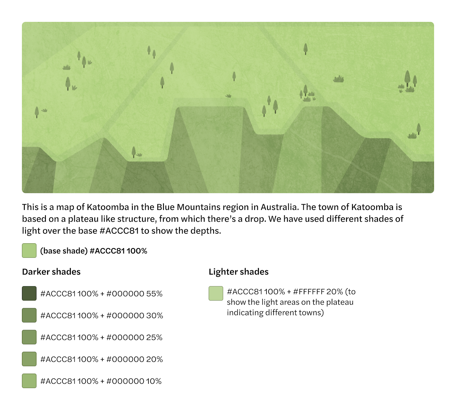
Using different shades to show terrain
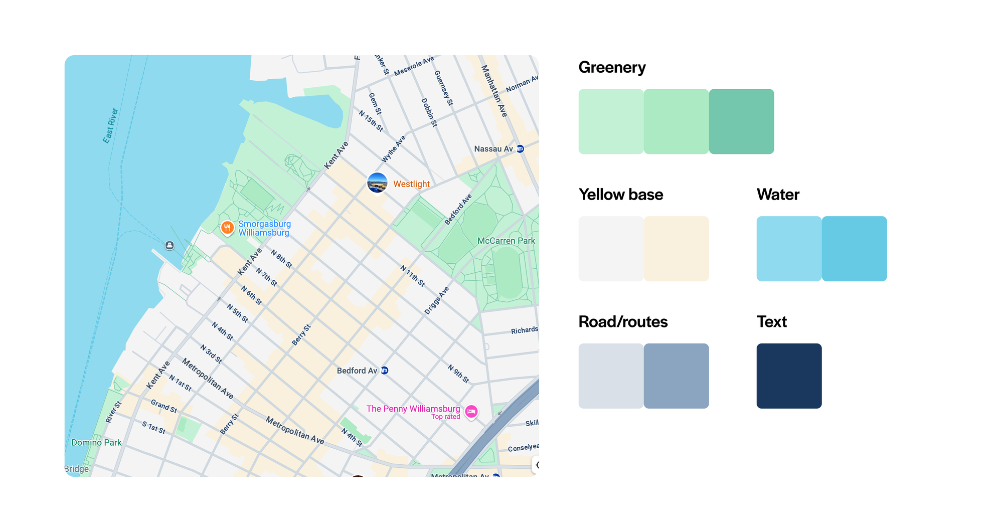
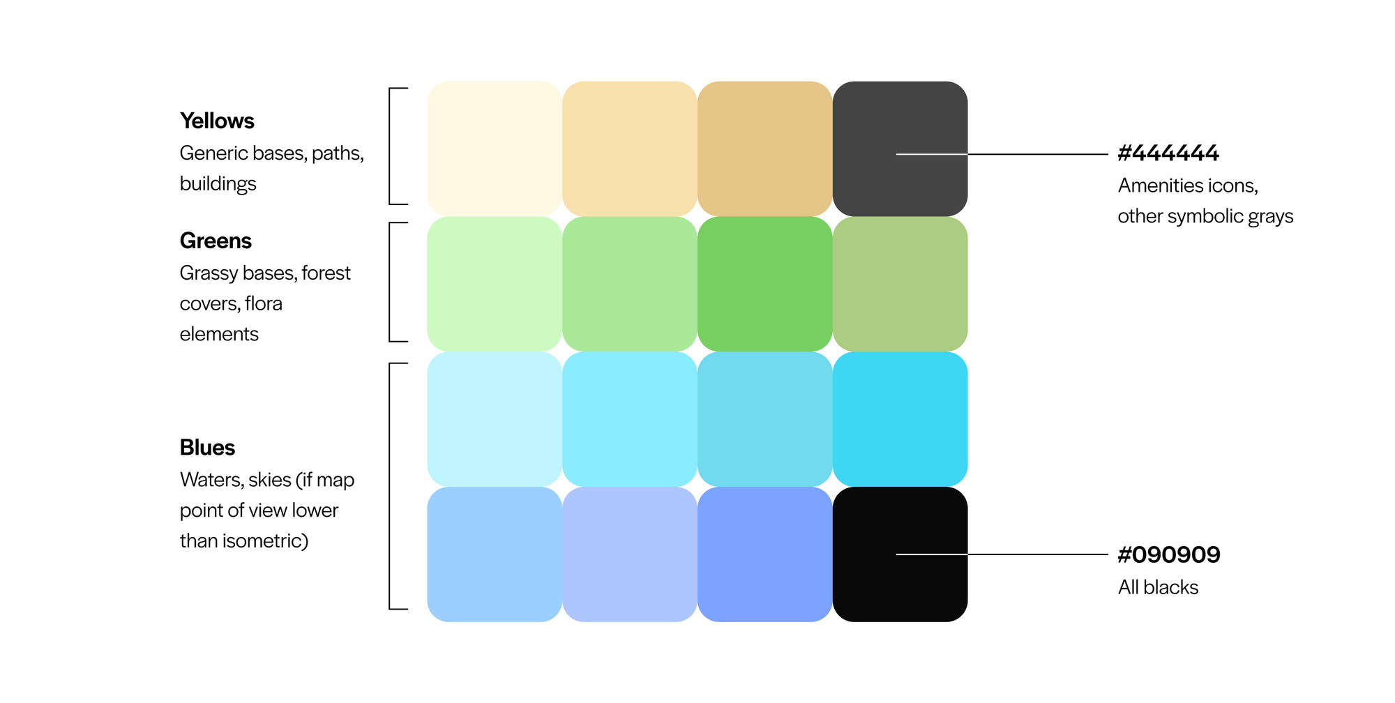
Similar to Google Maps, where terrain is shown using varying shades of the same green, we created different shades of the same base color by layering black or white at varying opacities. This approach maintained a consistent palette while allowing key features like terrain to stand out. The added bonus is that since the shades are based on the base colour, we can easily adjust the entire map’s mood by changing the base color, which automatically updates all the shades, making our system both flexible and powerful.
Experimenting with colours for icons
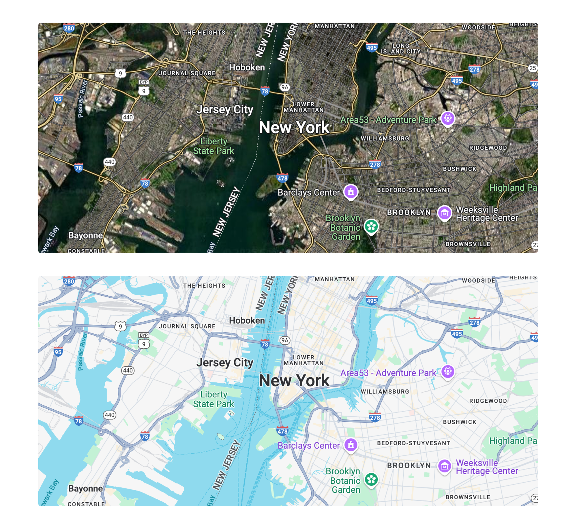
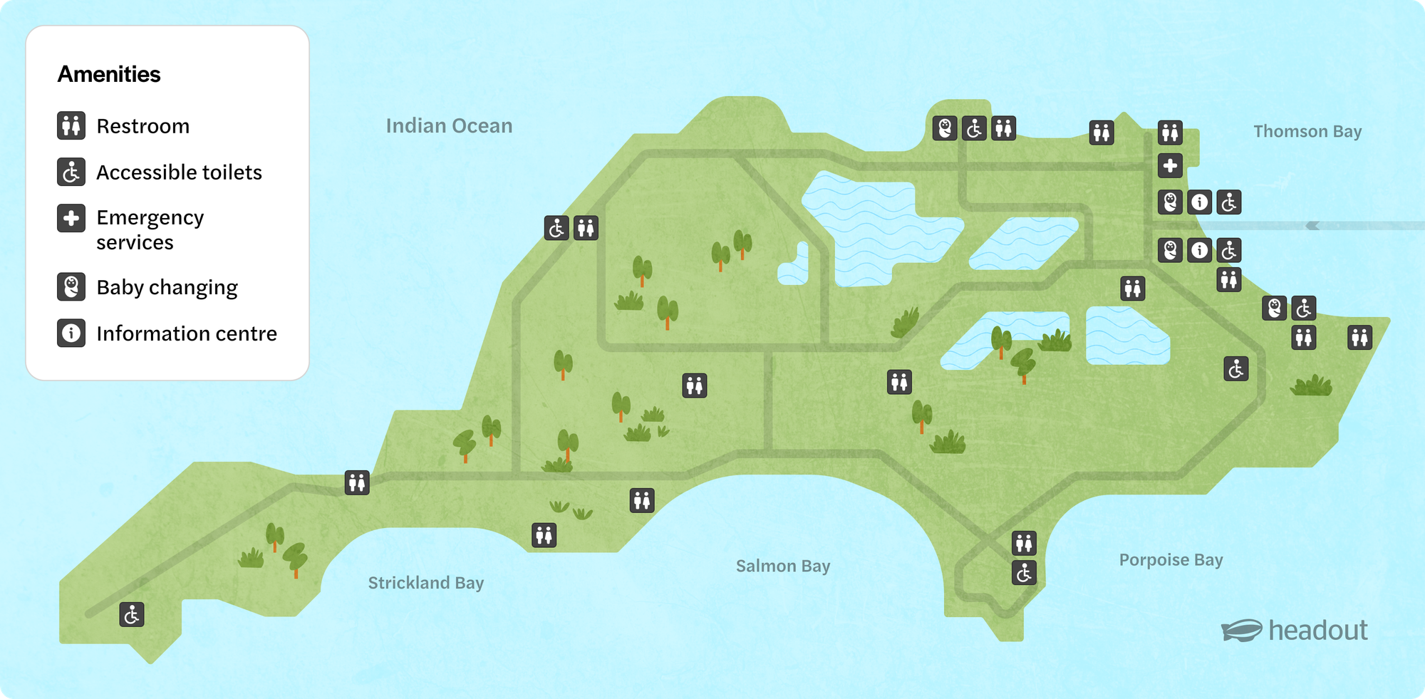
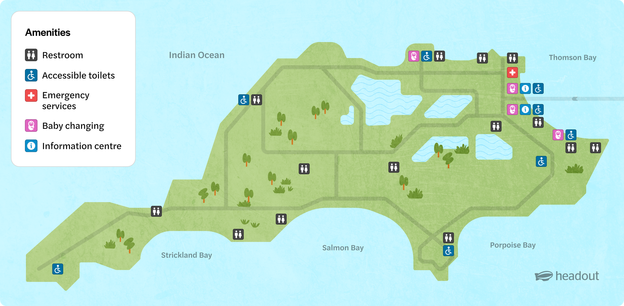
In Google Maps, different colored icons are used to represent various categories: purple for theaters, green for parks and forests, blue for parking, red for medical facilities, grey for other services, orange for food-related places, and so on.
Similarly, we’ve adopted a color system for our map to clearly distinguish key locations. For example, grey represents restrooms, pink is used for childcare and baby changing stations, red is for medical services or emergencies, dark turquoise signifies accessibility features, and light turquoise is used for information centres, amongst others. Also, we often encounter maps with around a ton of amenity icons. For example, one map required several restrooms, accessible restrooms, baby changing stations–while 1 emergency centre, which was getting mixed up with the rest. To tackle this, we made emergency centers bright red—subtle but eye-catching—so users could quickly spot them amid dozens of restrooms and few info centers. Color coding like this helps users glance at maps and immediately understand key points.
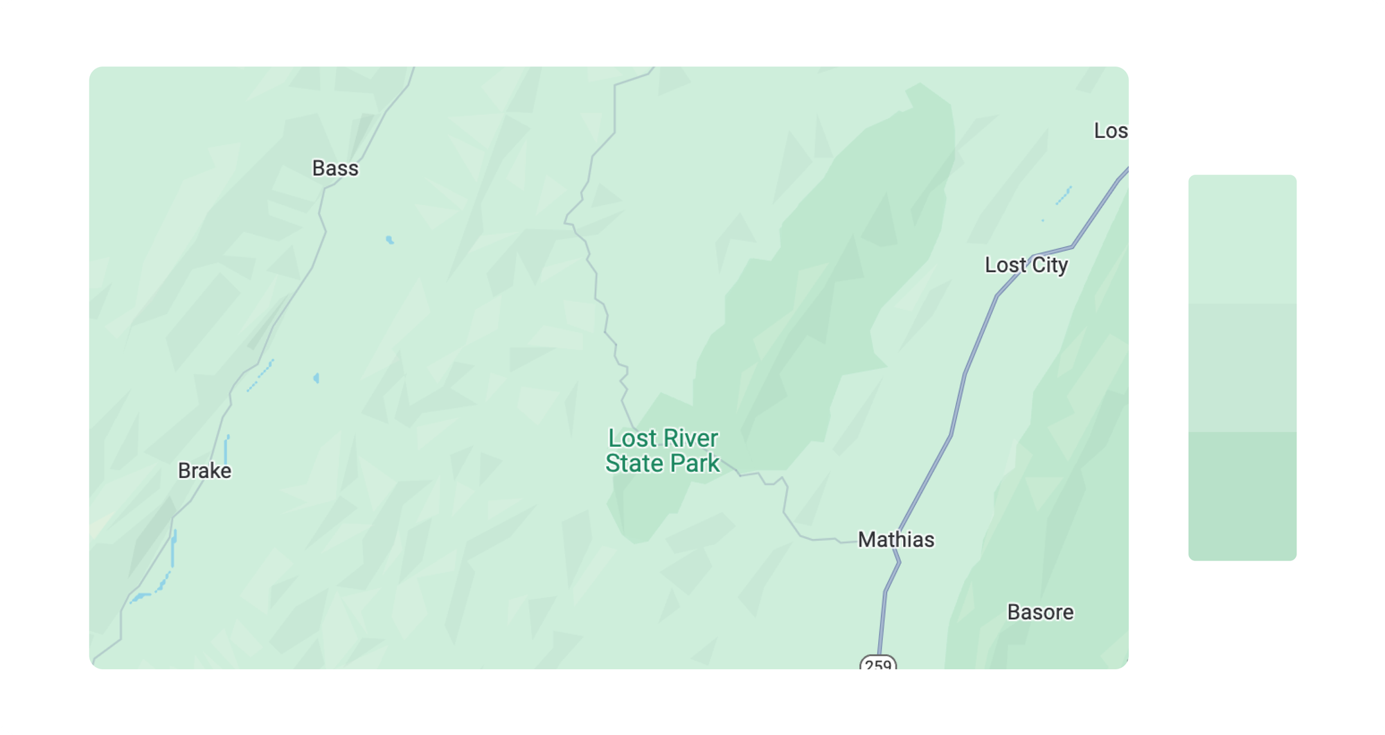
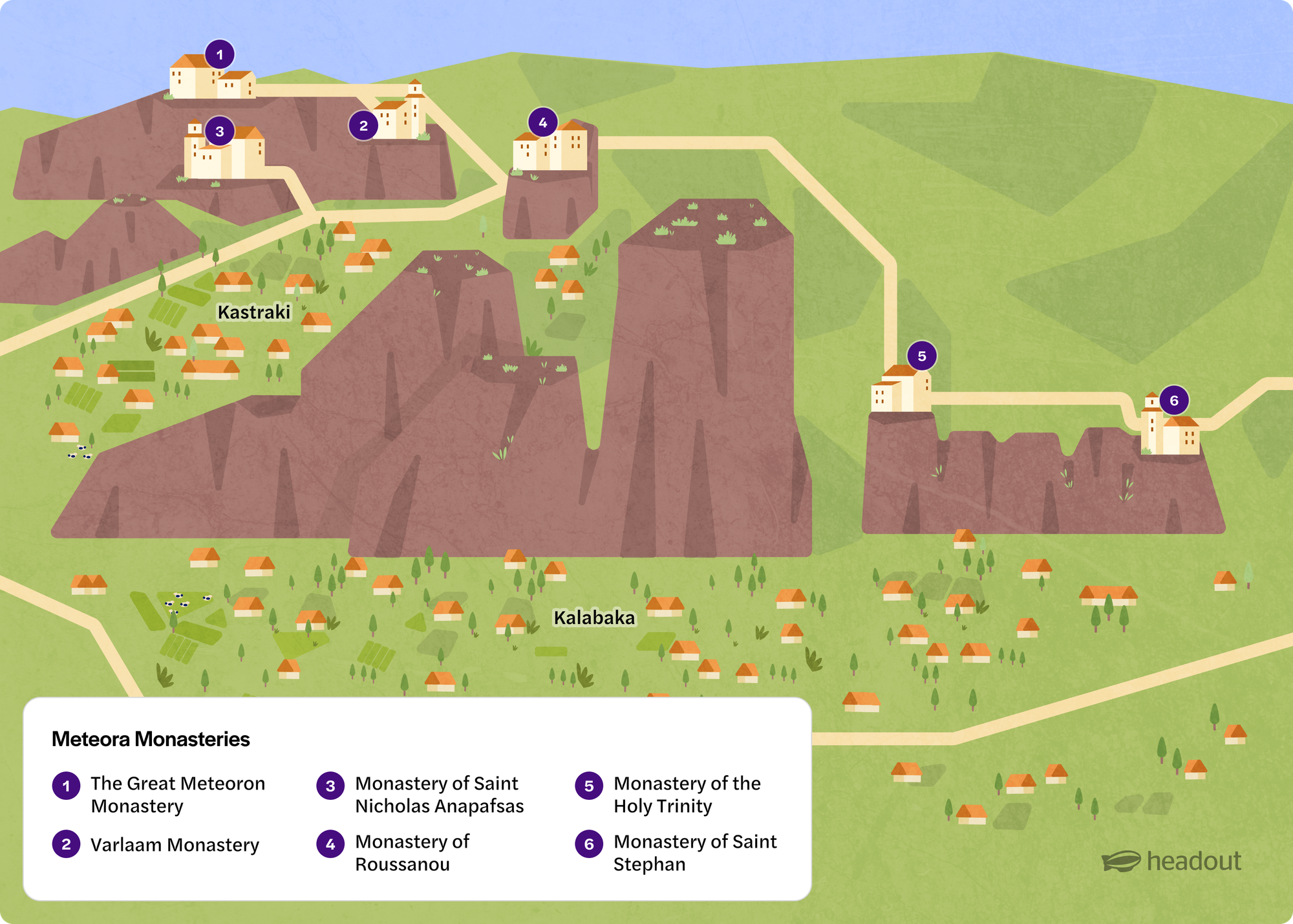
Different viewpoints for different maps
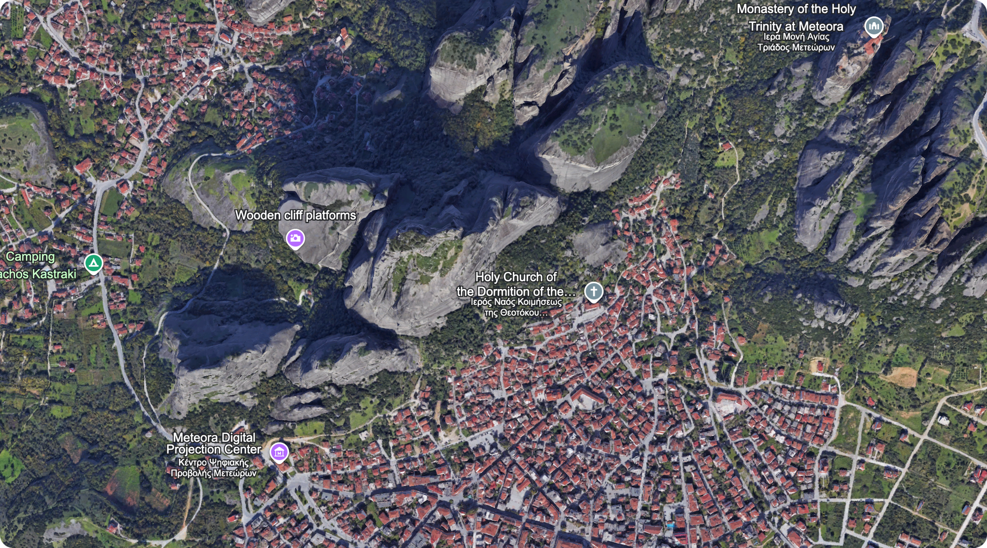
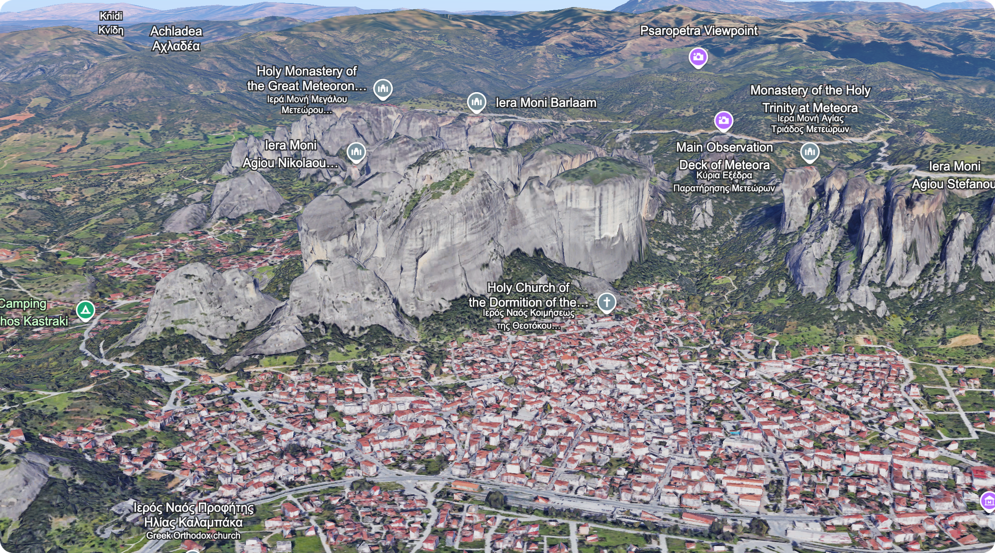
Just like in Google Earth, where you can adjust viewpoints and angles, we’ve found that changing perspectives on our maps can highlight key features more effectively. For example, in areas like Meteora, Greece, a lower angle better showcases the iconic rocky formations, which wouldn’t be as visible from an aerial view. We always consider different angles, similar to how we check perspectives in Google Earth, to ensure the best composition for representing each location.
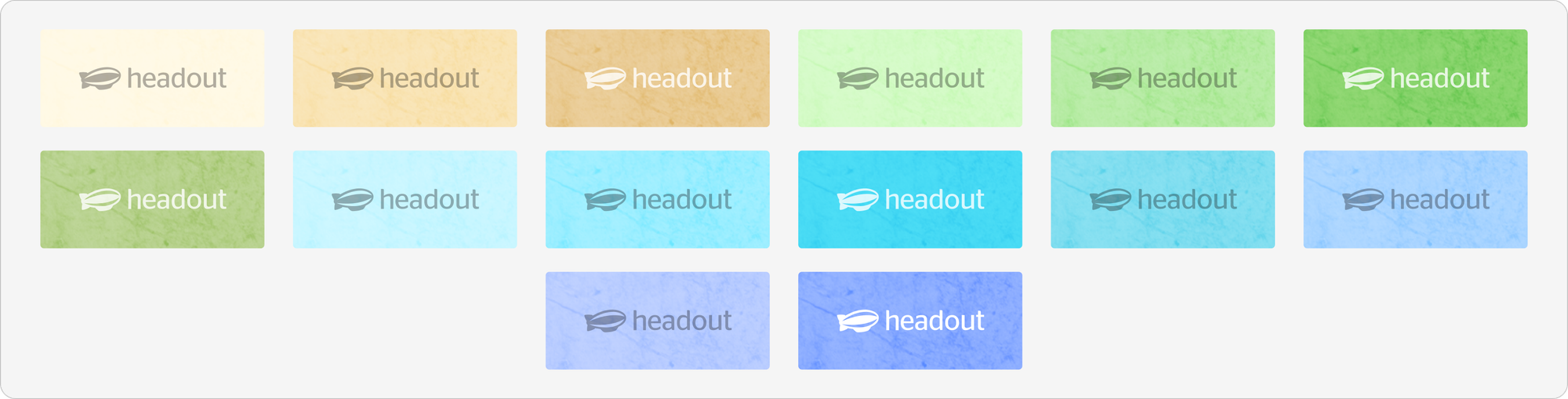
The colour system
We started by gathering every map we had into one place to see the big picture. What stood out immediately was the sheer variety of colours—umpteen shades of greens, yellows, blues and countless other shades. It was a rainbow, but not a helpful one.
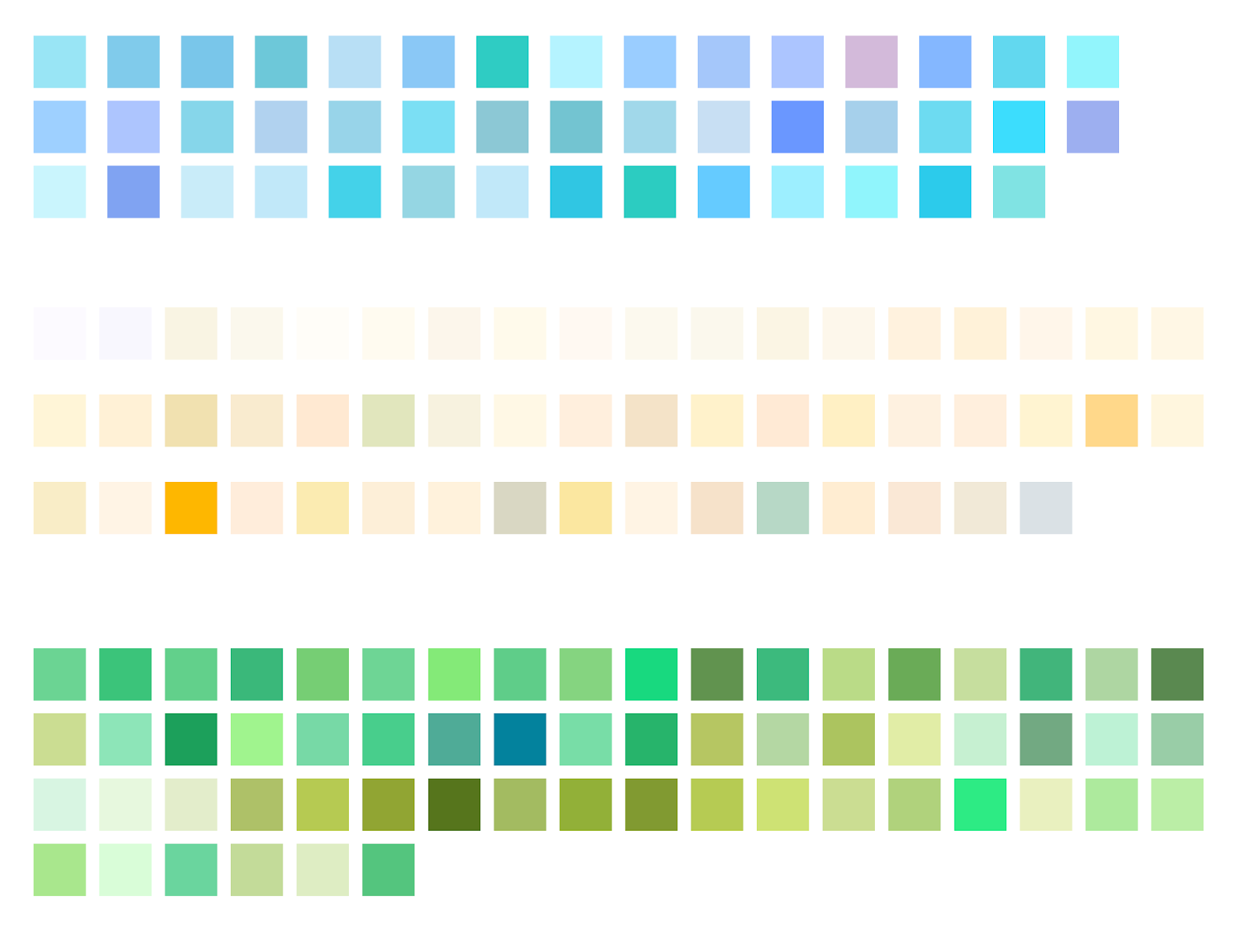
Taking inspiration from Google Maps, we decided to simplify. We narrowed our base layer palette down to a small group, broadly assigned for different use cases. This standardization made our maps feel unified and easier to build, while still flexible enough for diverse needs.
Other elements for a static map
While we drew inspiration from Google Maps, we added other unique elements to create a complete design system for our static maps.
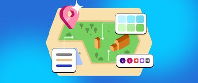
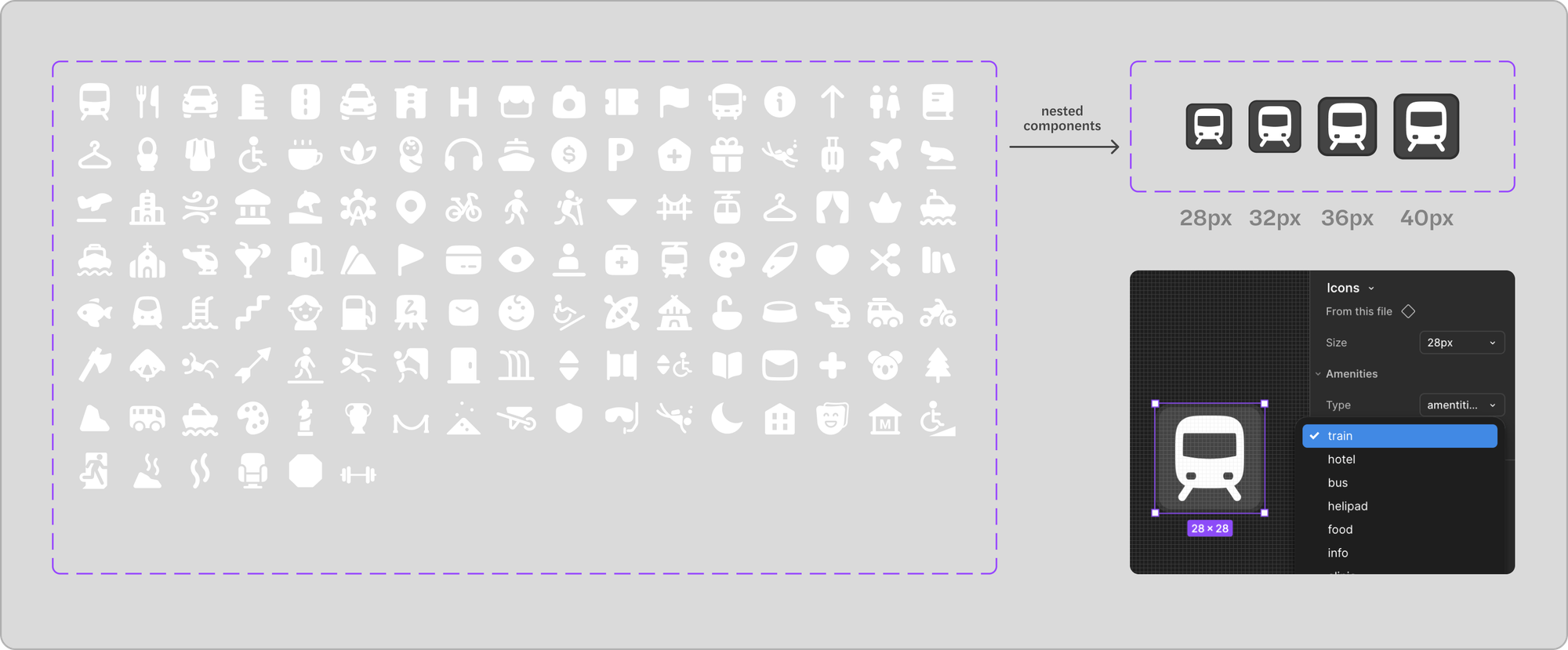
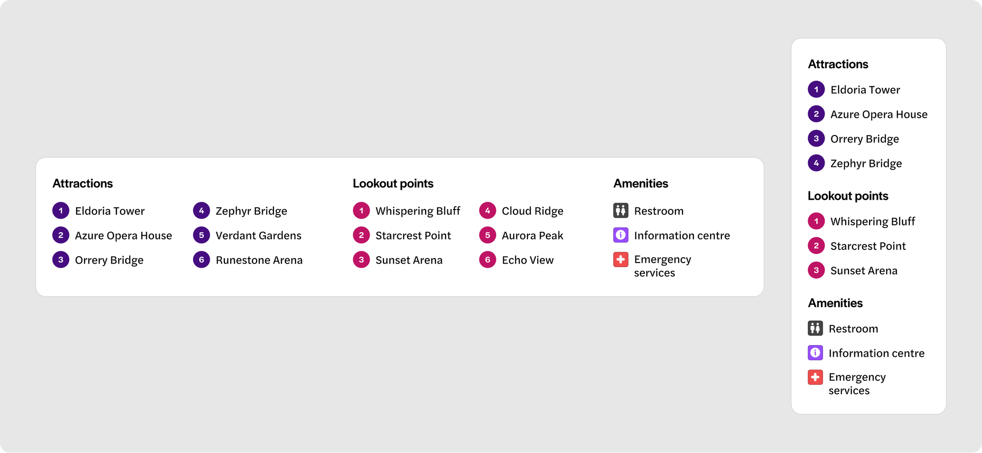
Icons and markers
With over 100 amenities icons in our library, we standardized the components, with 2 properties: type and size. This made sure that all our markers—whether for amenities, transportation points, or landmarks—were easy to identify and consistent across maps.
Legends: horizontal and vertical versions
When we were collecting inventory of legends, we realised we were using varyingly different legends —
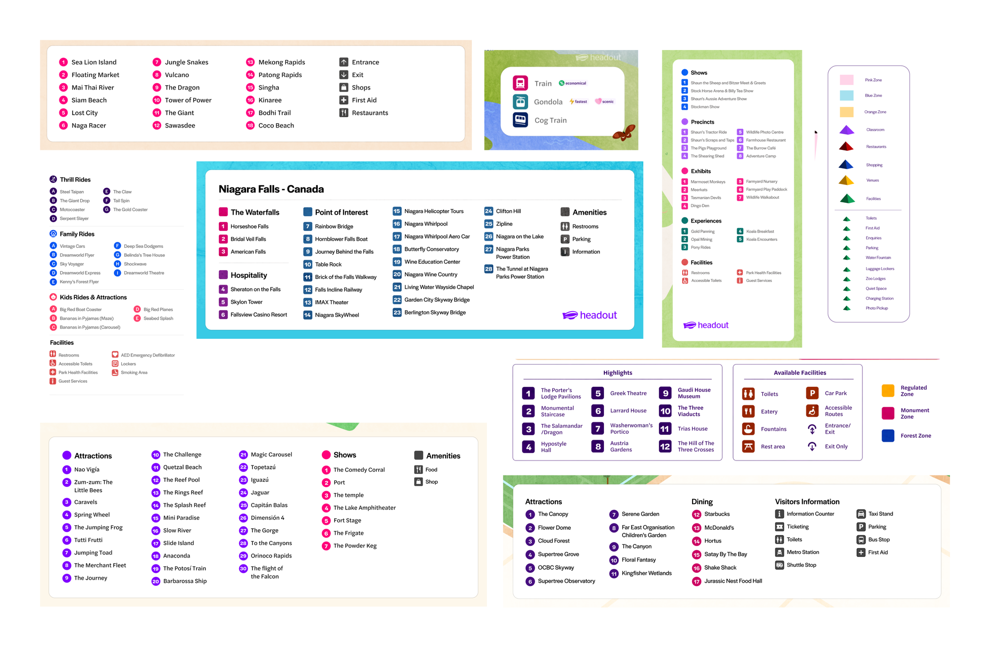
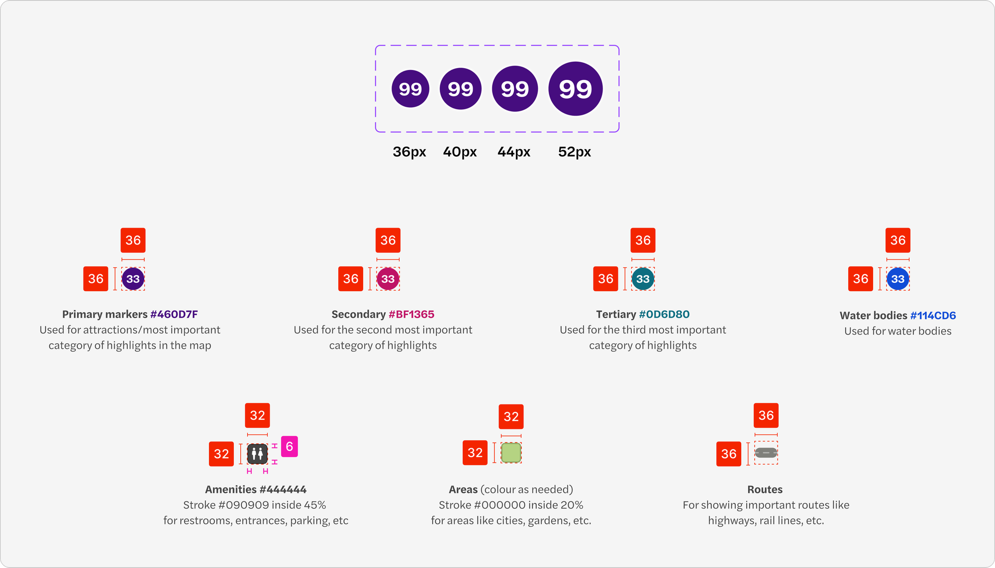
We decided to settled on one visual language, which was easy to read from both mobile and desktop. We created two types of legends — horizontal and vertical —with fixed spacing and padding to keep everything neat and consistent. We defined the colors for primary, secondary, and tertiary markers, including water bodies and amenities.
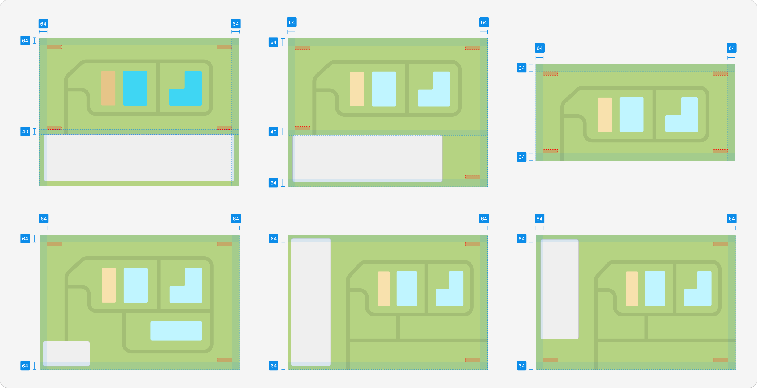
Logo placement
Originally, we placed the logo inside the legend, but it was taking up way too much space and distracting from the map’s content. After testing, we decided to move the logo to the upper corners, placing it 64px from each side and 40px above the legend. This gave it the space it needed to breathe while still being visible. The logo has a lowered opacity, making it clear without being intrusive.
Adapting maps to their environment
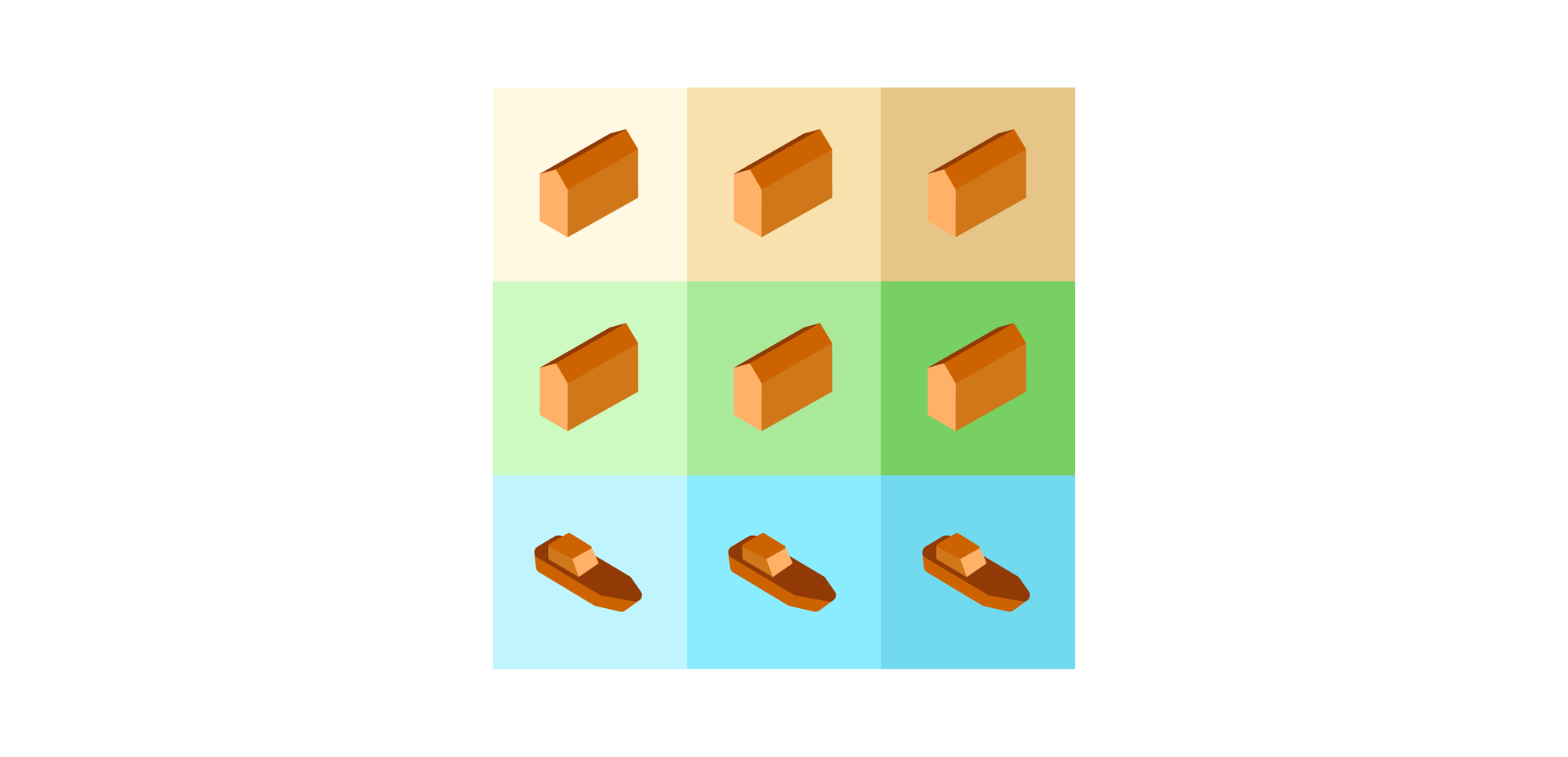
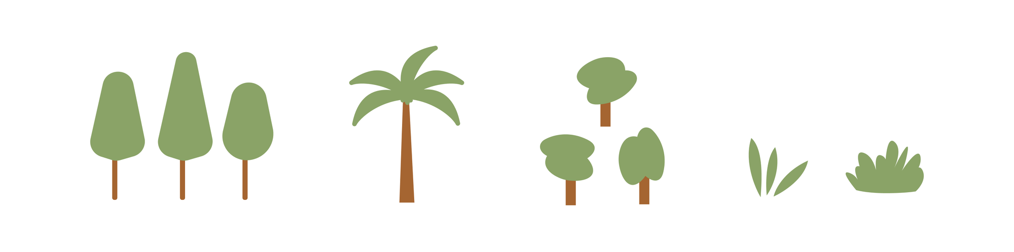
We felt our maps should reflect the places they represent, which is why we customise illustrations and colors based on the local climate and geography. For beach destinations, we replace standard trees and bushes with palm trees to capture the coastal vibe. In colder regions like tundras or mountains, we use pine trees and cooler, lighter color palettes to match the environment. This attention to local details helps users connect with the map on a deeper level, making the experience more authentic and immersive.
Textures and pre-handoff checklist
We created texture rules for different areas on the map, using blend modes and specific opacity settings to give depth without overwhelming the key features. Also, we introduced a pre-handoff checklist to ensure that all critical elements were double-checked before passing the map along. This has drastically reduced human errors and the back-and-forth between teams, improving our workflow.
Components for efficiency
All elements which are used repeatedly on the maps are Figma components and variants. Now, when you’re creating a map, all the essential elements—amenities, markers, legends, textures, flora and fauna illustrations, logos, and more—are available across as drag-and-drop components. This ensures consistency and speeds up the process, allowing designers to work more efficiently.
What’s next: evolving the system
While the system is already helping us streamline map creation, there are still a few improvements we plan to make:
- Route guidelines: A new guideline system for creating routes that ensures clarity and consistency across all maps.
- Colour system refinement: We plan to refine our colour system based on real-world use cases, including better color combinations for floor plan, theme park, island maps.
- Streamlining unused elements: We’ll remove elements which haven't been used much or at all and clean up the entire design system.
- Colour index for amenities: Like pink for baby changing stalls, blue for accessible restrooms, and so on.
- New icon variations: We’ll add new icons that combine images and numbers, like airport and metro station markers, making it easier to refer them from the legend, while keeping their icons on the map for familiarity.

Impact
With the map design system now in place, we’ve dramatically improved our workflow and ensured that every map feels cohesive, no matter how complex. What used to take 3–5 days now takes as little as one day, speeding up the process while maintaining high-quality, consistent maps.
A massive shoutout to the rockstars who made this happen! Big thanks to Rohnit Rehani and Ramakrishna V for their constant guidance and wisdom throughout the journey, Zanetta Malar for her brilliant insights on the color system and icons, and Prathiksha Bhat and Satish Sulikeri for their priceless feedback during our design system jams! You all truly made this project shine! 🌟