Design QA: The taste test your product desperately needs!
Ever wondered why your mom always asked you to taste the dish while cooking? (Spoiler: It wasn’t just for your approval)

Ever wondered why your mom always asked you to taste the dish while cooking? (Spoiler: It wasn’t just for your approval)
It wasn't just to ensure it was tasty—it was her way of making sure the dish was perfectly balanced, tailored to everyone's tastes, and something people would love, remember , and crave again. Cooking wasn’t just about following a recipe; it was about crafting an experience.
Now, let’s draw a parallel to digital products. If a product strikes the right balance between great visuals and a seamless user experience, it becomes something people love, remember, and keep coming back to. Just like our moms did with their cooking, we too need to "taste"—or in our case, test and refine—the product before it reaches our users. That’s where Design QA comes in.
So, what is Design QA anyway?
In product development, this “tasting” process is called quality assurance (QA), and for designers, it’s more specifically known as design QA. It might sound a bit technical, but really, it’s just a checkpoint to ensure that what designers envision and what engineers build actually match up. Think of it as the bridge connecting design and development—a bridge that needs to be strong and well-defined. If it’s not, it can lead to broken user experiences and mismatched designs.
Design QA typically comes into play after the initial development phase during the first cycle of review. And, let’s be honest—having an efficient design QA process can be a game-changer. It boosts collaboration, speeds up the development cycle, and ensures the final product looks and feels exactly as intended.
The current state of Design QA: A bit of chaos
We took a good, hard look at how we were handling Design QA here at Headout, and, well... it was all over the place. We were diving into multiple design files, sending messages to different designers and developers, and using inconsistent methods to provide feedback. One day we were annotating screenshots of the latest build; the next, we were scattered across Slack threads, leaving feedback in a way that was hard to track and chaotic to manage. Unsurprisingly, this made collaboration with engineers a bit of a nightmare and led to longer development cycles, ultimately delaying feature launches.
When dealing with hundreds of issues, some inevitably slipped through the cracks, leading to an endless cycle of back-and-forth. It started to feel more like a frustrating game of ping-pong than true collaboration. We realised we were missing something fundamental and needed to rethink our approach.

The industry struggle: we aren't alone
Curious about how others were handling Design QA, we reached out to a few designers in the industry. We found that most teams were using a mixed bag of solutions:
- Screenshots in Slack messages: Handy, but good luck scrolling back to find that one specific piece of feedback. It’s not practical.
- Jira tickets: Creating a ticket for every design issue is tedious and often misses the nuances of design feedback.
- Excel sheets: The traditional way of tracking issues. It works but is far from ideal for managing the complexity of modern digital products.
It was clear: we weren’t alone in this struggle. Design QA had become a manual, time-consuming process that drained energy and slowed down production.
Making Design QA more efficient (and saving our sanity)
To fix our process, we first needed to understand the basic chain of operations from design completion to implementation:
- Design handoff: Designers hand off the final mockup.
- Development: Engineers start building the design and then deliver it for QA.
- Feedback loop: Designers review the implementation, provide feedback, and this cycle continues until the product is just right.
Sounds straightforward, right? In reality, this is where things often go wrong, leading to those "Wait, I thought you meant this!" moments.
After some introspection, we identified the key issues in our process:
Lack of standardisation: Each designer had their own way of annotating and communicating feedback, leading to confusion.
Ambiguous feedback: Vague comments like "This spacing feels off" left engineers puzzled, especially when they didn’t know which device or browser the issue was on.
Endless back-and-forth: Without a structured system, it was hard to track which bugs were resolved, which ones were still pending, and whether the previous fixes were aligned with the designer’s intent.
Pinpointing these problem areas helped us draft a more streamlined framework.
Our solution: A structured framework for Design QA
We developed a framework to encapsulate all feedback with relevant details—page name, device, OS version, browser, and an easy way to track each issue. This solution had two main components:
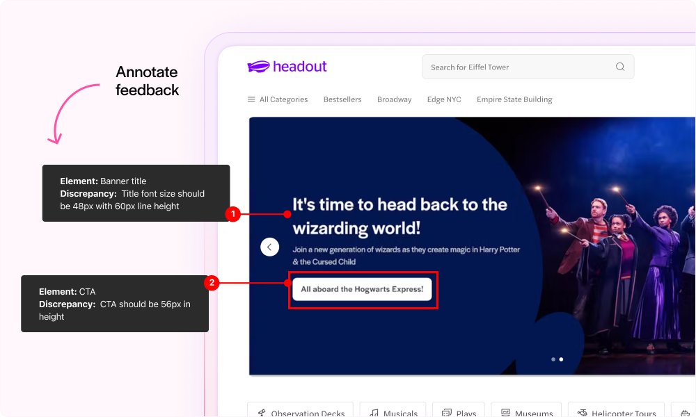
Annotations
No more guessing games! We standardized our annotation system so that feedback became specific, actionable, and left little room for misinterpretation. We covered key design aspects—spacing, typography, color, interaction states—so developers knew exactly what to focus on.
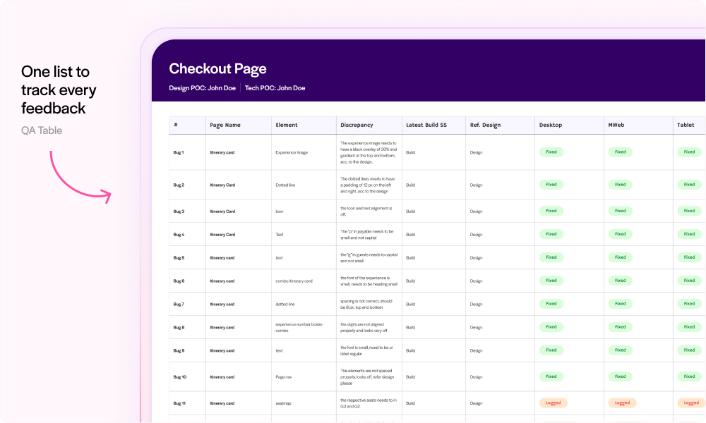
The QA table
A central table that allows designers to document feedback with the page name, discrepancy details, device, OS, and current status of the feedback/bug. This table became the single source of truth, helping track all feedback that engineers needed to address. All annotations were consolidated here for easy reference, drastically reducing cycle time and keeping everyone on the same page.
Testing out the framework
Before fully rolling out this framework, we ran a short experiment with a group of developers and designers. Here’s what happened:
Clarity and consistency: The new table and annotation system cut down the "What did you mean by this?" questions. Everything needed to recreate the bug was documented, making the developers' lives easier and eliminating frustration on both sides.
Smoother communication: The structured format made feedback quicker, clearer, and far less prone to misinterpretation.
However, there was still one major drawback: creating these annotations and filling out the table was time-consuming. While the framework streamlined communication, it still required significant manual effort. There were issues with designers manually creating annotations and then adding them to the QA table, along with a few other challenges. We're continuously working on improving this process, so stay tuned to see how we optimize this approach and strengthen collaboration between designers and engineers.
A huge thank you to Rahul Halder and the entire Product Design team at Headout for being among the first to test and offer essential feedback, helping us shape the most efficient process. I’d also like to extend a special thanks to Ramakrishna for his support and guidance during the development of the process.