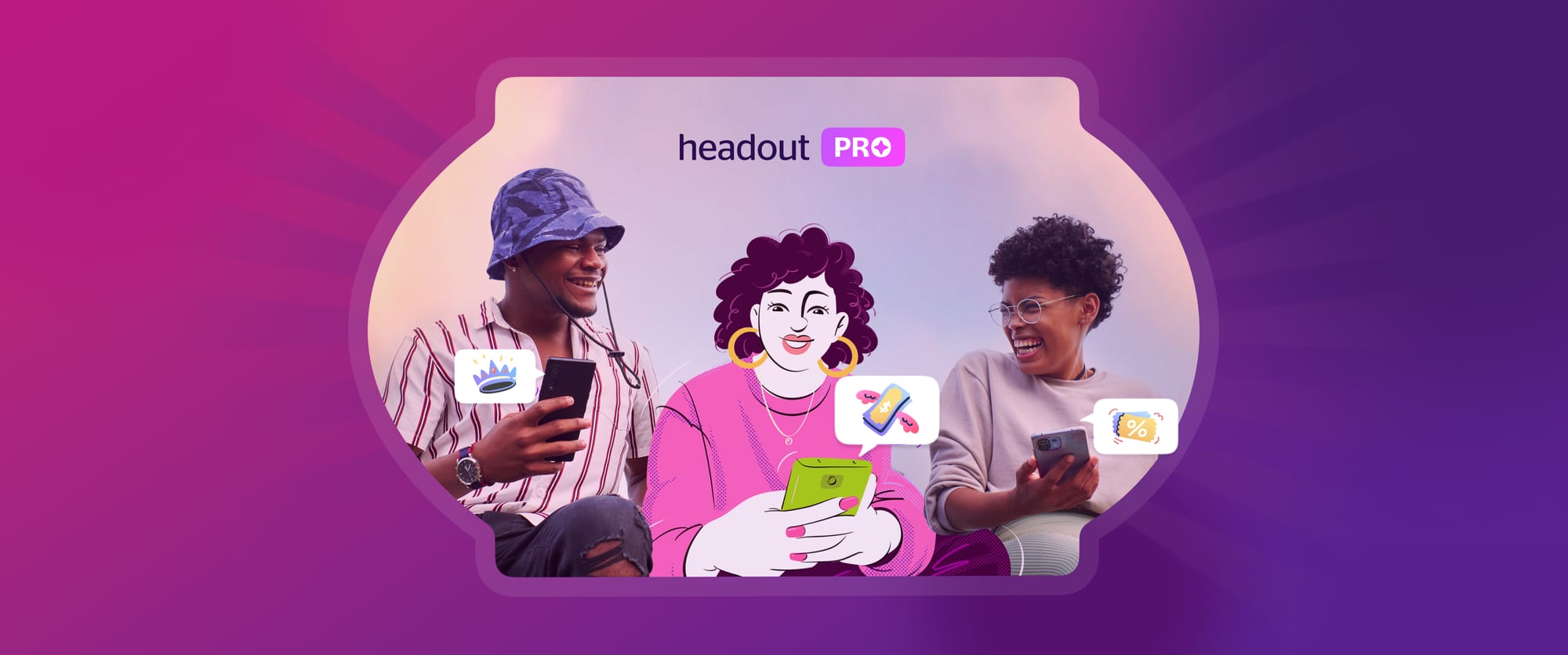
Headout PRO: Designing for a rewards based loyalty program
We launched a free loyalty program to see if offering perks and free tickets would encourage repeat bookings and keep users engaged.
You know that feeling when you book your first experience—maybe it's a boat ride along the Amalfi Coast, or a hot air balloon trip over Cappadocia. You’re excited, a little nervous, and completely ready for the adventure. Then, after it’s all done and you're still basking in the post-adventure glow, imagine getting an unexpected surprise—a free ticket to your next adventure or a cool perk for something else you’ve always wanted to try. Suddenly, that trip you just booked feels like the beginning of something bigger.
That’s what we wanted to capture at Headout. We've always believed that a good adventure deserves more than just a great memory. It should lead to more exploration, more discovery, and, well, more reasons to come back for another round. That’s how our loyalty program was born. Not just to offer discounts or perks, but to create something that feels like an ongoing journey. Every booking leads to the next, with little rewards along the way that make you feel like you're part of something special.
We decided to test the waters with this loyalty program. The idea was to see if we can hook our users into making repeat bookings by offering them exciting perks and free tickets. It's all about keeping our users excited and coming back for more. The plan was to increase our user retention rate by bringing more emphasis on loyalty.
Before we dive into how we addressed user retention at Headout, if you're unfamiliar with loyalty programs, Sakshi Bhutra has provided a brief explanation in Membership magic : building communities in the digital age.
Why Loyalty Program
Initially, we had experimented with a paid membership model but quickly realized that asking users to pay for benefits before fully experiencing our offerings didn’t resonate. It felt too much like an advertisement, too soon. So, we pivoted. Instead, we embraced a free, rewards-based program built around milestones. This approach allowed us to provide value upfront, without the burden of payment, making the journey feel more organic. This strategy not only encouraged engagement but also offered key benefits like:
Customer Retention
Encouraged repeat purchases and fostered long-term relationships with existing customers.
Increased Spending:
Incentivised customers to spend more to earn rewards or achieve higher loyalty tiers.
Brand Loyalty:
Built a sense of attachment and loyalty to the brand, making customers more likely to choose this over other brands.
Our approach
Once we had decided to go with a loyalty program, the next step was designing it—figuring out the rewards and levels, how and where to introduce it, and shaping its branding and messaging.
Deciding on rewards
Our rewards program was a mix of transactional rewards—for instant gratification and experiential rewards—to build lasting brand loyalty. Transactional perks focused on giving discounts on the experiences we offered, ensuring users enjoyed immediate benefits and stayed engaged. Meanwhile, experiential rewards, such as free tickets to certain popular experiences we provided, helped foster trust and loyalty. By providing users with delightful experiences, we believed they were more likely to develop a strong connection with our brand.
Mapping the optimal flow
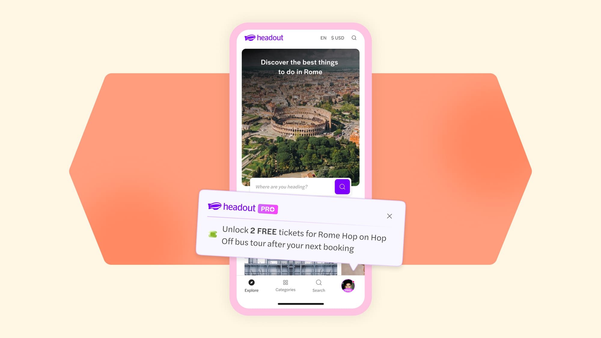
First, we needed to pinpoint the perfect spot to unveil the loyalty program in our product—where it would grab the most attention and create a real buzz. We started by mapping out all the potential touchpoints and sketching rough user flows. This exercise helped us see the big picture and assess each entry point's impact. Since this experiment was being rolled out for new users on the platform, we decided to play it cool and introduced the program after they had booked their first experience. Timing was everything, right? We didn’t want it to feel like in-your-face marketing, and by then, users would’ve caught the vibe of our app, so it seemed like the natural next step.
Designing the rewards journey
After locking in the flow, we dove into the iterations. While structuring the rewards program was crucial, it was equally vital to decide how we portrayed and communicated the rewards journey. After all, if users couldn’t understand it, they wouldn’t be eager to jump on board. Clarity was key to getting users excited and opting in.
Crafting the reward elements:
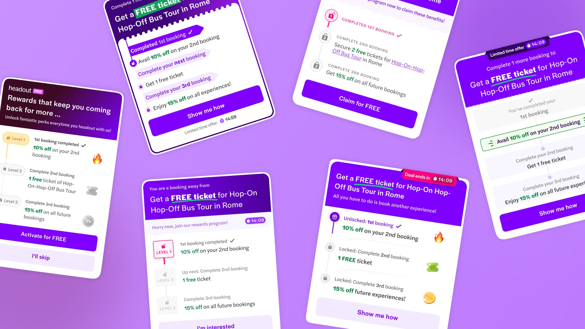
During our exploration for effective visual communication, we considered multiple combinations of icons to represent the two stages—locked and unlocked rewards. Our brainstorming sessions included experimenting with icons such as gifts and locks, with color contrasts to create the distinction between the two stages. Additionally, we also explored a more playful approach by assigning different emojis to each reward while carefully manipulating colors to clearly convey the locked and unlocked stages. Recognizing the need for enhanced clarity, we took it a step further and toyed with the idea of incorporating level numbers alongside icons. This dual approach was designed to give users a clear, visually engaging way to distinguish between locked and unlocked levels, as well as the rewards within our loyalty program timeline.
Copy that connects:
Copy was a crucial element to focus on, especially when introducing the rewards program for the first time. Our goal was to craft copy that instantly grabbed users' attention and was easily consumable. This way, users could quickly understand the benefits and rewards structure without any confusion. To enhance user engagement, we focused on several strategies. First, we ensured that our introductory banner featured a compelling tagline designed to excite users and encourage interaction. The banner copy showcased the upcoming reward users would unlock, aiming to entice and engage them. We also added a personal touch by including users' names in the main tagline. Moreover, we used catchy slogans across various touchpoints to ensure our messaging was not only engaging but also personalized for a more impactful experience.
Consistent visual identity:
Maintaining a consistent rewards identity was paramount across various user flows. It was crucial that all touchpoints, from the pre-opt-in stage to post-opt-in, upheld the same visual identity. This ensured a seamless transition and clear differentiation between a user who had yet to join the rewards program and one who was already a part of it. Consistency in the rewards identity not only established a cohesive user experience but also set it apart from other service features. Our vision for the rewards program was to keep it simple, align it with our brand identity, and add a sense of exclusivity and premium quality. To bring this vision to life, we ensured that all our assets, including gifs, animations, icons, and banner styles, resonated with these qualities. Each element was carefully curated to reflect the program's essence, maintaining a consistent and sophisticated aesthetic in line with our brand ethos. Here were some snapshots of the different elements we designed -
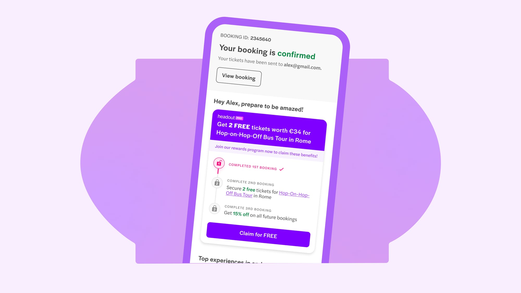
The main loyalty introduction card featured the user’s name alongside a catchy tagline to grab attention and add a personal touch. Rather than a generic title, we highlighted the upcoming reward in the main title and included a rewards timeline to clearly communicate the program's value to users.
We offered timely prompts to users who had joined, motivating them to book again and advance their levels for enhanced rewards.
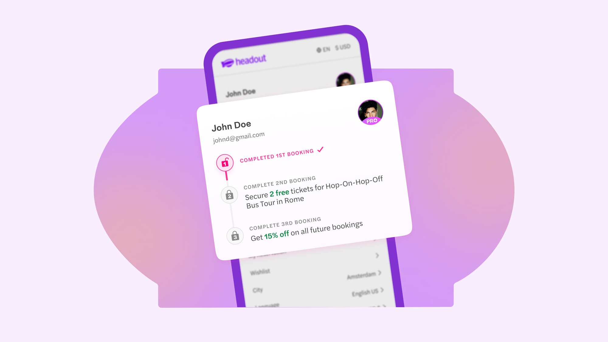
A rewards timeline was added to the account section for PRO users to track their progress. We also added a PRO badge to the user profile to create a feeling of exclusivity.
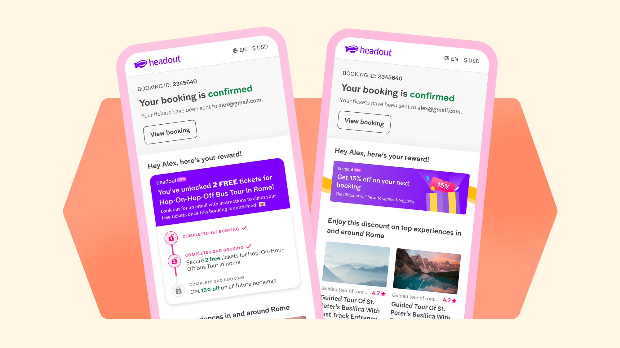
We continued to display the reward progress after users completed their bookings, letting them see how close they were to unlocking their rewards.
A small win with big plans ahead
The experiment showed a slight boost in retention, a promising first step. Although this was our initial attempt at designing for a rewards program, we’re committed to refining and enhancing it. Our goal is to make opting into the program an easy choice for users, and we’re just getting started!
A huge thanks to Sakshi, Roshan, Zanetta, and Ajith for their invaluable contributions to the project. Their efforts made it possible to bring these exciting designs to life!
None of this would have been possible without Atish's guidance and the contributions of Shubham and Pranav in bringing this project to life.
A special shoutout to Aditya Vora, whose valuable feedback helped shape both the project and the blog, and Ramakrishna V, for his constant support and guidance every step of the way.