Nudge, don't nag: Crafting delightful notifications
Ever had your phone buzz so much it felt like it was trying to breakdance? We wanted to transform those annoying pings into personalized gems.
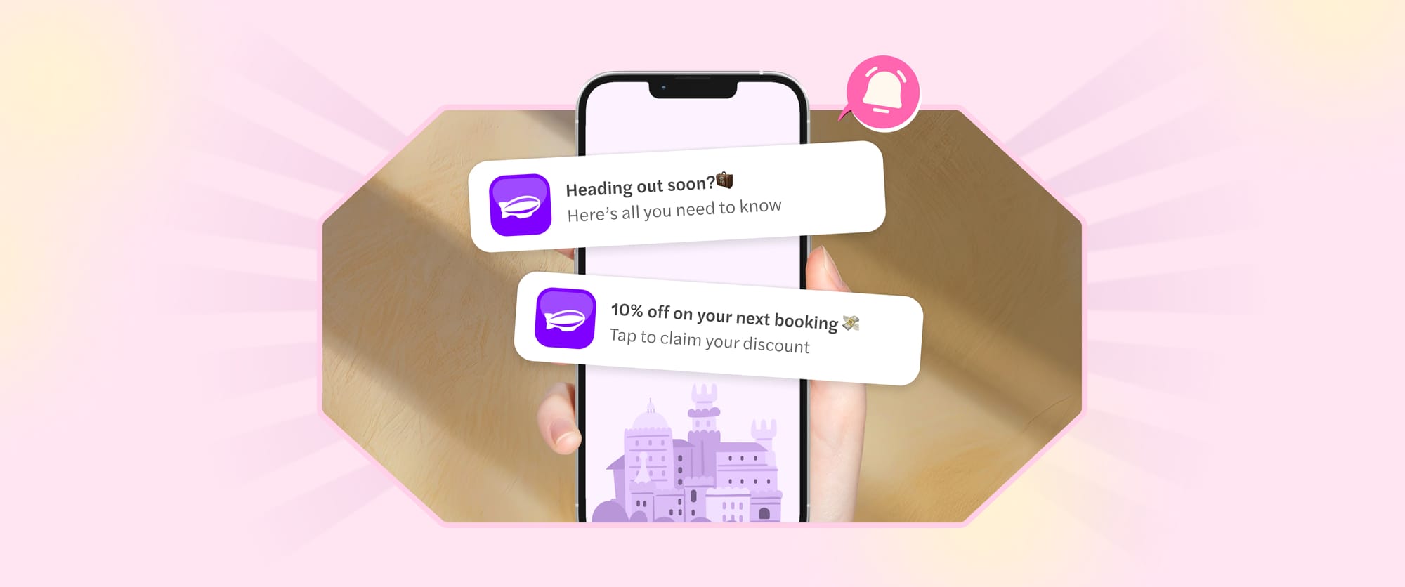
Ever had your phone buzz so much it felt like it was trying to breakdance? We’ve all been there—drowning in a sea of notifications that scream “spam!” rather than “check this out!” But what if we could change that? We wanted to transform those annoying pings into personalised gems, whether you’re booking a Dubai desert safari or exploring the Vatican Museum, making travel planning a breeze!
In our current approach to push notifications, only a small set of users were opting in, and our primary goal was to bring the opt-in rates up to industry standards. Push notifications have been proven to be a great way to boost engagement and keep users coming back, so we knew there was potential we weren’t tapping into. To make notifications useful and get more users on board, we needed to rethink how we could make opting in feel like a natural, valuable choice.
Our notification flow had two big issues. First, users had to go into their account settings and manually turn on notifications—a hidden, hard-to-find process that most users missed entirely. Second, there was no context. With notifications often seen as spam these days, we weren’t communicating its value. All users saw was a standard, generic device popup, with nothing explaining how our notifications could benefit them.
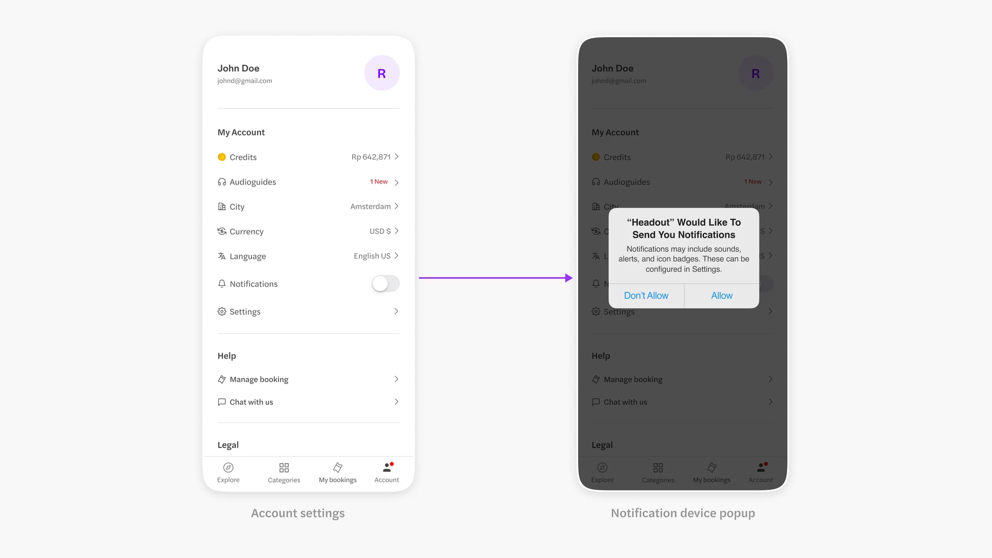
To address these issues, we decided to introduce a pre-notification screen that appears just before the standard device popup. This new screen would give users a quick rundown of the benefits of enabling notifications, showing how they can stay updated on important details, exclusive offers, and personalised recommendations. By adding this extra step, we were trying to shift the focus from “just another alert” to a valuable feature that enhances their experience, helping users see the true value of opting in.
The next step was to figure out the best place in the user flow to introduce this screen, where it would be most valuable, and encourage users to opt in for notifications.
Booking flow
Since our notifications provide key booking details, we identified the post-booking flow as an ideal touchpoint. Just after a user books an experience and lands on the "My Bookings" page, we’d introduce the screen there. This approach offers high visibility and relevant context, as most users naturally visit this screen, making it an effective spot to highlight the benefits of enabling notifications.
Onboarding flow
Another key touchpoint we identified was during onboarding, right when users first download our app. By introducing the notification screen early in the flow, we could ensure it feels less intrusive and gains high visibility. This way, users are made aware of the benefits of notifications from the start, seamlessly integrating them into their initial experience with the app.
When it came to designing this screen, we knew we didn't want it to be just another generic notification screen—those would do nothing to encourage users. Instead, we aimed for a personalised approach that felt relevant to each user. This meant the copy and visuals needed to complement each other perfectly. For each touchpoint, we decided to run A/B/C tests, developing specific hypotheses for three different variants at each stage. These hypotheses guided our design choices, ensuring both the visuals and the messaging resonated with users.
Booking flow
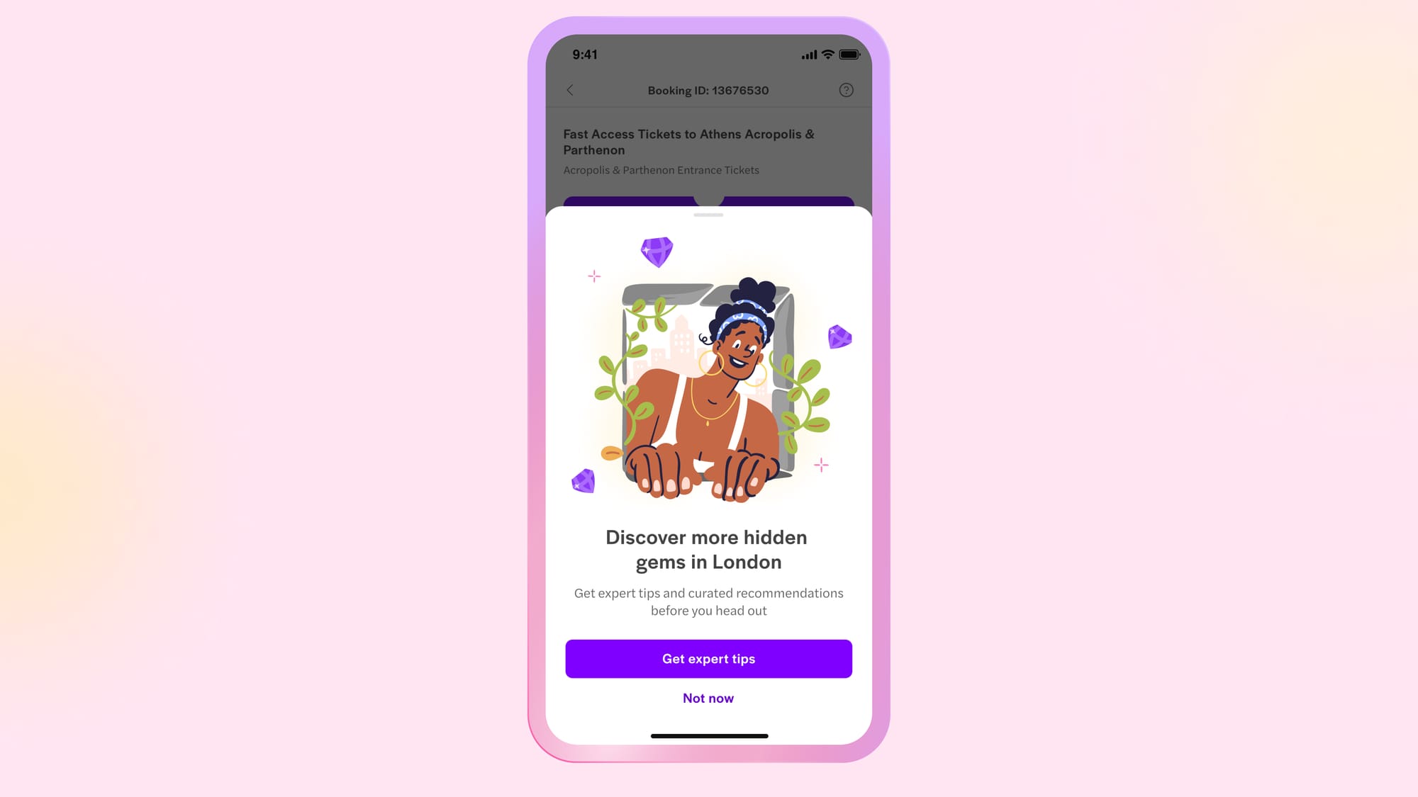
Hypothesis 1 - Users want the best for their experience and hence prefer tips
We wanted to highlight that our notifications provide valuable tips related to the booking users have just made, specifically mentioning the name of the city where they’ve booked their experience to enhance personalisation. To reflect this, both the copy and subtext focus on this benefit, with the CTA saying "Get Tips" to emphasize the value of enabling notifications. The accompanying illustration features an excited person peeking out at the city, capturing the enthusiasm for staying informed and making the most of their recent experience.
Hypothesis 2 - Users get motivated by discounts and offers
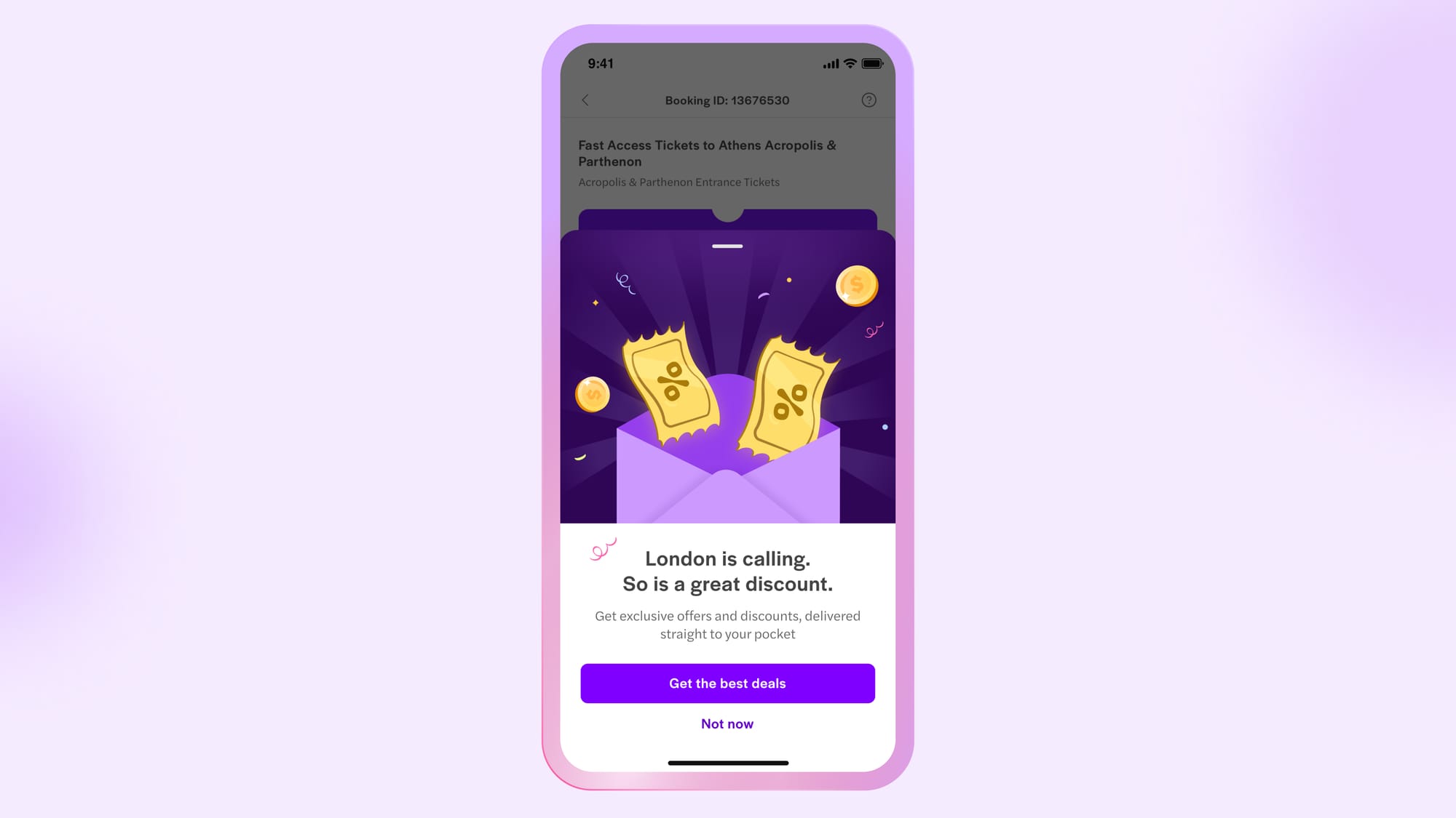
Who doesn't love a good discount? We know that people are drawn to deals, so we wanted to tap into that enthusiasm. That’s why our illustrations feature coins and notes to highlight the discount aspect, while the copy reinforces this message. To quickly grab users’ attention, the CTA copy says "Best Deals," to nudge users to not want to miss out on the best offers, deals, and discounts.
Hypothesis 3 - Notifications are not spam
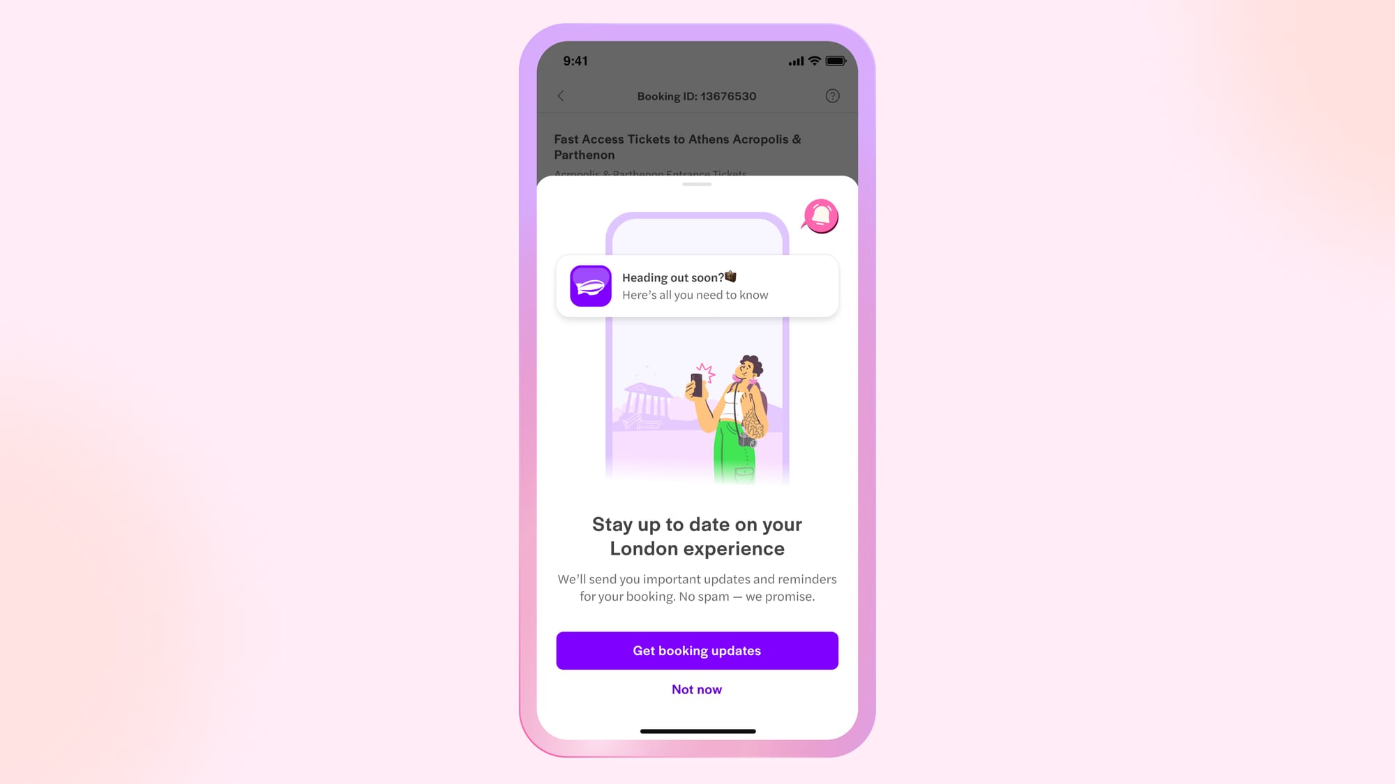
When it comes to notifications, the first thing that often comes to mind is spam, and we wanted to challenge that perception. Through our copy, we aimed to convey that enabling notifications is a great way to stay updated on their recent booking. To support this, we included a preview of the type of notifications users can expect, showcasing the value and relevance of our alerts through engaging visuals.
Onboarding flow
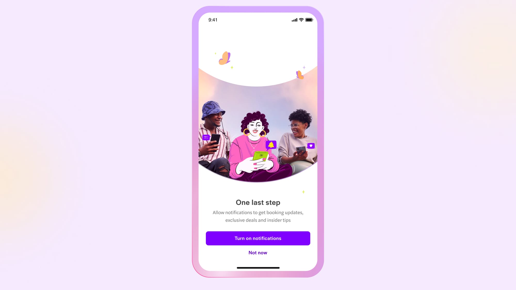
Hypothesis 1 - Users are more likely to opt in if we make notifications part of the onboarding flow
We figured that if we framed notifications as a natural step in the onboarding process rather than an extra task, it would feel more seamless for users. So, through our copy, we made notifications appear as a step of onboarding. In our visuals, we showcased people enjoying our app and staying updated, reinforcing the idea that enabling notifications enhances their overall experience.
Hypothesis 2 - Notifications are not spam
Once again, we aimed to challenge the notion that notifications are just spam. To do this, we crafted clean and concise copy in bullet points to clearly explain how notifications can benefit users. Complementing this, we used a looping animation to showcase the various types of notifications users could receive, providing visual context that emphasizes their relevance and usefulness.
Onboarding - Hypothesis 2
Hypothesis 3 - FOMO drives people to switch on notifications
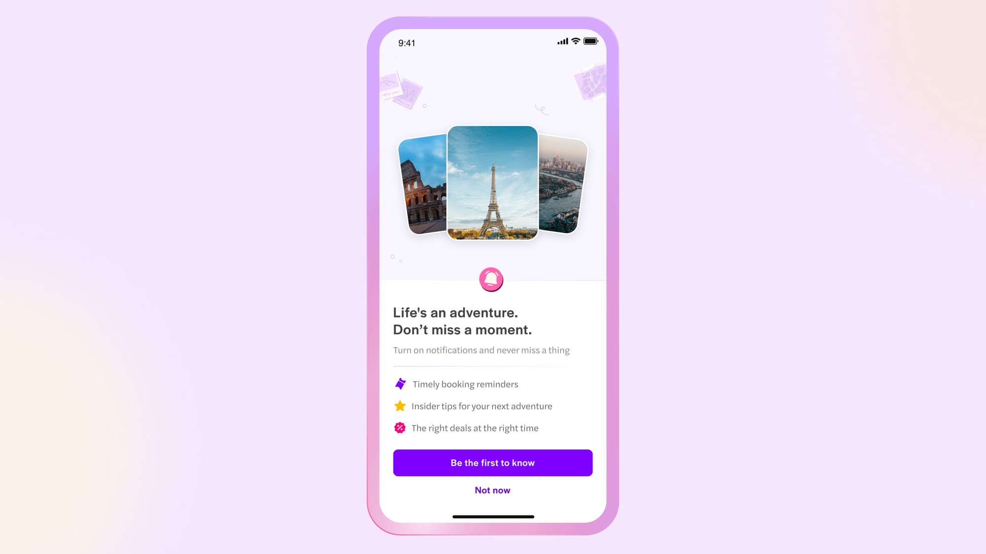
We believed that tapping into a sense of FOMO (fear of missing out) could encourage users to opt in for notifications. Our copy reflects this through quick, engaging pointers that highlight the benefits. To reinforce this idea, we included a brief animation featuring images of three popular attractions, further adding value and enticing users to stay informed.
What did we achieve?
We’ve observed a significant boost in our notification opt-in rates, confirming that the introduction of this screen truly made a difference. We’re also working on designing notification nudges for frequently visited pages, which we believe will further elevate our opt-in rates.
I’d like to extend my gratitude to Raghav for his guidance throughout the project, to Mohana for her essential copy contributions, and to Ajith for his stunning illustrations that brought the screens to life. A big thanks to Ramakrishna for his support during the process.

