Oops, payment failed? How we designed a calm path to completion
We gave our payment retry flow a friendly facelift so if a payment hiccups, you don’t freak out—you just hit retry and sail right through to booking.

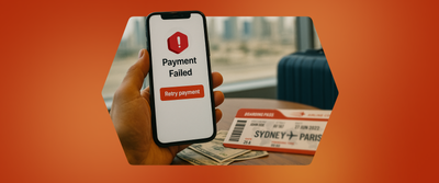
Imagine this: you’ve just found the perfect desert safari or sunset cruise on Headout. You’re excited, you enter your details, and tap “Pay”... then—disaster. Your bank declines the transaction.
In that moment, doubt creeps in: “Did I lose the booking? Do I have to start over?”
For us at Headout, this wasn’t just a minor hiccup—it was a real point of friction. It disrupted the booking experience for a significant number of guests and had a direct impact on our business.
So, we set out to redesign the payment retry flow—not just to solve the problem, but to turn a stressful moment into one of reassurance. Our goal was to help users bounce back quickly, feel supported, and complete their bookings with confidence—not panic.
The Background:
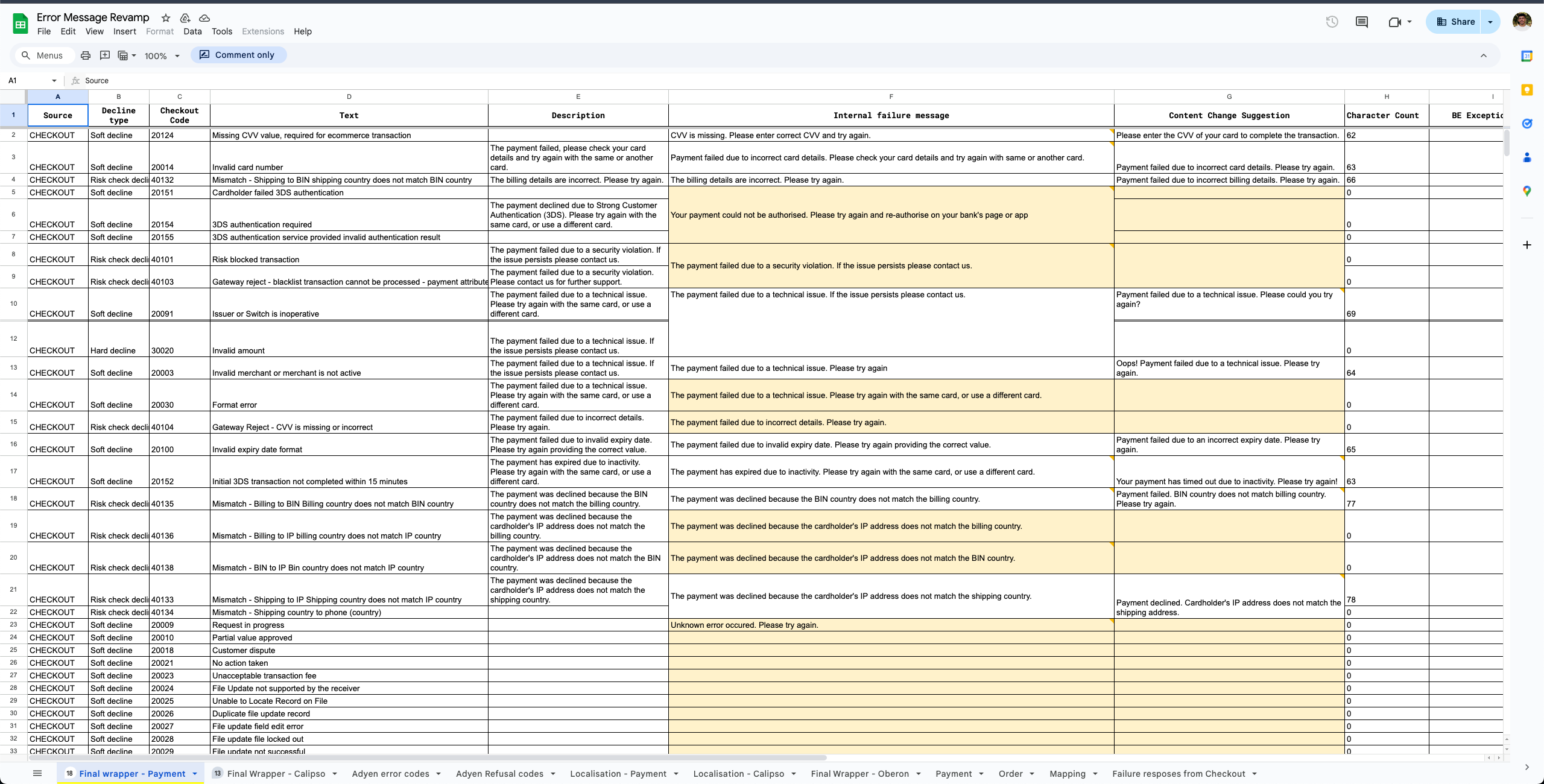
Most users have no trouble checking out on Headout—about 72% of order attempts go through without a hitch. But that still leaves 28% that fail, and we wanted to understand why.
About 8% of those failures come from things we can’t do much about—fraud blocks, inventory issues, and other external factors. We call these hard errors, since they usually require the user to start over or take action outside the platform.
But the remaining 20%? Those were more interesting. These were payment-related errors—things like incorrect CVV, insufficient funds, or temporary bank declines. We classify these as soft errors because they usually happen despite clear booking intent and, more importantly, they’re often recoverable in the same session.
And here’s where the problem showed up clearly:
Nearly 1 in 3 users who hit a soft error didn’t try again.
That translates to around 6% of total order attempts lost—people who were ready to book, ran into a payment error, and dropped off entirely.
The experience wasn’t helping them recover. It just left them hanging.
The Challenge:
The data was clear: users were hitting a wall—and it wasn’t just about failed payments. Behind the numbers, we saw signs of frustration, confusion, and a sense of being left in the dark. Informal feedback backed this up. Many users didn’t understand why their payment failed or what they were supposed to do next.
One major culprit? Our error messages. They weren’t designed with users in mind. They lacked clarity, offered little guidance, and left too much to interpretation. Instead of helping users recover, they added to the stress.
So the challenge wasn’t just technical—it was emotional. We had to:
- Reassure users that their booking was still safe
- Reduce friction by preserving user inputs
- Provide clear, actionable next steps—without overwhelming them
- And above all, recover as many stalled transactions as possible
Our North Star: Lead with Empathy
We knew that solving this wasn’t about throwing more UI at the problem—it was about designing with empathy. So we framed our approach around a few key questions that guided every decision:
How do we show users their effort hasn’t gone to waste?
→ By building trust, confirming their booking is safe, and creating a sense of calm.
How do we make retrying feel easy, not exhausting?
→ By keeping the flow simple and retaining as much of their input as possible.
How do we guide users with clarity—and compassion?
→ With empathetic copy, thoughtful visuals, and a clear path forward.
These principles became our compass—and helped us reimagine the experience from the user’s point of view.
Designing the Safety net : From Panic to Progress
Fixing the post-payment failure experience wasn’t just about making it look better. We needed to reduce confusion, help users recover quickly, and give them a sense that things were still on track. That meant reworking every part of the flow—from the messages to the screens—to remove friction and build confidence.
1. Clearer Error Messages
The biggest issue was obvious: our payment error messages weren’t helping. They were vague, technical, and often left users unsure of what went wrong or what to do next.
So we rewrote them. Working with content and product, we made the messages direct and easy to understand. Each one now clearly explains the issue—like an incorrect CVV or a bank decline—and tells the user exactly what to do next. No guessing, no jargon.
2. A Better First Step After Failure
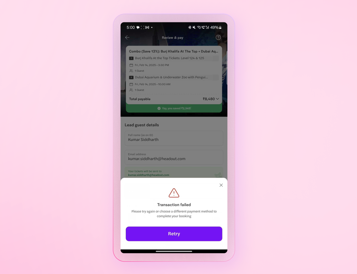
The moment right after a payment fails is high-stress. Users often assumed their booking was gone or that they’d have to start over. And our old design didn’t help—it dropped them onto a generic error page with no reassurance and no clear direction.
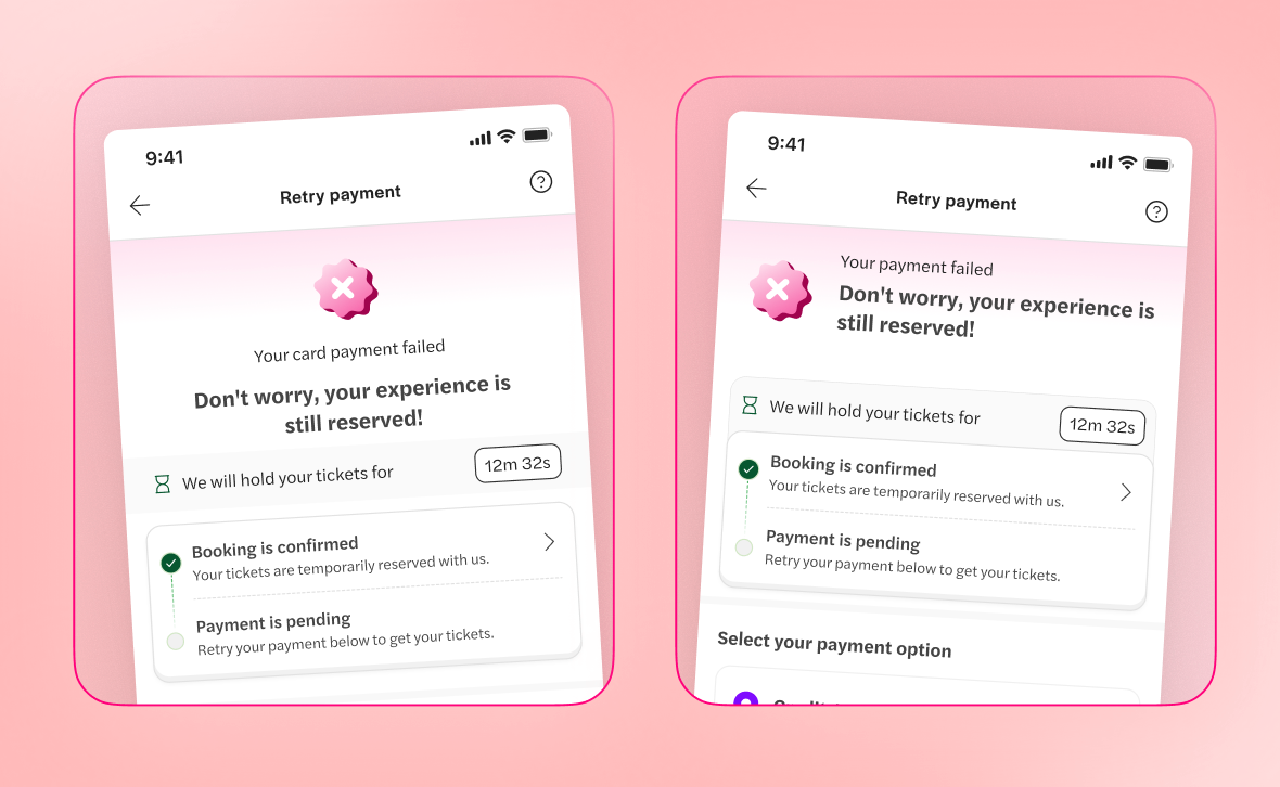
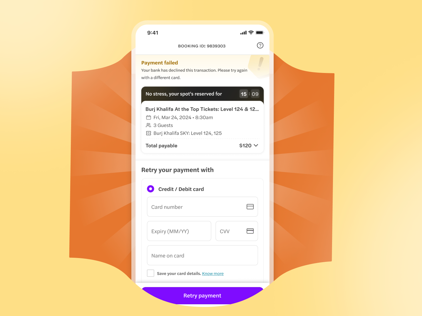
We replaced that with a dedicated screen confirming their spot was still being held. The goal was to reduce panic and give users a clear next step. The screen was designed to:
- Confirm the booking is safe (for now)
- Offer a simple way to retry without re-entering details
- Keep the layout clean and focused
It was a small shift, but a meaningful one. Instead of hitting a wall, users now saw a way forward.
Designing the Experience
One early version of the screen used a bright pink gradient and a small countdown timer. While eye-catching, the design felt loud and made the situation feel more stressful than it was.
We added confirmation tags like “Booking confirmed” and “Payment pending,” but also layered in a large warning banner. Instead of helping, it dominated the screen and heightened user anxiety.
Including the booking ID was a step in the right direction—it reassured users their spot was held. But we missed showing the itinerary card upfront. Without it, users lacked context and clarity around what they were still trying to pay for.
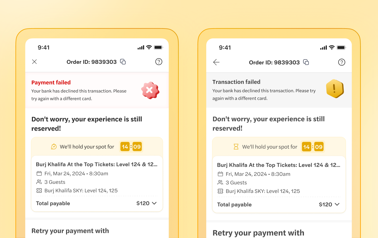
After gathering feedback, we refined the design by softening the visual tone, bringing key details like the itinerary and booking status to the forefront, and stripping away elements that distracted from the main action(as seen above). These changes made the screen feel calmer and more focused—helping users understand what was happening and get back on track without added friction.
The UX Writer's Touch: Saying More with Less
Improving this flow wasn’t just about design—it was also about precision in language. Our UX writer stepped in to tighten the messaging, keeping it clear, concise, and purposeful.
For example, lines like “Don’t worry, your experience is still reserved!” and “We’ll hold your spot for…” were reworked into a shorter, cleaner version: “No stress, your spot’s reserved for…”
This wasn’t just a tone change. It reduced visual clutter, made space for what really mattered, and helped keep users focused—without losing the reassurance they needed. It was about balance: fewer words, clearer intent.
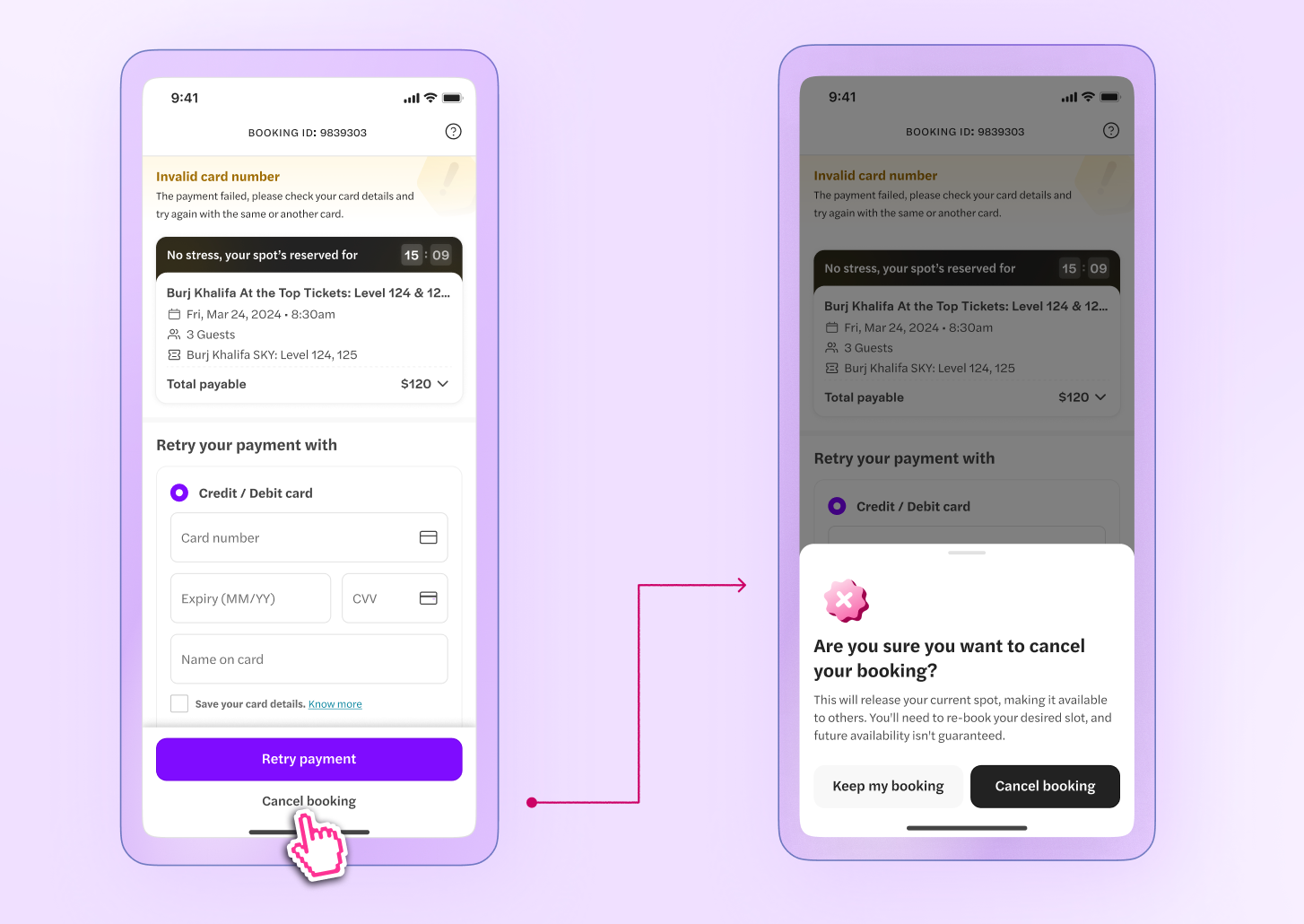
Guiding the Exit
One key decision was how to handle exit intent: should users see a back button or a “Cancel Booking” option? We chose the latter because it offered a clearer, more deliberate action. A back button could create uncertainty—“Where will this take me?”—while “Cancel Booking” made the outcome obvious.
When users confirmed cancellation, they were smoothly redirected to the select page, where they could pick a new date or variant. The result was a flow that felt intentional and easy to navigate, with no ambiguity.
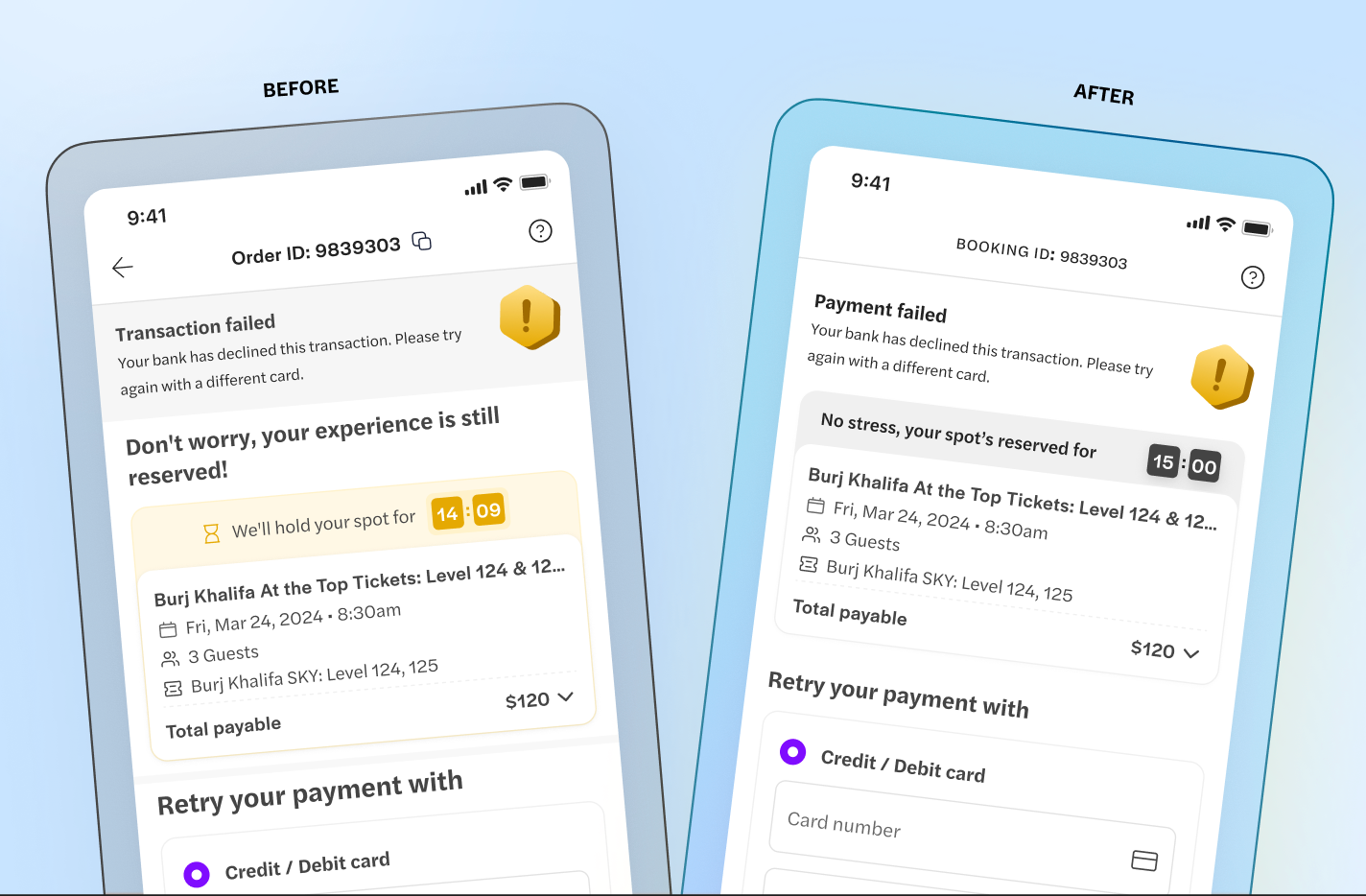
Color Evolution: From Alarm to Assurance
In our early designs, we used red as the main warning color on payment error screens. While red signals urgency, it also triggered panic—leading many users to abandon the flow instead of trying to fix the issue. It was working against our goal of creating a calming safety net.
To better understand this, we looked at how other brands handled similar moments. Many used softer tones—like orange or yellow—that still signaled urgency but felt less alarming. These colors encouraged action without overwhelming the user.
During a focused design jam, we explored how color psychology could work in our favor. One analogy stuck: the traffic light.
Red says stop—final and often irreversible.
Yellow says pause—there’s time, proceed with care.
That insight shaped our decision to shift from red to yellow. It helped us communicate that yes, something went wrong—but it’s recoverable. The message was simple: your booking isn’t lost, and you still have time to act.
The transition from red to yellow became a symbol of our goal: to reassure users that their booking wasn’t lost, and that they still had the chance to resolve the issue calmly and confidently.
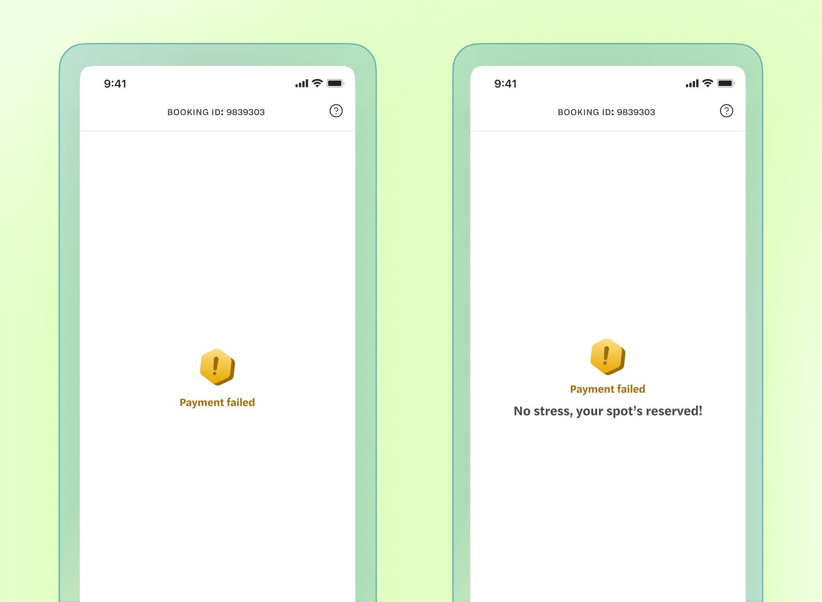
Designing the Transition: A Soft Pivot
Once the colors and layout were in place, we turned to interaction. The goal was to create a brief moment of pause—a chance for users to reorient before retrying payment, without feeling rushed.
Instead of jumping straight into the retry screen, we introduced progressive disclosure. The flow started with a simple confirmation of the payment failure, immediately followed by a reassuring message: “No stress, your spot’s reserved!”
This sequencing helped reset the user’s mindset—acknowledge the issue, then offer reassurance. A subtle animation guided attention, giving users just enough time to process before moving forward.
The result: a smooth, intentional shift from failure to recovery.
The results spoke for themselves.
- Significant recovery: 6 in 10 users who hit a payment error completed their booking on the second attempt—a strong recovery rate that turned a frustrating moment into a clear next step.
- ~5% lift in overall conversion across platforms, translating into a meaningful recovery of previously lost bookings and a direct boost to revenue.
- Increased user confidence: Beyond the numbers, the design impact was clear. Empathy-led copy and softer visuals consistently helped users stay engaged and move forward.
Payment failures aren’t just technical—they’re emotional. If handled poorly, they break trust and derail intent. But with the right design, they become moments of recovery and reassurance. This project reminded us that thoughtful feedback—like the sharp input from our UX writer—can shape outcomes in a big way, especially when clarity and tone matter most.
Acknowledgement
This project’s success is a clear example of how teamwork across different areas can lead to great results. We’re really thankful for everyone’s effort that helped make this happen.
We shifted user frustration into confidence, ensuring that completing a booking became a simple, stress-free task.
A special thanks to Ramakrishna for his design brainstorming and direction, and to Mukul and Debanwita for giving me the space to organize my thoughts. Pranjal played a crucial role in shaping the final output, refining the copy to be clearer, more reassuring, and impactful. This just goes to show how design isn’t just about visuals; it’s about creating a complete experience that communicates with users every step of the way.
Also, a huge shoutout to our amazing payments team headed by Amit, backend, analytics, content, and design teams. This project was a big win for both our users and Headout.