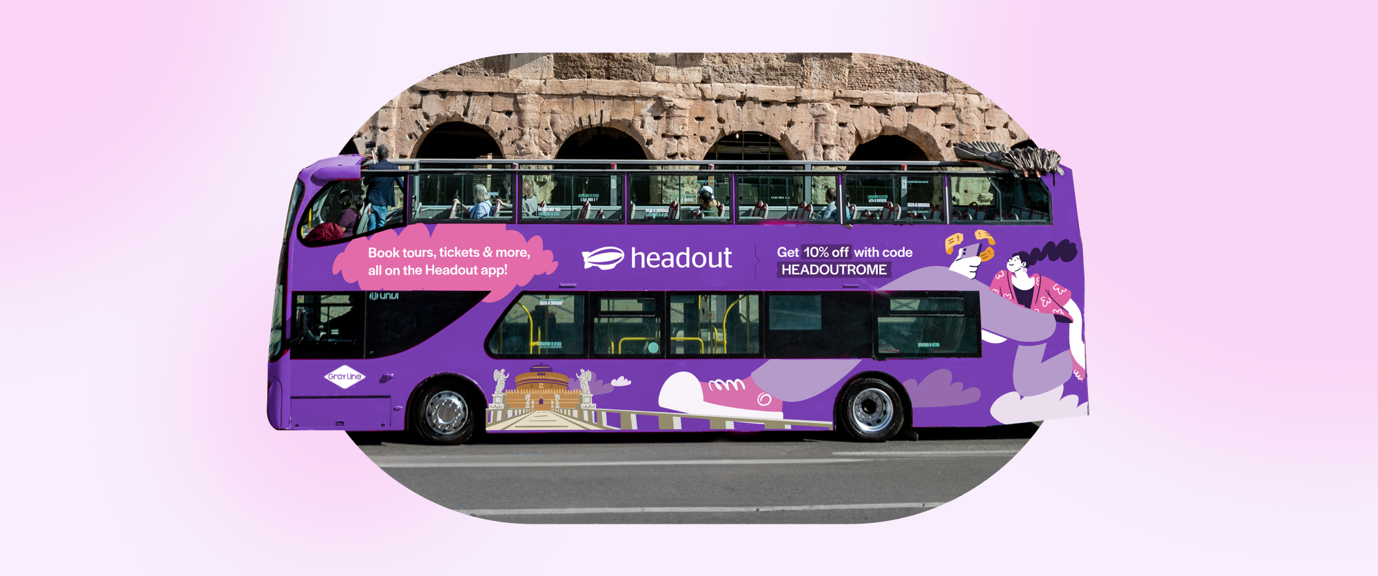
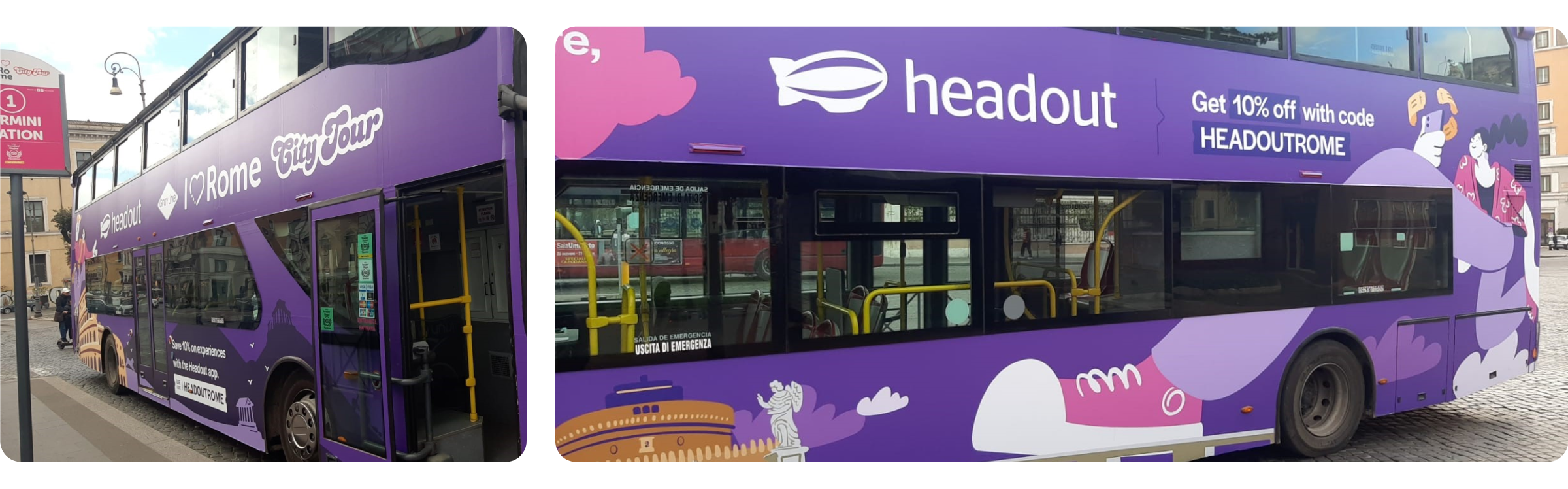
Purple on the go: The Headout experience on wheels
Hop on the Headout bus! Our eye-catching purple wrap not only makes it hard to miss but also turns every ride into a fun adventure filled with sights to see and places to explore!
Alright, let’s take a little trip down advertising memory lane. Remember those old-school billboards strapped to people’s shoulders? You’d see them walking around, casually turning themselves into human ads. It was quirky, attention-grabbing, and a bit of a hustle, right? Well, we thought, "Hey, that’s pretty cool, but how can we make it bigger?" And thus, the idea was born: if people can carry ads on their shoulders, why not a whole bus? That’s how we took inspiration from the walking billboard tradition and gave it a giant, four-wheeled upgrade—all in the streets of Italy. So, instead of a person walking down the street, we had a bold, adventurous bus cruising through Rome, turning heads and making waves just like those old shoulder billboards did—but on a much grander scale!
Mapping the Canvas: Understanding the Bus
Designing for a bus is a whole different game. It's not just about slapping on a design—it's about considering the entire user journey (the literal journey on the bus). We wanted to make sure every element, from air vents to windows, lights, and doors, was thoughtfully integrated into the design. Our research was driven by one clear goal: enhancing the travel experience.
We kicked things off by rolling up our sleeves and diving into the research phase, digging through every reference we could find about bus interiors and exteriors. It wasn't just about aesthetics; the design had to seamlessly work with the bus structure. Every detail mattered. So, we began with wireframes, carefully mapping out the entire bus to ensure we didn't block any views or cover up important features.
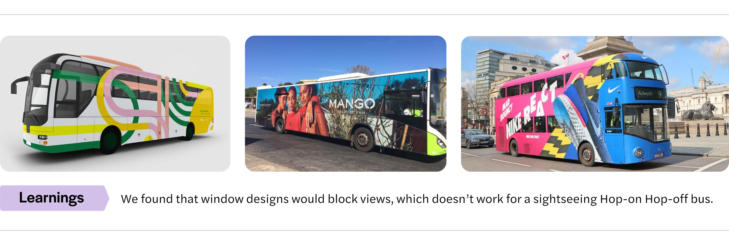
Speaking of views, one major pain point we wanted to avoid was the experience of being on a long bus ride where your window is covered by an advertisement sticker from outside. All you can see is... nothing. Not exactly a great travel experience, right? By paying close attention to every aspect, from window placement to visibility, we ensured that our design not only looked good but enhanced the user experience—inside and out.
How did we make the design approach uniquely ours?
Doing the research and uncovering these challenges was just one small piece of the puzzle. We were working with limited space, broken up by windows, vents, and other elements, which made delivering "the message" far from straightforward. So, we decided to break down our visual ideas into distinct approaches:
Larger-than-Life Approach: Taking one bold visual and wrapping it across the entire bus for maximum impact.
3D Approach: Creating the illusion that you’re peeking inside the bus from the outside.
Illustration Approach: Leveraging illustrations to take full control of the limited space, ensuring the message fit perfectly.
Whimsical Approach: Showcasing real-life experiences with a playful, illustrated twist.
Brand-First Approach: Putting brand elements front and center to convey the essence of Headout, beyond just a single message or experience.
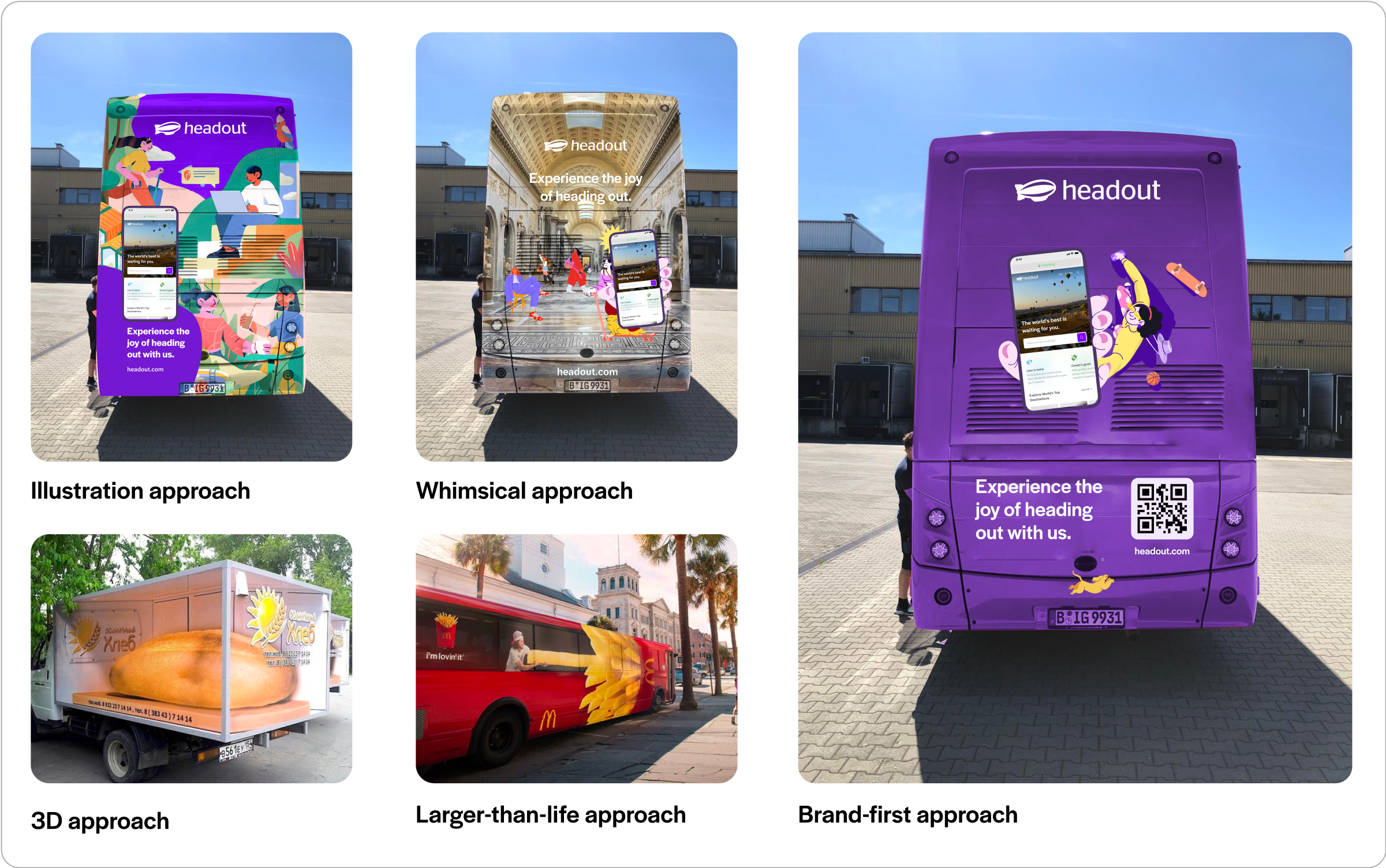
Breaking things down like this made the design process much smoother, helping us take decisions across various teams and stakeholders.
In the end, we chose to blend the brand-first and illustration approaches. Why? Because they offered us the perfect balance! Together, they gave us the space to express, write, and showcase exactly what we wanted to communicate to our guests.
Paint the bus purps! (purple)
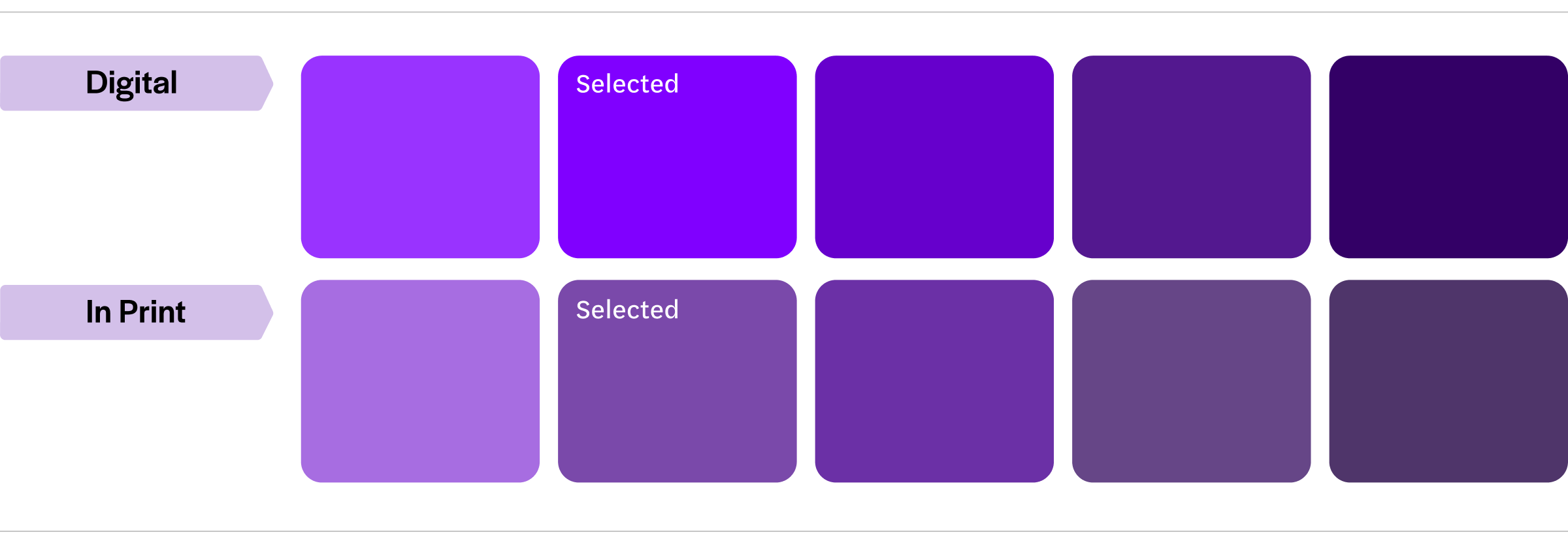
The first step? Painting the bus purple (well, not literally). Finding that perfect shade that matches what you see on the screen is like hunting for a unicorn! We dove into a sea of printed samples—hundreds of them—using a trusty Pantone shade card to make sure we nailed the exact color. Figuring out what materials give each finish was crucial before we finally locked in that eye-catching shade of purple. It was a colorful adventure, to say the least!
In the end, it’s just a design. Is it really?
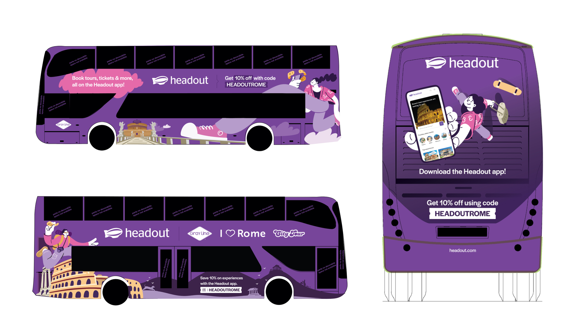
Our design process was like piecing together a puzzle. We went all out with illustrations of the Colosseum and Castel Sant'Angelo, infusing our design with that unmistakable Italian charm. Blending these elements seamlessly was like creating a masterpiece. Our primary layer featured bold illustrations of iconic experiences, while the secondary layer added smaller elements from Rome, creating a rich, layered effect.
The Wrap-Up
Working on a project like this was a dream come true. The rich history, the vibrant culture—it all seeped into our design. Our bus wrap was a temporary but impactful installation that not only spread the word about our brand but also showcased our love for adventure and fun. Watching our Headout-branded bus roll through the streets of Rome felt like witnessing your child take their first steps—pure joy! It transformed into a rolling billboard for our brand, inviting everyone to hop on board and start exploring with Headout.
Even though we weren’t in Italy, but watching this video brought the joy right to us—like we were there!
Check out the bus in action here.
So, how did this blog come to life? Well, it stemmed from our quest for insights into the technicalities of bus wrap design—because, let’s face it, we couldn’t find anything useful online! We aimed to balance our creative vision with the practical necessity of ensuring unobstructed views for our passengers. After all, who wants to gaze at a wall of ads when there’s a whole world out there just waiting to be explored?
This bus wrap? Total team magic! Big cheers to Ramakrishna and Ajith for their thoughtful design and ideas. The messaging genius? That’s Palaq and Aakanksha, who nailed the words and the vibe. And hats off to Samuel and Rudolf for steering the entire project from start to finish! Special shoutout to Sara for capturing the Rome bus journey and turning it into web highlights for everyone to enjoy!