Curtains up: Unveiling the new London Theatre Tickets landing page
Same drama, new look ✨. In this article I'll cover the process of revamping the landing page of London Theatre Tickets, to enhance the experience of the website and improve the overall conversions.
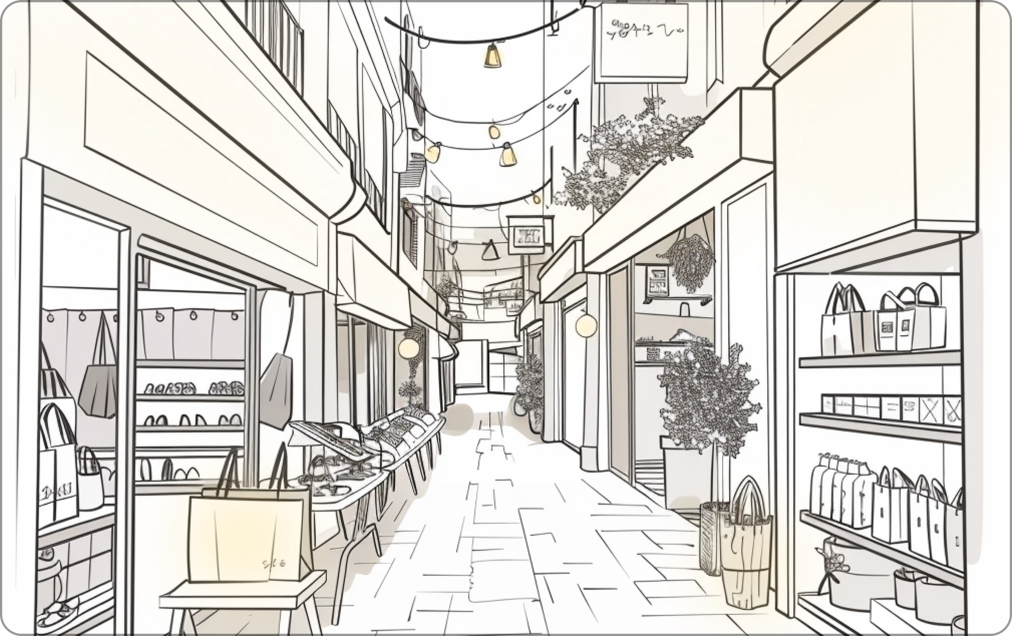
Have you ever visited a shopping alley, where numerous shops compete to sell their products? If you're a regular customer in that area, you may already have some preferences. However, what if you're new to the area? You look around and realise that most of the shops sell the same goods. The question that arises next is: How do you decide which one to enter?
A shopkeeper does multiple things to be able to convince you to check out their products. They exhibit their best items upfront to garner your interest, display their awards to gain your trust and add decorative lights or even some music at the storefront to evoke your delight.
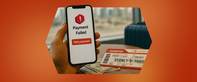
In the digital world, this is where the landing page of your product can make or break the deal.
Your page might be ranking organically amongst the first few links that appear when a user searches for a product. However, the page also needs to encourage them to stay, explore, look around, trust your website and believe that it is the best solution for what they require.
Redesigning the Landing Page of London Theatre Tickets
About London Theatre Tickets
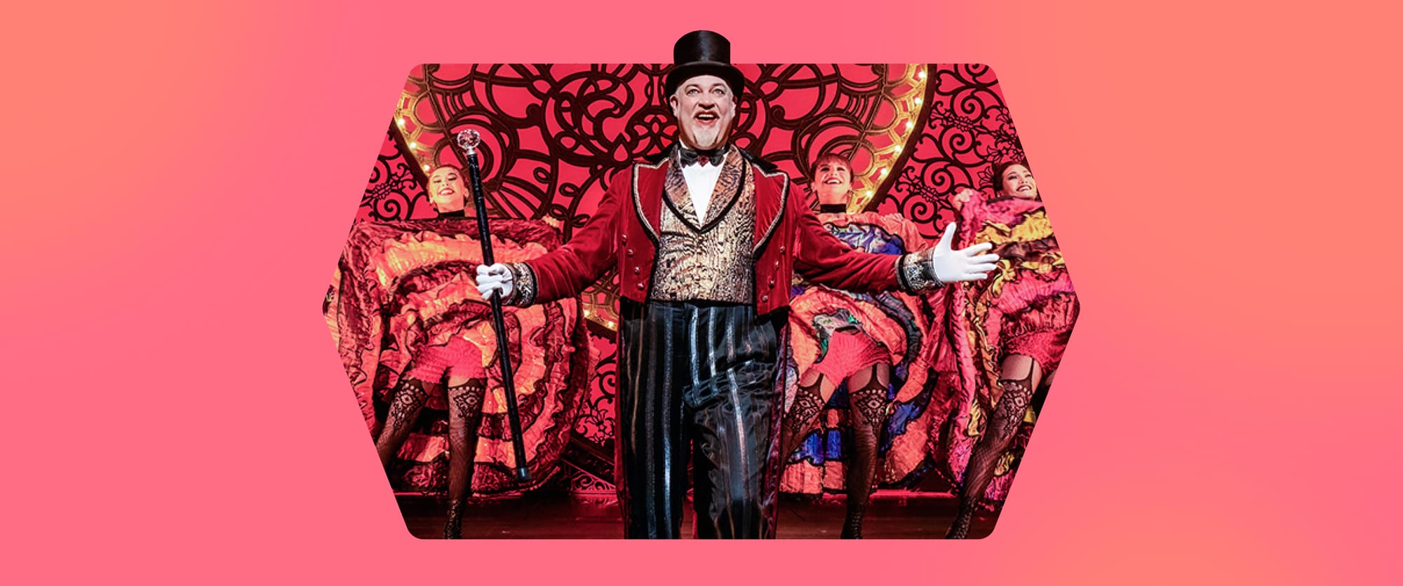
West End, London, is home to famous theatrical shows that attract both locals and tourists alike from all over the world. Renowned artists bring fun- filled live performances like musicals, operas and classical comedies to life through their world- class acting, engaging music and impressive dancing skills.
Hence, London Theatre is an important collection to Headout. Search engines like Google are filled with competitor websites that sell West End tickets. Amidst the busy street, Headout needs a way to stand out and attract customers. Making the shopfront inviting is a way to go about it.
THE LANDING PAGE IS THAT SHOPFRONT ✨.
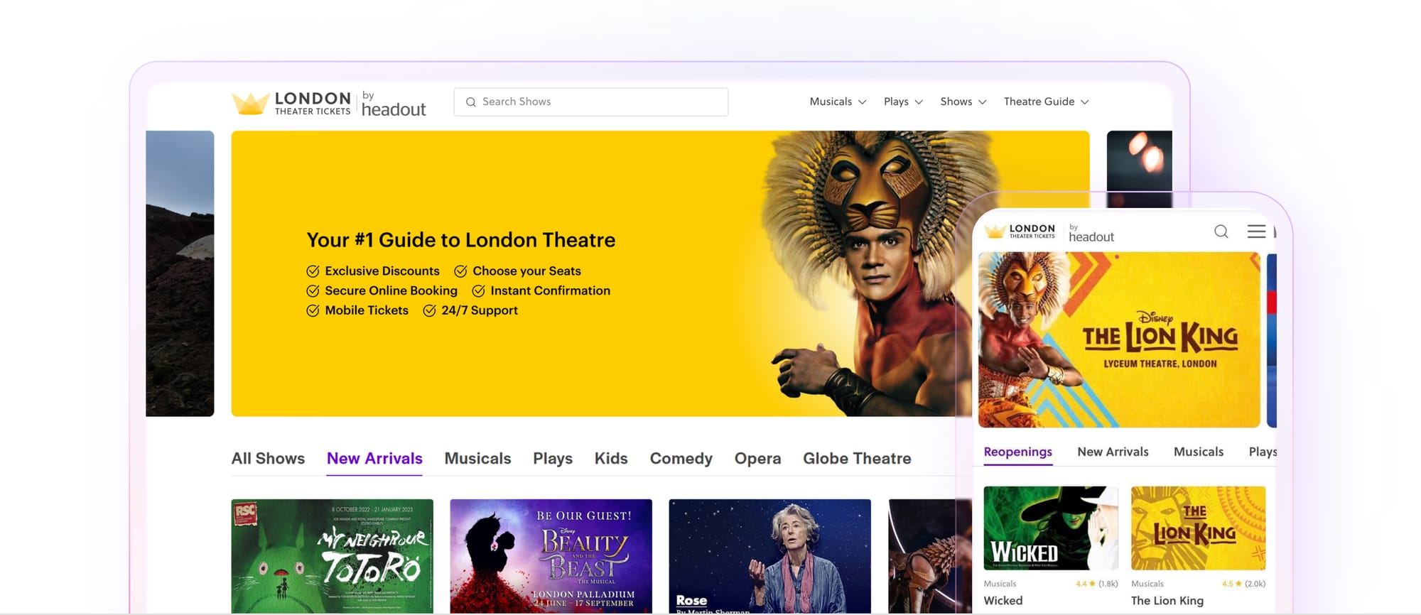
The Old Landing Page
This is how the old landing page looked like. It comprised of mainly 5 elements:
- Search bar
- Navigation bar: Includes links to different category pages and guides
- Banners promoting show posters
- Category wise filters: Categories include different kinds of shows like musicals, operas and so on
- Product cards
The Need to Revamp
While working on a feature request for this landing page, we realised that the design of the page did not communicate the essence of a theatre page at all. After an initial discussion within the design team, we presented this problem statement to all the stakeholders involved and soon got their buy-in for the same.
Using the street and the shops example as an analogy, it was like that clothing shop that may have the best products with the best deals but from the outside, it may not look like a shop that sells good clothes. The storefront of that shop may have dim lights and a plain exhibition, potentially discouraging the customers from stepping in at all. We had a strong hunch that if we decide to work on the UX and the visuals of this website, we will see potential improvements in the overall conversion rate (CVR). So, we went back to the drawing board and started listing down all the problem statements we can work upon. We decided to conduct an experiment with the goal:
Improve the browsing experience of the London Theatre Tickets landing page while enabling discovery and giving it a visual upgrade.
The Improvement Opportunities We Came Across
- The website is only displaying the shows upfront like a catalogue but fails to give the users a feel of what viewing a theatrical show in the West End would be like.
- It’s difficult to generate trust from the page.
- Category tab filters are simple text elements with no visual differentiation between them.
- Banners only contain show posters, with no further explanation of the show.
- Discounts on product cards are not highlighted on the page.
- The only way a user can explore shows on this page is by filtering them according to categories.
Brainstorming On Multiple UX Directions
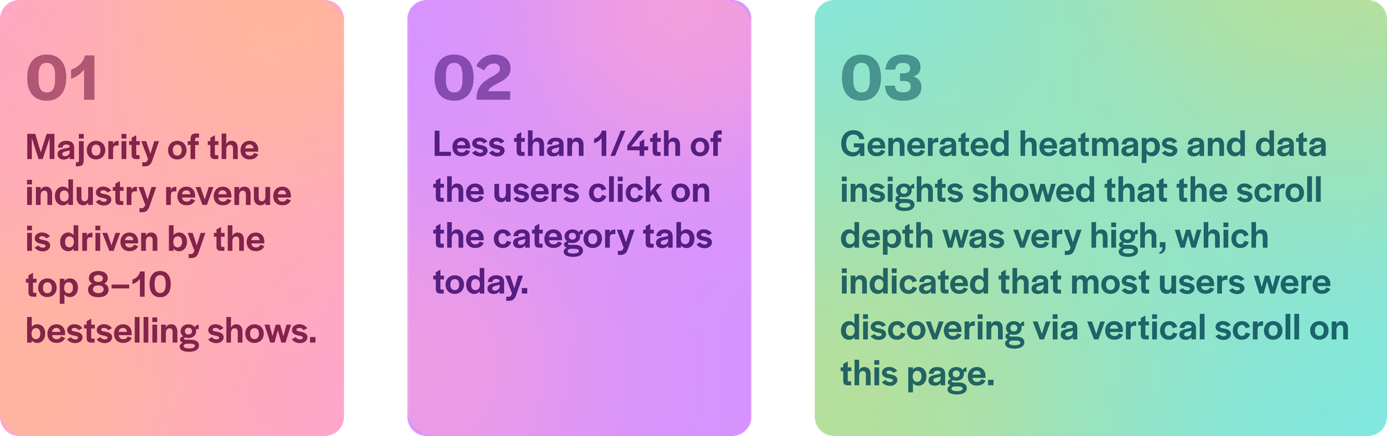
We compiled all the data and statistics in one file along with notes containing expectations and insights from various involved stakeholders.
Here Are Some Data and Research Insights We Had
Based on all the insights, we came up with a basic IA and wireframes on how we can improve the discovery on this page while also revamping the visuals. We also compiled screenshots from articles to explain to the stakeholders the potential directions we could take and why one makes sense over the other.
PS: Of course this involved multiple meetings over millions of cups of tea 🍵, whiteboard drawings, scrapping directions, to and fro with everyone involved and aligning everyone’s expectations to whatever possible from an experimental point of view.
Brainstorming On Visual Directions
After finalising the UX direction, we collected multiple different references for the visuals of how our new re-defined landing page could look like. We ended up with 5 to 6 different styles before we finalised one direction which worked for us. We continued to iterate in that finalised direction, and came up with different visuals for all the smaller elements like banners, trust boosters, product cards, category tabs, and so on.
The Final Designs
Banners
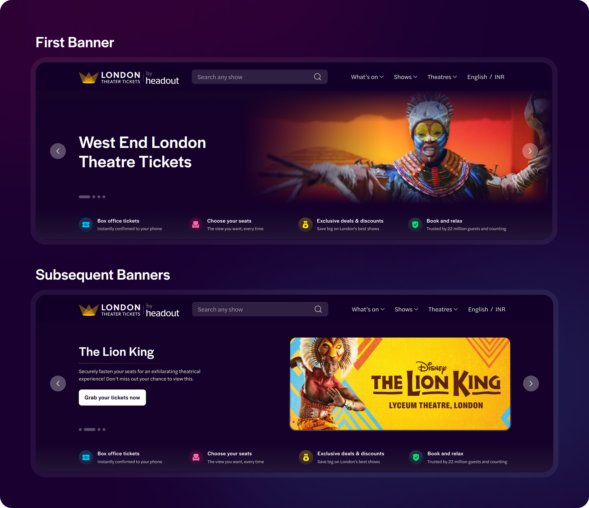
We decided to revamp the banners to not only give the user a feeling of theatrical performances in the West End but also promote the shows and sales that are going on. We did this by introducing:
- Immersive video: The first banner would now have an immersive video with clips of various famous shows in the West End.The aim of the video was to excite the user and give them an understanding of how their end experience would look like.
- Dark themed banners: While the entire page remained light themed, we decided to move the banners to a dark themed UI. This was done to give the feel of a dark environment just like a theatre performance, hence keeping the experience of our website synonymous with the end experience.
- Show banners: The subsequent carousel banners after the first video would now promote our bestselling shows. We started adding a short summary of the respective shows to quickly describe it, while potentially exciting the users about the storyline. We also added a clear CTA with the copy “Grab your tickets now” to make the banners evidently clickable.
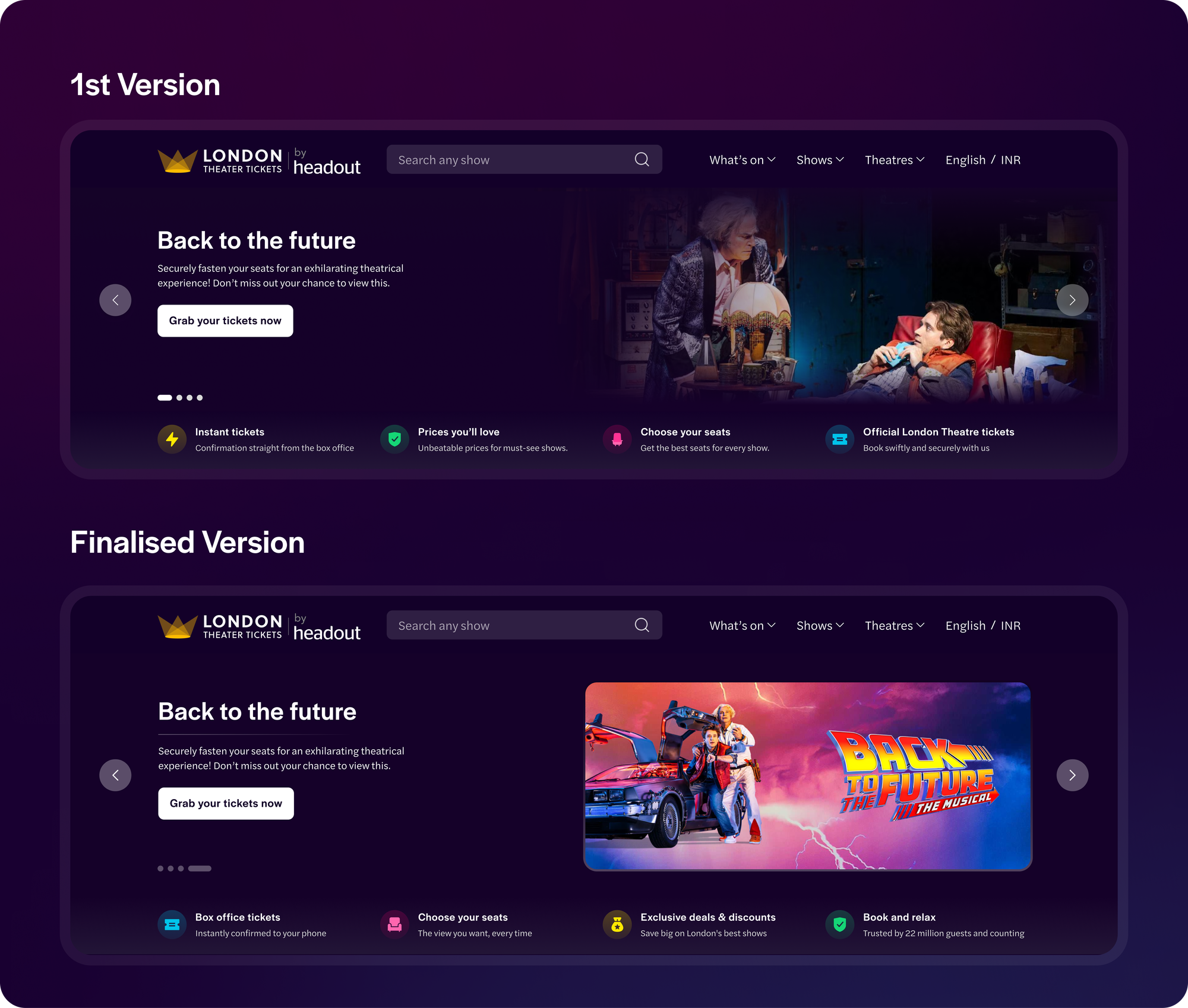
Improvements made over iterations
- In the initial revamped banners only the CTA was clickable. In the latest designs, we have made the entire banner clickable, following existing UX practices and also solving for the clickable area.
- Initially, we were using a show’s performance images to promote that respective show in the banner. After doing some research, we realised that users resonate with show posters more than the performance images since that’s what is mostly being advertised and presented to them in the pre-booking cycle. Hence, in the latest designs we replaced all the performance images with the respective posters.
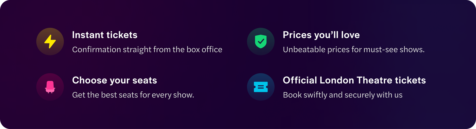
Trust Boosters
To generate the trust of the users on our website, we are highlighting why they should buy with us. This section will appear as an extension to the main banner itself. We targeted 3 main factors to be able to do so:
- Ease of booking: Informing the user about how their tickers are instantly confirmed with us and also the fact that they have the flexibility to choose their preferred seat.
- Competitive pricing: Highlighting how the user can grab some of the best deals with us.
- Social proofing: Mentioning the number of guests who have trusted us and booked with us.
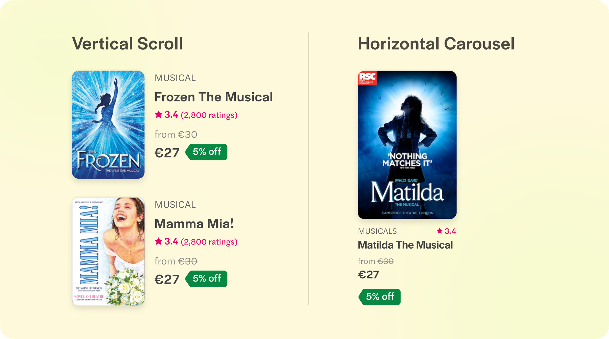
Vertical Show Posters and Revamped Product Cards
One of the major shifts was changing the show posters from a horizontal aspect ratio to a vertical one.
- Vertical posters are often used in shows and cinemas. This shift helped us keep the nostalgic feeling and easy recognition of the show intact while improving the visuals on the landing page and making it more synonymous with the entertainment websites.
- Shifting to vertical posters also helped us display more product cards on Desktop. With horizontal posters we were able to show only 4 in a row while with vertical posters we could now show 6 of them, thus improving discovery of shows.
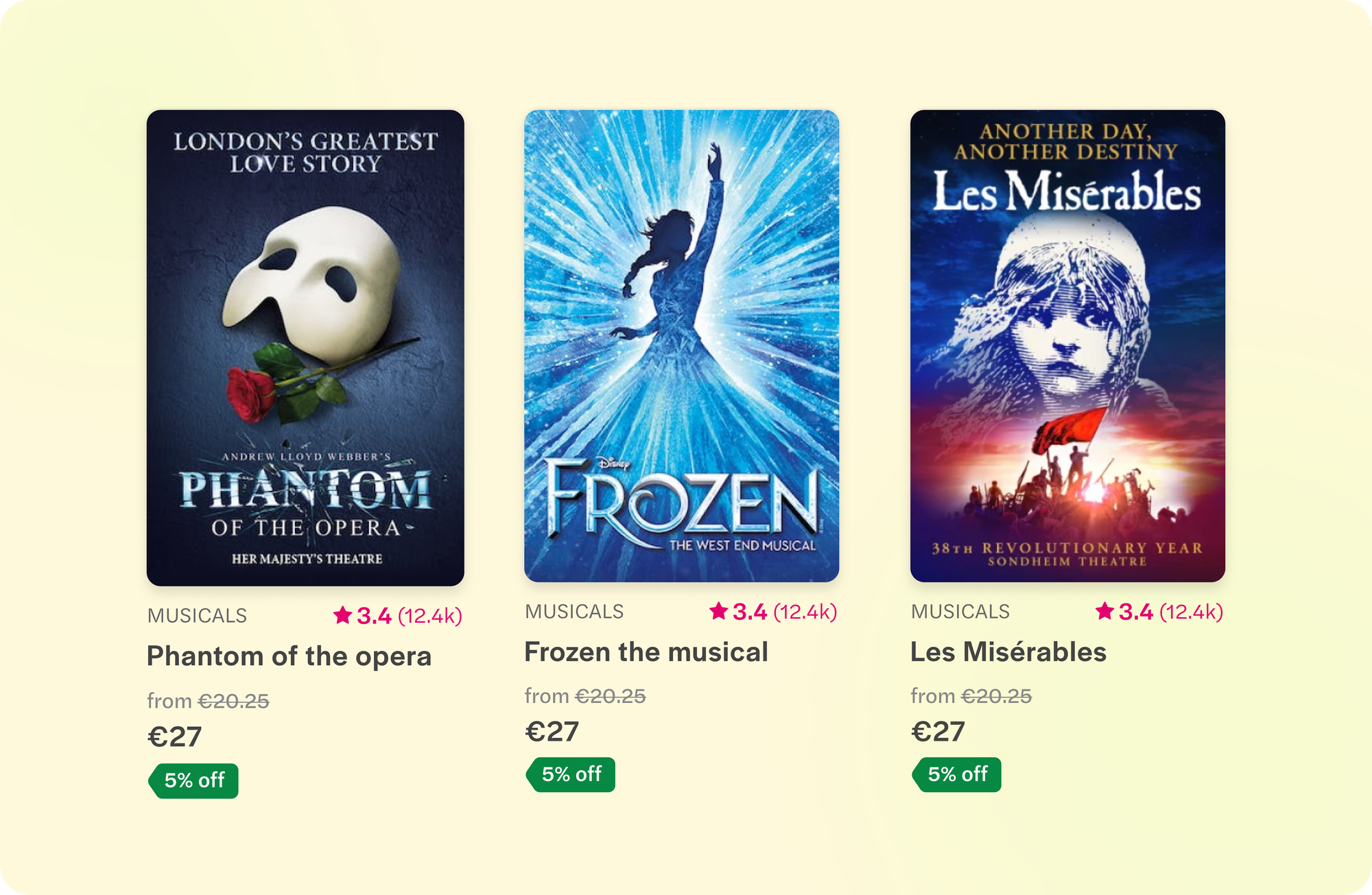
Product Card Elements
- Show poster
- Category name
- Show name
- Ratings for the show along with the number of reviews
- Pricing
- Discount/Offers (if any)
- Opening soon/ Closing soon with the date (if applicable)
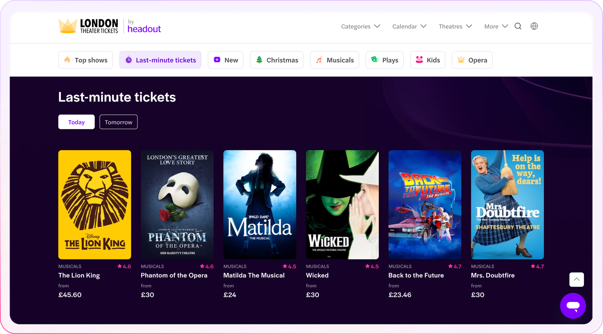
M-web Product Cards
On M-web, there are 2 different kinds of product cards: One style is used for the top West End shows section where we sort product cards by popularity. This is a vertical scroll down the page. The second style of product cards are used in sections below, which are horizontal carousels and made to cater to specific categories like Opera, Musicals, etc. or to cater to specific user needs like Last minute tickets.
The reason these were given different UI treatments is to ensure that the user has a very clear idea of when a vertical scroll for browsing has changed to a horizontal scroll.
Desktop Product Cards
On Desktop, there’s only one UI for the product card. The content and parts of the card are the same as what is being used in M-web.
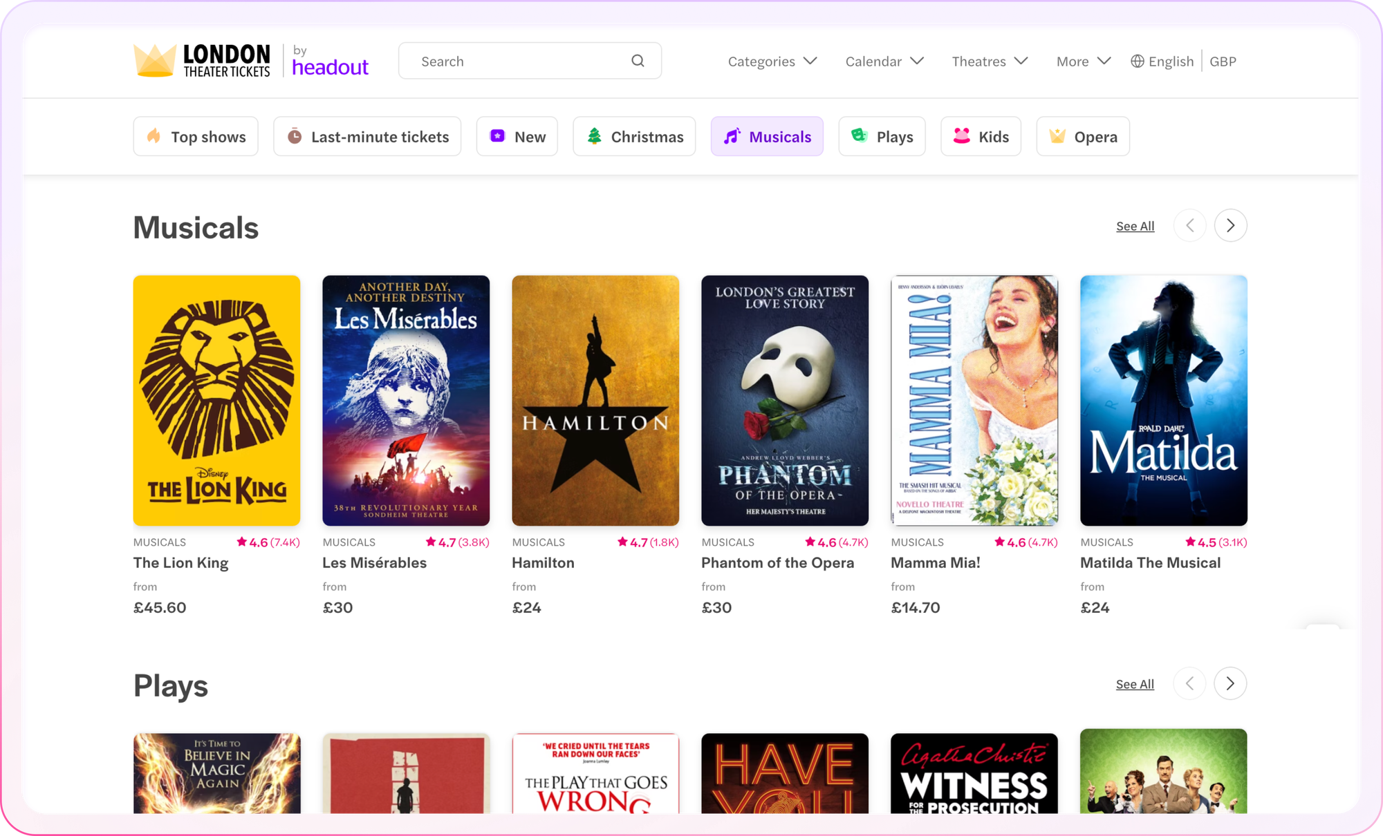
Discovering More About a Category Using Carousels and Filters
The first fold of the new website was now designed to target users who mostly know what they are looking for. However, what if users are just scrolling and browsing through the page trying to find the right show for them? As per the previous data collected, we already know that the scroll depth of this page is pretty high and a lot of users search for specific categories like Musicals, Opera, etc. as well.
To help users make a decision on which show to watch, we introduced category carousels on the page. Here we populate the bestselling shows of each category stacked next to each other. The purpose of these sections was to further aid discovery and help users conclude what show they’d like to purchase. Hence these were positioned below the “Top shows” section of the page.
For easy discovery of these categories we also introduced category filters. On click of the filter the user would jump scroll to that particular category on the page.
New Ways of Discovering: Introducing Last Minute Tickets
We did not stop at categories. We also introduced a section called “Last minute tickets” where users can filter whether they are searching for shows that are playing “Today”, “Tomorrow”, “This week” or “This weekend”. This section was added to cater to the data around the booking lead time of our users where most of them were buying last minute tickets.
Improvements made over iterations
In the initial iteration “Last minute tickets” was appearing below the “Top shows” section. There was no other way to access it apart from scrolling down. However, to our surprise, after the initial experiment the adoption of this section was really high. Hence, we decided to add it as a filter on the top to enable jump scroll functionality from the first fold of the page.
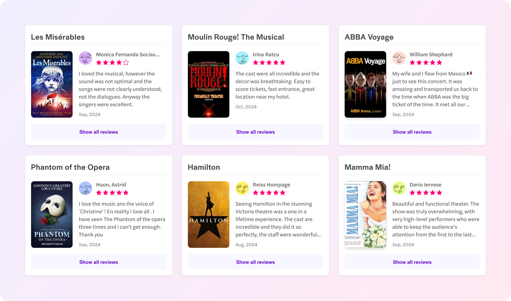
Reviews Left by Users
Nothing induces more trust in a user than social proofing. We decided to introduce user reviews on our landing page where one can see upfront the experience of other users who have already booked with us and witnessed the magic of West End’s theatrical shows. This was positioned between category carousels to ensure it appears early in the vertical scroll and to also break the monotony of category carousels in the page.
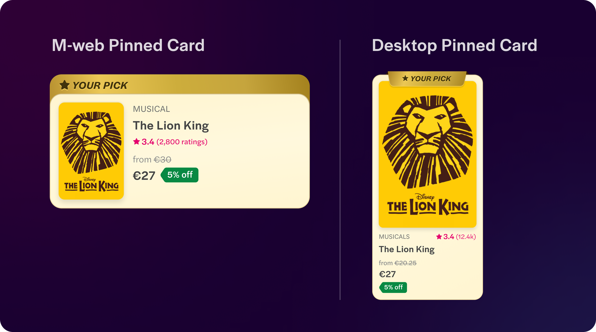
Pinned Product Cards: If the User Lands on Our Website After Searching for a Specific Show
A lot of users land on after searching for a particular show. In that case, we show them the show they had searched for upfront to avoid the hassle of searching for the show again. With the new designs, we also revamped these pinned product cards ensuring they get enough visual hierarchy. The copy “Your pick” makes it evident that this is the show they have been searching for.
How Did the Experiment Perform?
The experiment was a huge win 🥳! The new designs are now 100% live and London Theatre has now grown to become one of the best selling collections for Headout.
No project can be achieved without teamwork and collaborative efforts by all the stakeholders involved. Here’s a shoutout to everyone for making this happen:
Special shoutout to Ramakrishna V., whose unwavering support and mentorship were the backbone of this project. In addition to his invaluable contributions, he has continuously motivated me to challenge my limits which has helped me learn a lot along the way. Also a big thank you to Zanetta Malar for the fresh new set of category icons, Aditya Kulkarni for his sharp product insights, Rachit Jain for providing us with key user research insights, and Aayush Dongre for all his effort in developing the final product.
Made it so far? Do check out the page. It is live on👇
https://www.london-theater-tickets.com/