UX in motion: Driving CVR up with the hop-on hop-off redesign
Booking a bus tour shouldn't feel like solving a Rubik’s cube. We tore down the clutter, revamped the flow, and made picking a HOHO tour on Headout smoother.
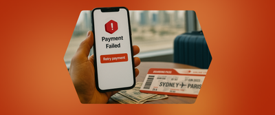
We have all been there- trying to book a trip online but finding it impossible to choose amongst the plethora of tour options. Information buried in layers of pages, making it an endless process to take a quick decision.
This is exactly what we set out to fix with the new hop-on hop-off (HOHO) website redesign on Headout.
Overarching problem statement
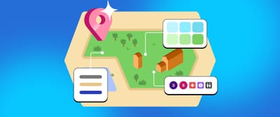
Hop-on hop-off buses provide a convenient and flexible way to explore a city’s major attractions. With designated stops and regular intervals, users can get on and off as they like throughout the duration of the tour.
The previous website for hop-on hop-off was using a basic template that was made for scalability and one that easily fits all categories. The principle of this redesign was a simple one: "One size does not fit all".
Since the goal was to improve the conversion rates of hop-on hop-off as a category, we had to breakaway from the norm and make the entire flow contextual for the end user, helping them make a choice and checkout with us in just a few clicks.
Audit of the previous website
Emerging themes
- Limited information about the different tours present on the landing page: Instead of highlighting unique features or key attractions, it relied on generic descriptors that didn’t help users easily compare or choose the tour best suited to their interests.
- Important details about routes were hidden away in a swipe-sheet: Key information such as route details, operating hours, and top attractions were only accessible after clicking the “More Details” CTA.
- Little to no information about the tour present on the select page: The select page displayed only variant-related content, offering no additional context about the tour itself. As a result, users had to constantly navigate back to the landing page to access more information about the tour.
Variants are different options within a product that the user can choose from. For eg: In the case of HOHO, if the product we are selling is Big Bus hop-on hop-off tours, it can have 24, 48 and 72 hr as variants within it.
We took it a step further: Deep diving into the pain points of our users with review analysis
We turned to one of the most honest sources of feedback — user reviews. Focusing on our top-performing HOHO cities, we gathered and analysed 200+ reviews, across 1 to 5 stars to uncover key insights and recurring themes.
To make sense of all the user feedback, a spreadsheet was created and each review was broken down into four parts — what the user said, what (if anything) they liked, what went wrong, and what we could learn from it. This format made it easier to spot common issues, connect the dots, and pull out takeaways, helping us see the bigger picture.
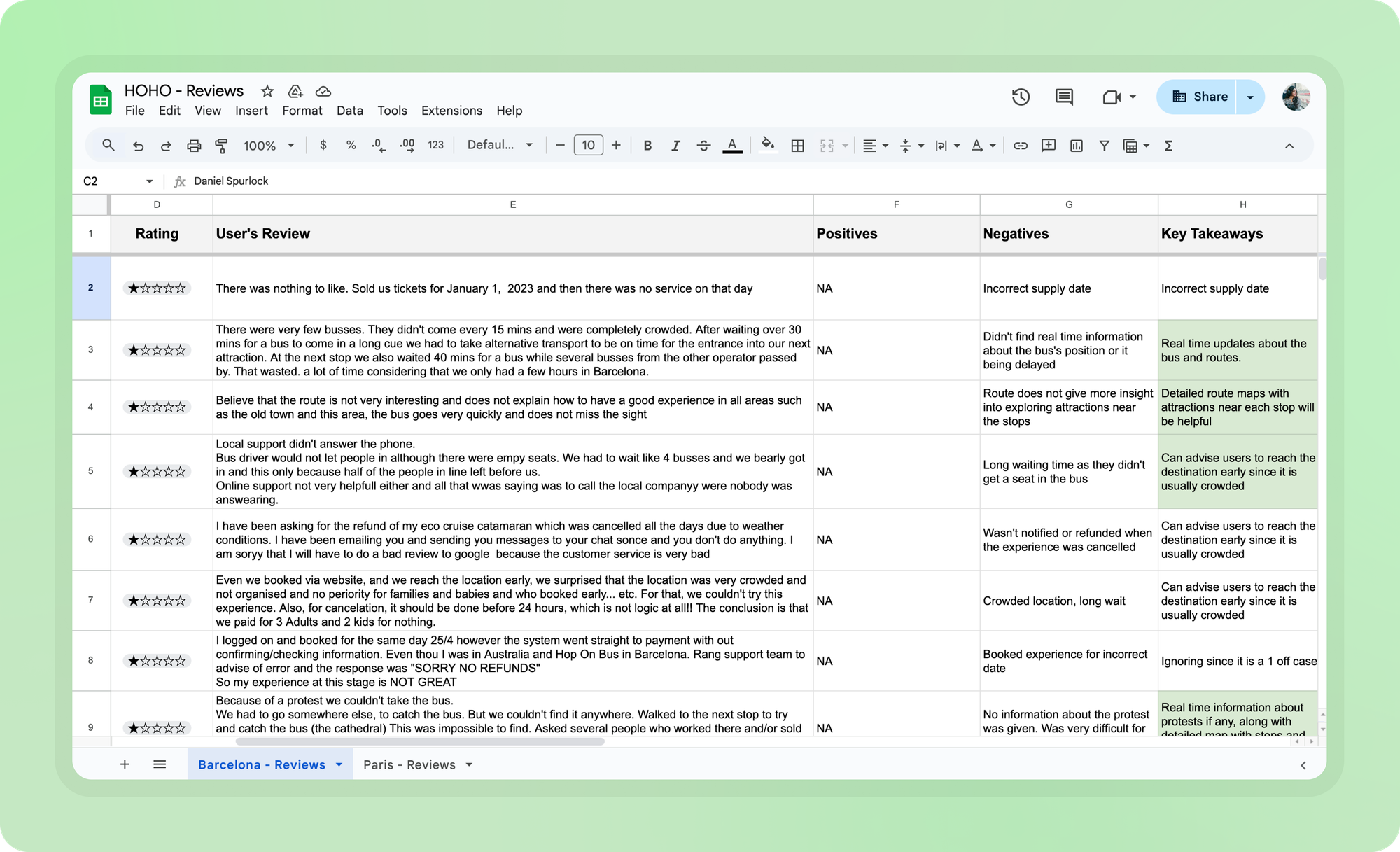
Since the reviews spanned both the pre- and post-purchase experience, we grouped the key takeaways into two main buckets: actionable items for the product and recommendations for our supply partners. While the suggestions for our supply partners were documented and passed along to the business team, we focused our efforts on digging deeper into items that could directly improve the user experience.
Top insights from the review analysis
- Most users complained about unclear route maps on our websites which were not interactive and were difficult to read.
- Outdated maps presented incorrect information to the user about the operating routes or attractions being covered, leading to post-purchase frustration.
- The lack of information about boarding points, operating hours, frequency and the number of routes in the selected tour made it difficult for the users to choose which tour they should opt for.
- If there's a change in the route information, some stops are not working or if a route is closed on a particular day, we were not actively informing the user via an email or showing it on our website, which further led to mismatch in expectations.
Secondary research
We studied key players in the space, including Tootbus, Big Bus, Bus Turístic, City Sightseeing, and many more, to benchmark industry UX standards and identify opportunities for improvement. This helped us refine our direction and define clear next steps for the redesign.
Insights from secondary research
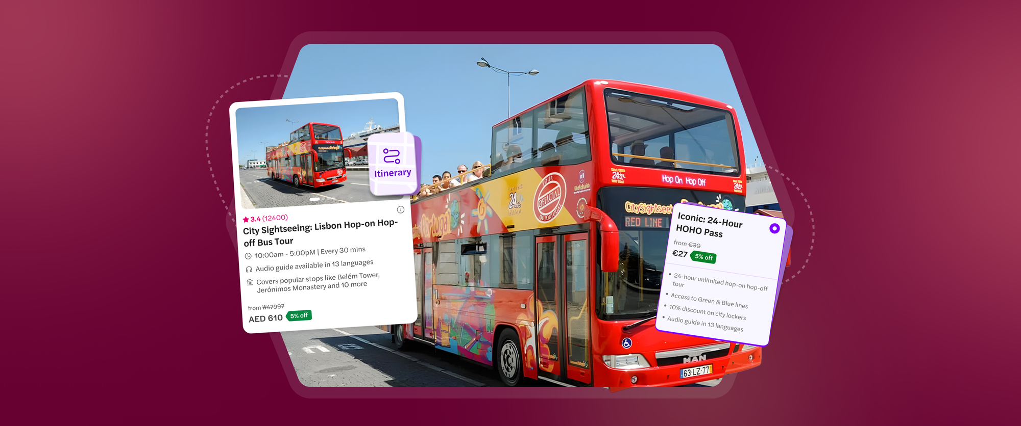
- Most product cards clearly list what amenities and perks are included in a HOHO tour. Information about ticket variants, audio guides, guided tours and cruises (if included) are mentioned upfront.
- Routes are also highlighted with an easily accessible touch point for users to explore details of the stops and top attractions covered.
Turning insights into action items
- Redesigning the product cards to provide all essential information upfront, enabling quicker decision-making.
- Enabling quick touch points for accessing route details with operating hours and top attractions clearly displayed upfront.
- Redesigning the select page to provide all the relevant tour information on a single page reducing back and forth for the users.
Given that most of Headout’s bookings come from M-web, we prioritized designing a solution for this platform first.
Introducing the new Hop-on hop-off flow ✨
Revamped product cards
After a detailed analysis of the content within our existing product, we came up with a set of structured descriptors to provide users with all the necessary details.
The new structured descriptors include:
- Operating hours and frequency of buses on the routes, to help users plan their trip.
- Audio guides and the number of languages they are present in for the tour.
- Top attractions covered on the routes, to not only inform but also excite the user of what they are to see.
- For edge cases like night tours, we have also added a pickup location descriptor to inform the user about where the tour is starting from.
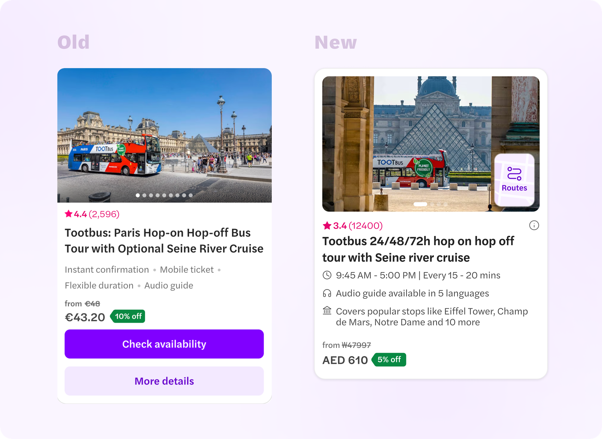
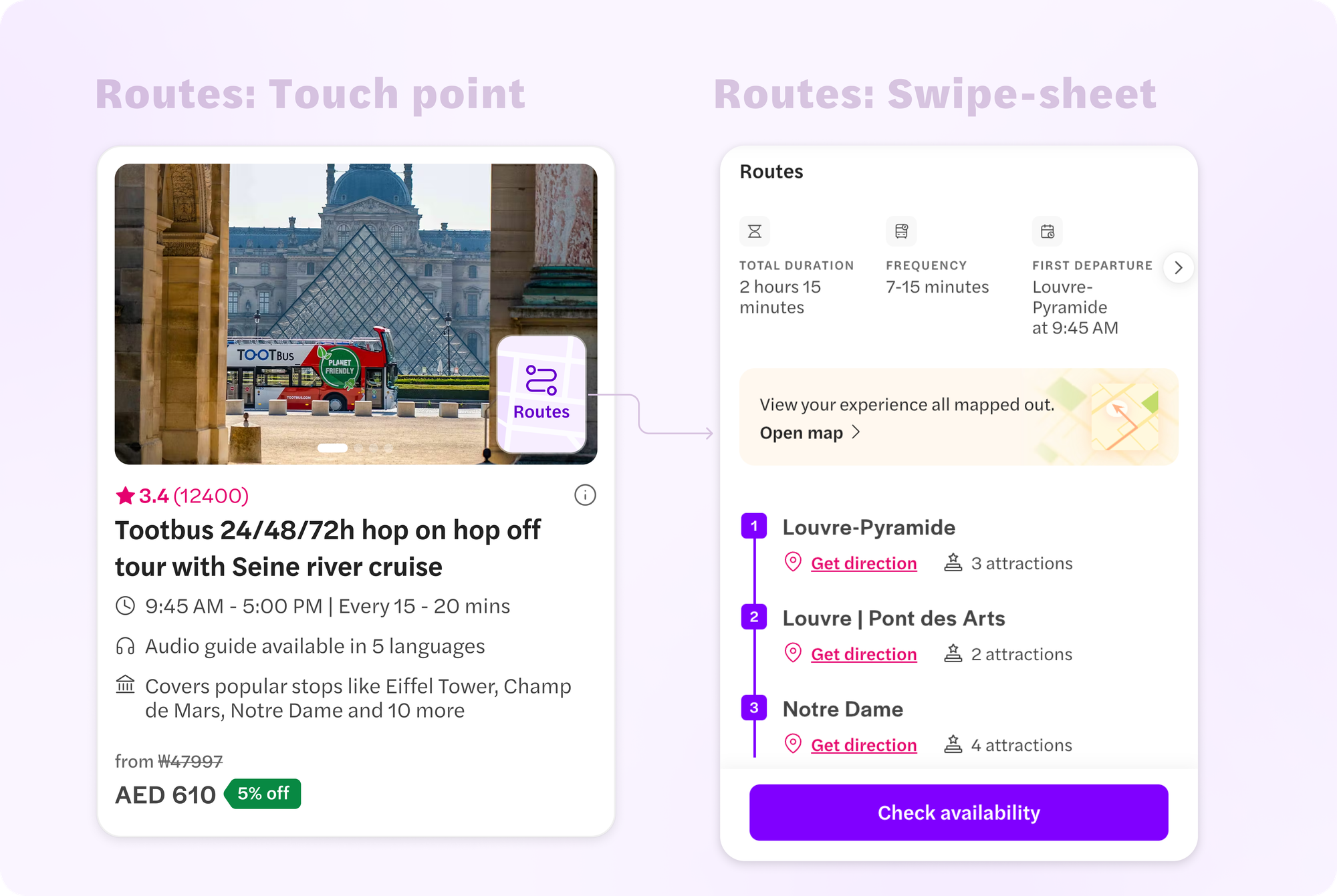
Bringing route details to the landing page:
- Now each product card has a "Routes" pop-over menu.
- Clicking on it will open a swipe-sheet with route details, operating hours and top attractions covered. This was added based on our research insights where we got to know that routes were one of the key decision making factors for our users.
- The swipe-sheet also has a "Check availability" CTA, which will take the user to the select page.
Further, since we are combining the select and more details page, we have removed all CTAs from the card. Tapping anywhere will take the user to the select page.
The all new select page
- The banner has been revamped with the addition of reviews count and a clear heading. The dark theme ensures that the attention goes on the variant selections more than the header.
- The revamped date strip takes lesser space and is more clutter free. Once the user starts scrolling, the date strip becomes sticky at the top of the page.
- The first variant is auto-selected to indicate and nudge the users to make a selection on the page. Further, the UI of the variant card has been tweaked. The variant content has also been rewritten to be able to cut down redundant points and make variant cards easily comparable while reducing card heights.
- We retained the sticky bottom CTA as a quick touch point to move to the next step.
- We now also have route details below the selection unit, enabling the users to consume route related information on this page as well.
- Below route details we have added the remaining information slices like- inclusions, need to know, image gallery and reviews. The reviews section can also be accessed via a jump scroll if the user clicks on the reviews unit in the banner.
The Experiment 🔎
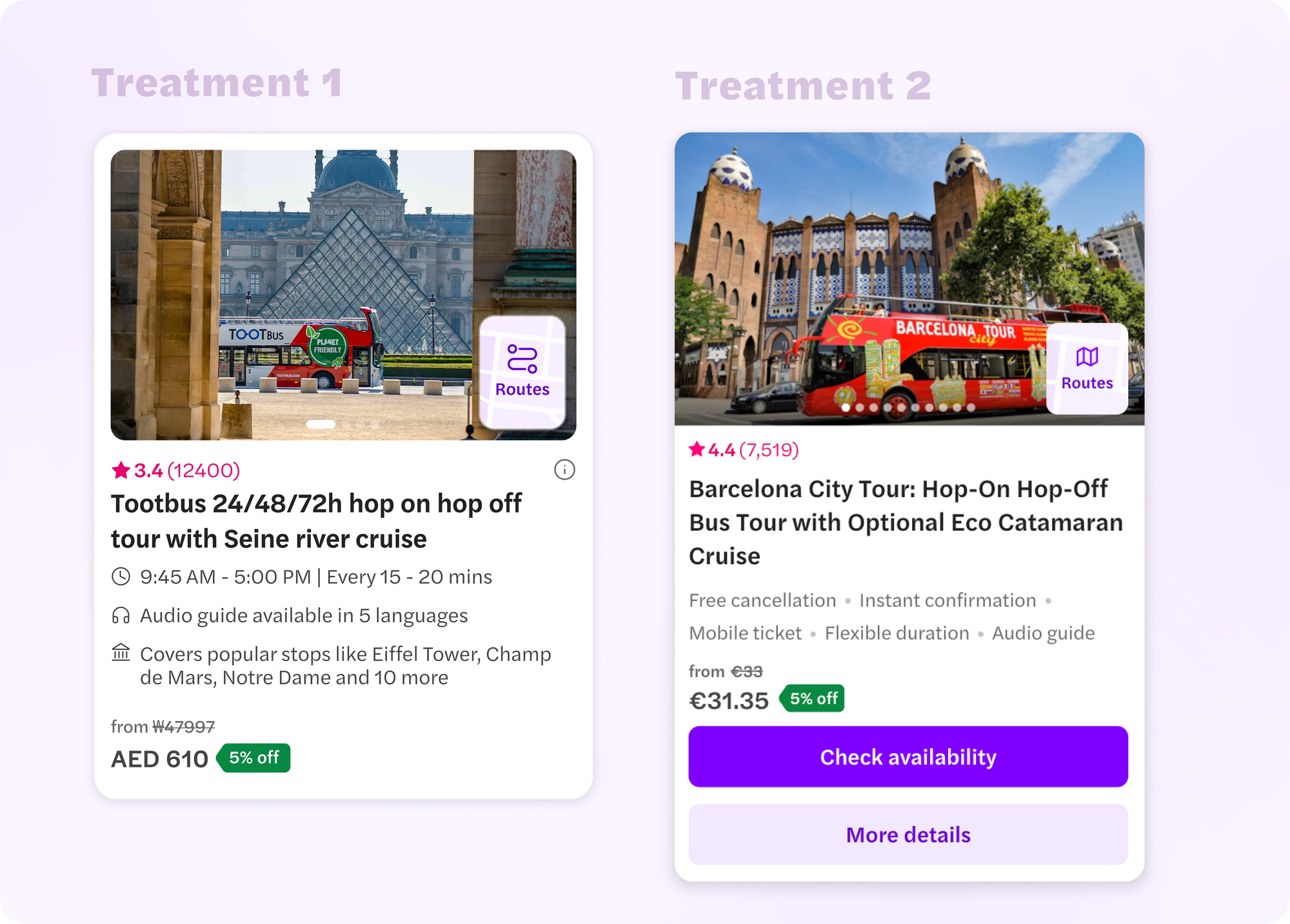
We conducted the experiment with 2 different solutions.
- Control: The previous website.
- Treatment 1: Revamped product cards with the new select page.
- Treatment 2: Old product cards with the addition of the route pop-over menu and the new select page.
This helped us understand the impact of each feature change we were proposing in an even more detailed manner.
Results 🥁
While both the treatment versions had a significant CVR uplift compared to control, Treatment 2 surpassed Treatment 1 as well, making it the winner.
Treatment 2 was then rolled out at 100% for hop-on hop off! 🎉

Some key takeaways and next steps
While the new product cards did not make a significant impact for the hop-on hop-off category, we knew the learnings we had to take home:
- The descriptors had to cover more details and different aspects of the tour.
- The CTAs had to be brought back on the product card to also let users read quick details of the tour on the landing page itself.
While not immediately for HOHO, we revised the product card with these learnings and applied it for the cruises category, where the new product cards with the contextual descriptors uplifted the CVR significantly. I will cover this in my next blog, so stay tuned!
Both the product cards and the new select page ended up serving as a helpful UX starting point for other categories in Headout.
That being said, no project can be a success without team effort. Shoutout to Ekansh Bansal and Aditya Kulkarni for their valuable product inputs, and Ramakrishna V for his guidance throughout the project.
Made it so far? Check out the product. It's live on: https://www.hop-on-hop-off-tickets.com/paris-bus-tours/
PS: It is live on M-web only. We are working on bringing the same UX to Desktop soon! ✨