Rebuilding for scale: How Framer CMS transformed our design magazine
We recently wrapped another edition of Headout’s yearly design magazine—this time with a name: Pantheon. More than just a showcase, it’s a living archive of the design team’s work, process, and progress over the past year. Pantheon brings together everything from the past year—projects, stories,
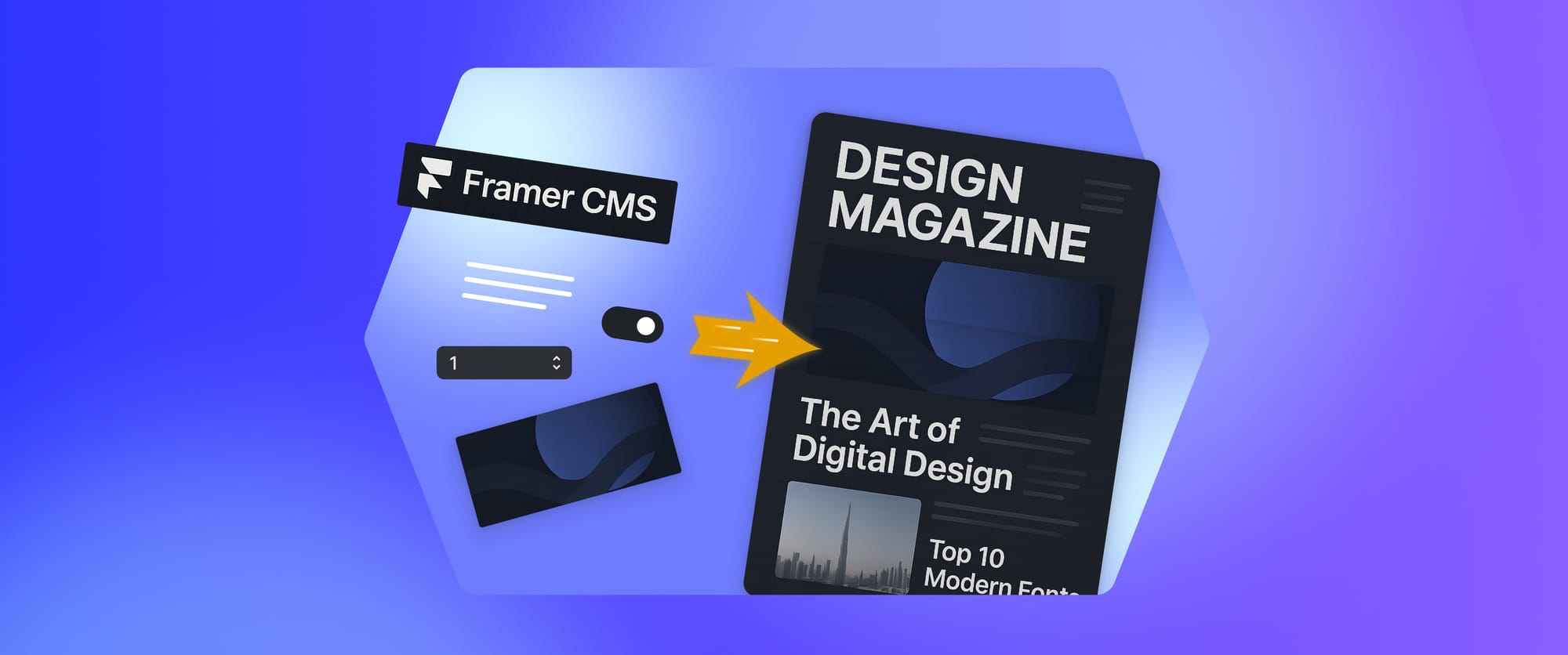
We recently wrapped another edition of Headout’s yearly design magazine—this time with a name: Pantheon. More than just a showcase, it’s a living archive of the design team’s work, process, and progress over the past year.
Pantheon brings together everything from the past year—projects, stories, metrics, and learnings—all in one dynamic experience. What used to take hours of manual layout fixes is now a streamlined system that lets us focus on what matters: the storytelling.
In our first blog, we explored the thinking and visuals behind Pantheon (you can catch up on that here). This one's about what came next—turning that vision into a living, dynamic site using Framer CMS.
With just one collection, some smart field logic, and a handful of nested components, we made Pantheon modular and effortless to update. Here’s how we set it up:
A quick guide: How we built our component and linked it to Framer CMS
To help beginners and curious designers alike, here’s a closer look at how we set up our design magazine in Framer CMS—using real examples from Pantheon to show how we made it dynamic, flexible, and easy to manage.
1. One CMS to rule them all
We created a single CMS collection called "Projects" to manage everything across the magazine. Instead of splitting things by project status or pod, we used filters to dynamically control what shows up where—thanks to a simple POD/team field in each entry. Here's what each CMS item included:
- Slide type – whether it was a full-width breaker slide or a left/right image layout
- Title – the project name
- Status – dropdown with options like Live, In Progress, Backlog
- POD/team name – used later to filter content on different pages
- Links – Figma, Mixpanel, live site, learnings (each linked to an icon on the card)
- Image – the main thumbnail visual
- Metrics – any relevant numbers or data about the project
This gave us a clean data layer to manage everything smoothly, while keeping it flexible for all kinds of project formats.
CMS setup in Framer with multiple fields for managing design magazine content.
2. Designing the slide component
We built a reusable slide component in Framer, which became the visual template for each project.
It included:
- A placeholder for the project image
- Text blocks for the project title
- Icons for dynamic links (Figma, Mixpanel, etc.)
- A status tag driven by CMS fields
- A metric section
- Flexible layouts for left or right image alignment
3. Binding fields to CMS
Each of the elements inside our slide component was connected directly to a CMS field:
- Layout → Options field to control left and right alignment
- Image → Image field
- Title → Plain text field
- Description → Rich text field
- Status tag → Options field to select project status
- Pod tag → Options field to control where the project appeared based on POD/team name
- Link icons → Link field (Visibility based on whether the corresponding field was filled, no content = icon hidden)
- Metrics section → Number field (Dynamically shown only if data is provided)
4. Using transform for visual variants
Instead of designing multiple components, we leaned heavily on Framer’s Transform feature to tag each component variant to CMS options. So if a project’s status was marked Backlog, the card auto-switched to a backlog status variant. Set it to Live, and the design lit up in green—no manual styling needed.
Preview the 'transform' setup for the slide type field.
5. Simple sorting and smart visibility
To control which projects showed up on which pod page, we used the POD field as a filter. Whether it was sorting by pod, project status, or slide type—Framer CMS let us display the right content on the right project slide with zero manual intervention. Want to reorder slides? Just drag and drop them in the CMS dashboard and the layout updates automatically.
We also tackled an age-old layout issue: inconsistent icons. Not every project had the same resources—some had Figma files, some had Mixpanel dashboards, others had live URLs. So instead of hardcoding links, we made each icon conditional. If a CMS field was empty, the icon didn’t appear. That kept the layout clean and relevant, project by project.
Looking ahead
Pantheon wasn’t just about celebrating the work—it was about reimagining how we present it. What started as a maze of Figma slides and layout tweaks has evolved into a system that supports storytelling at scale. And now that the CMS is in place, adding new work to next year’s Pantheon will be as easy as filling out a form.
Want to see it in action? Check out the template we created using Framer CMS-

Quick visual showcase of the Headout design magazine.
Got questions about the setup or thinking of building something similar? Let’s talk—I’d love to share notes.
Big shoutout to Ramakrishna for constantly pushing us to explore new ideas and giving the team the space to build something meaningful. This magazine wouldn’t exist without that kind of support and Aditya and Siddharth for helping me wire up the CMS in Framer so well that adding content now feels almost too easy.

